Potluck, the all-natural Korean pantry staples line founded by Jen Arsenault, brings a vibrant and personal touch to the world of Korean cuisine. Designed to evoke the warmth of home cooking and family gatherings, Potluck’s visual identity and brand ethos embrace the art of small-batch cooking and the preservation of traditional flavors. Let’s explore the creative approach behind Potluck’s brightly colored branding and its connection to the essence of handmade culinary experiences, appealing to both seasoned Korean food enthusiasts and curious home cooks.
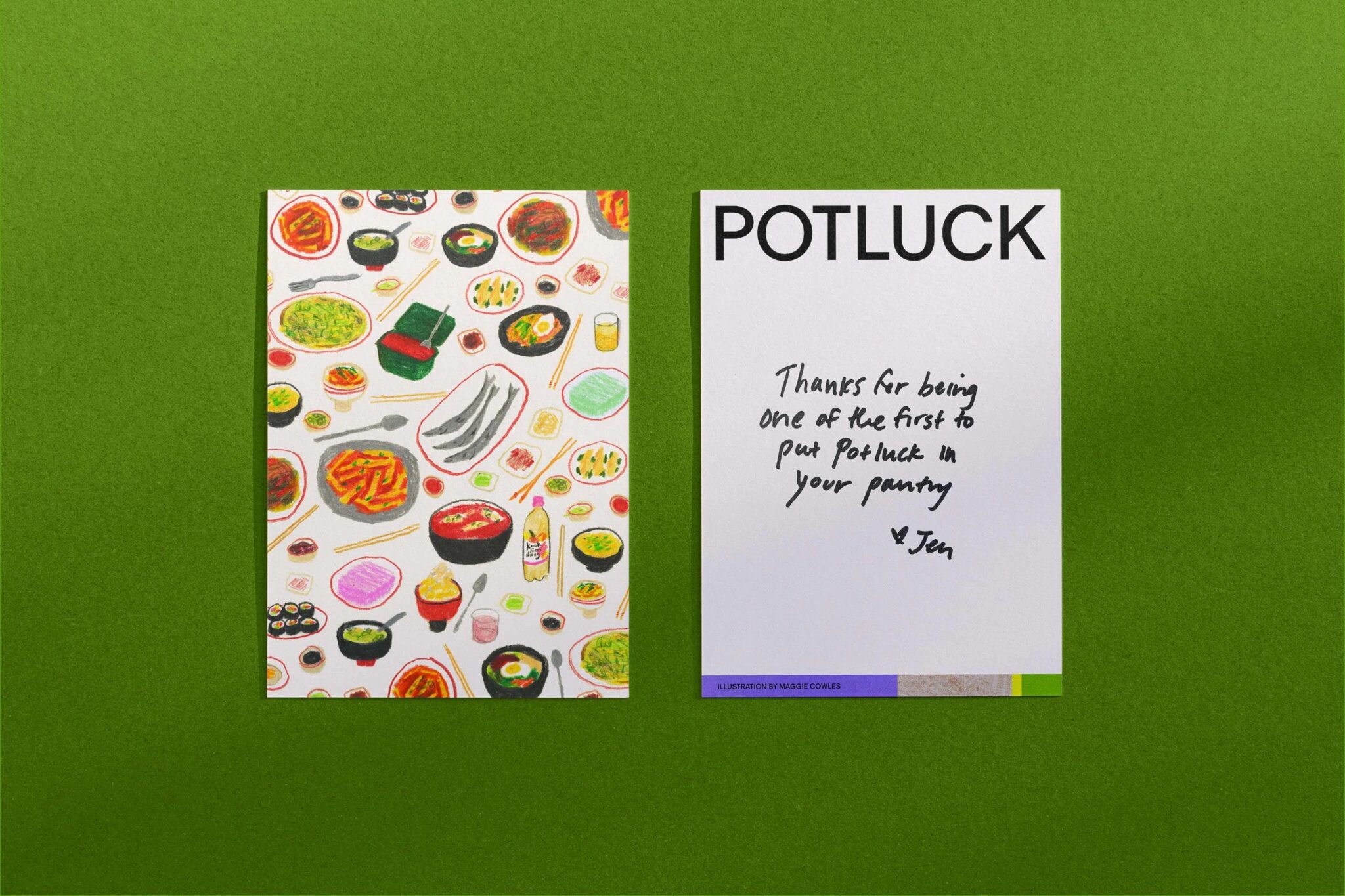
Handmade and Intentional
Regrets Only, the creative studio responsible for Potluck’s branding, recognized the importance of infusing a handmade and intentional feel into the brand’s visual identity. Taking an analogue approach to design, the team experimented with food printmaking techniques, using potatoes, charcoal, crayons, and watercolors to create abstract textures that mirrored the flavor profiles of Potluck’s products. These handcrafted marks found their place on the colorful boxes of homemade gochujang and ssamjang, adding a unique and personal touch to the packaging.
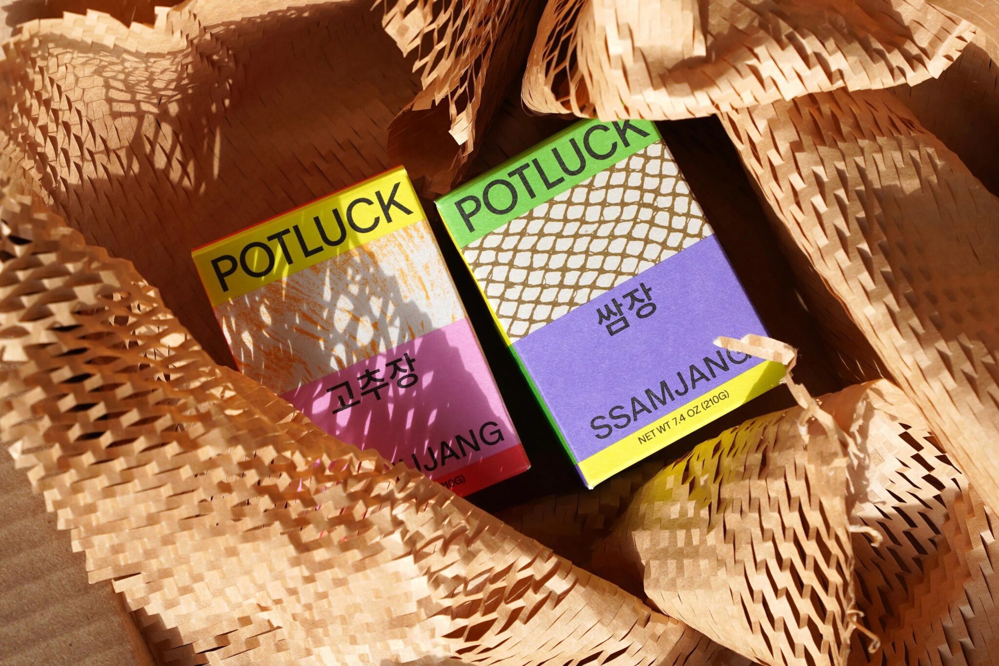
A Patchwork of Colors and Flavors
The project’s visuals drew inspiration from bojagi, traditional Korean wrapping cloths that beautifully stitch together discrete pieces of fabric to create intricate compositions. This concept overlaps with the meaning of potluck itself, representing a mix and match of different flavors and experiences.
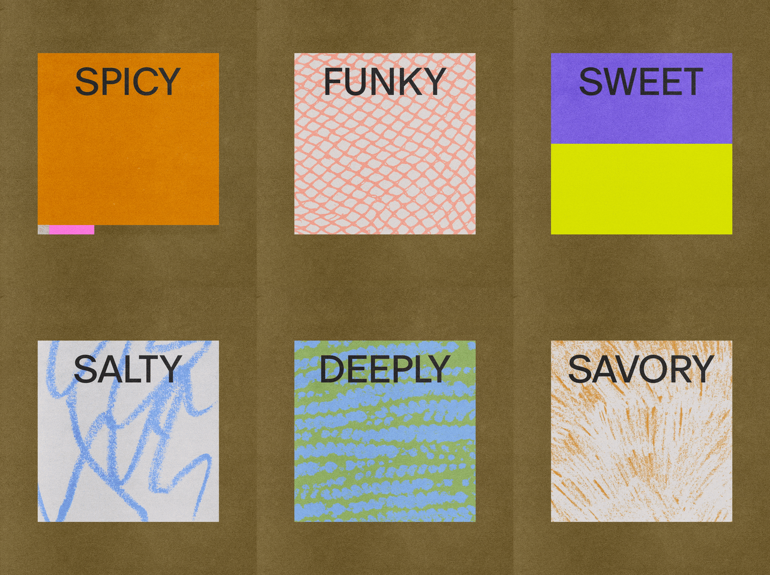
The studio translated this inspiration into a modular system across packaging, motion, and web design, creating vibrant patchworks that vary with each stack of colorful boxes on shop shelves. This attention to detail embraces the playful and experimental nature of cooking, capturing the essence of culinary creativity at its best.
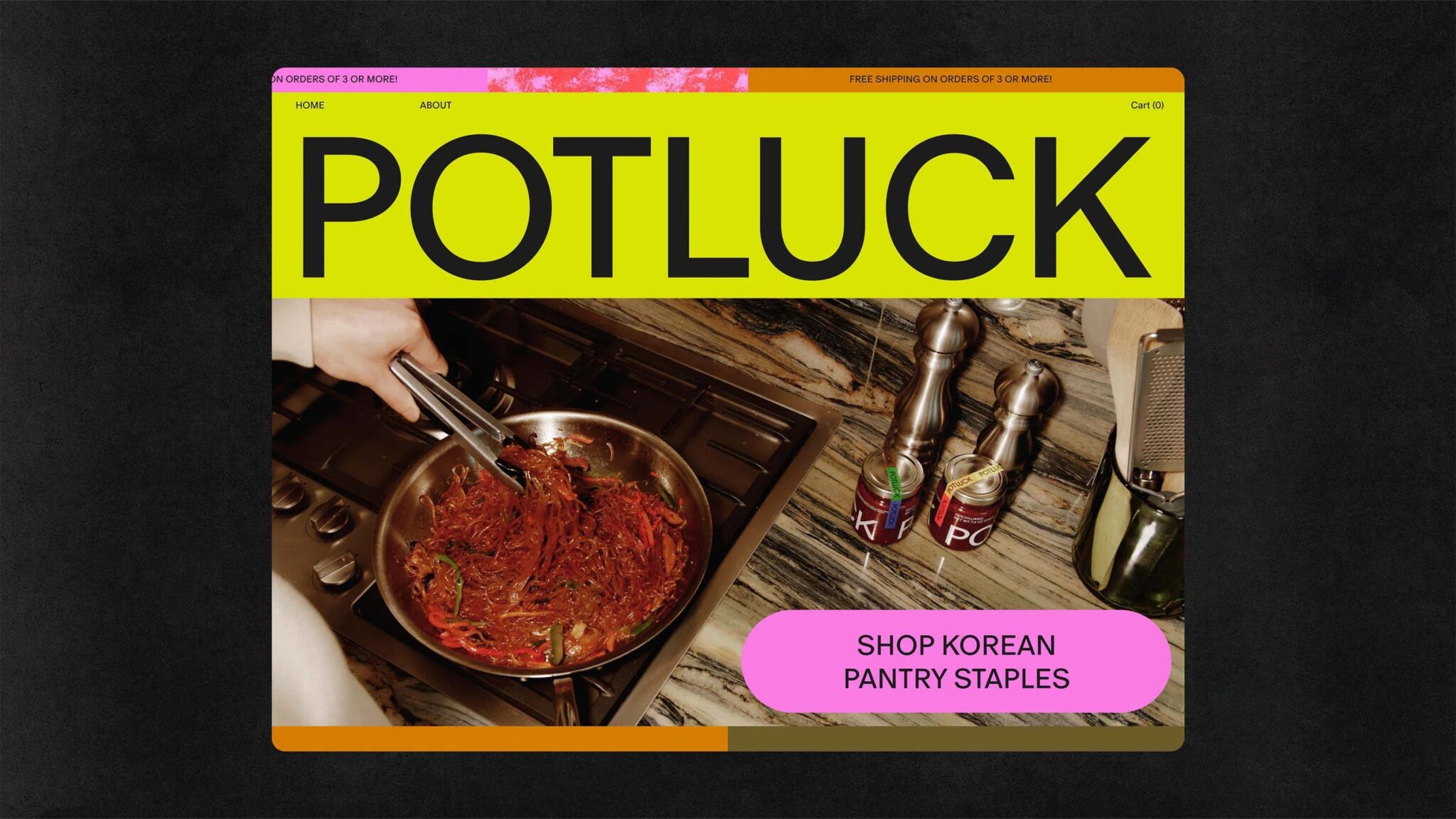
A Warm Welcome to the Korean Flavor Party
With its vivid colors, handcrafted textures, and patchwork patterns, Potluck’s branding is an open invitation to pull up a chair and experience the rich flavors of Korean cuisine. It’s a visual feast that captures the spirit of family gatherings, home-cooked comforts, and the joy of discovering new tastes.
Final Thoughts
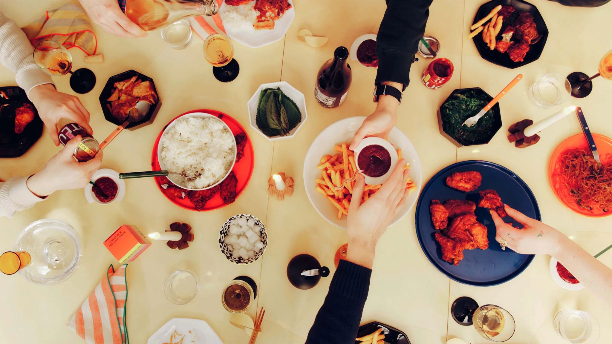
Potluck’s latest branding celebrates handmade aesthetics, allowing the unique touch of each cook’s hands to shine through, highlighting the authenticity and individuality of the culinary journey. The design embodies the spirit of gathering, where ingredients, dishes, and people come together to create a flavorful and unforgettable experience. With its mouthwatering branding and focus on all-natural, small-batch flavors, Potluck’s design invites both seasoned pros and curious newcomers to Korean cooking to fall in love with the brand’s delectable offerings.
Also Read: Cadbury ‘Memory Bar Boxes’ Gives a Sense of Comfort, Helps Tackle Dementia


