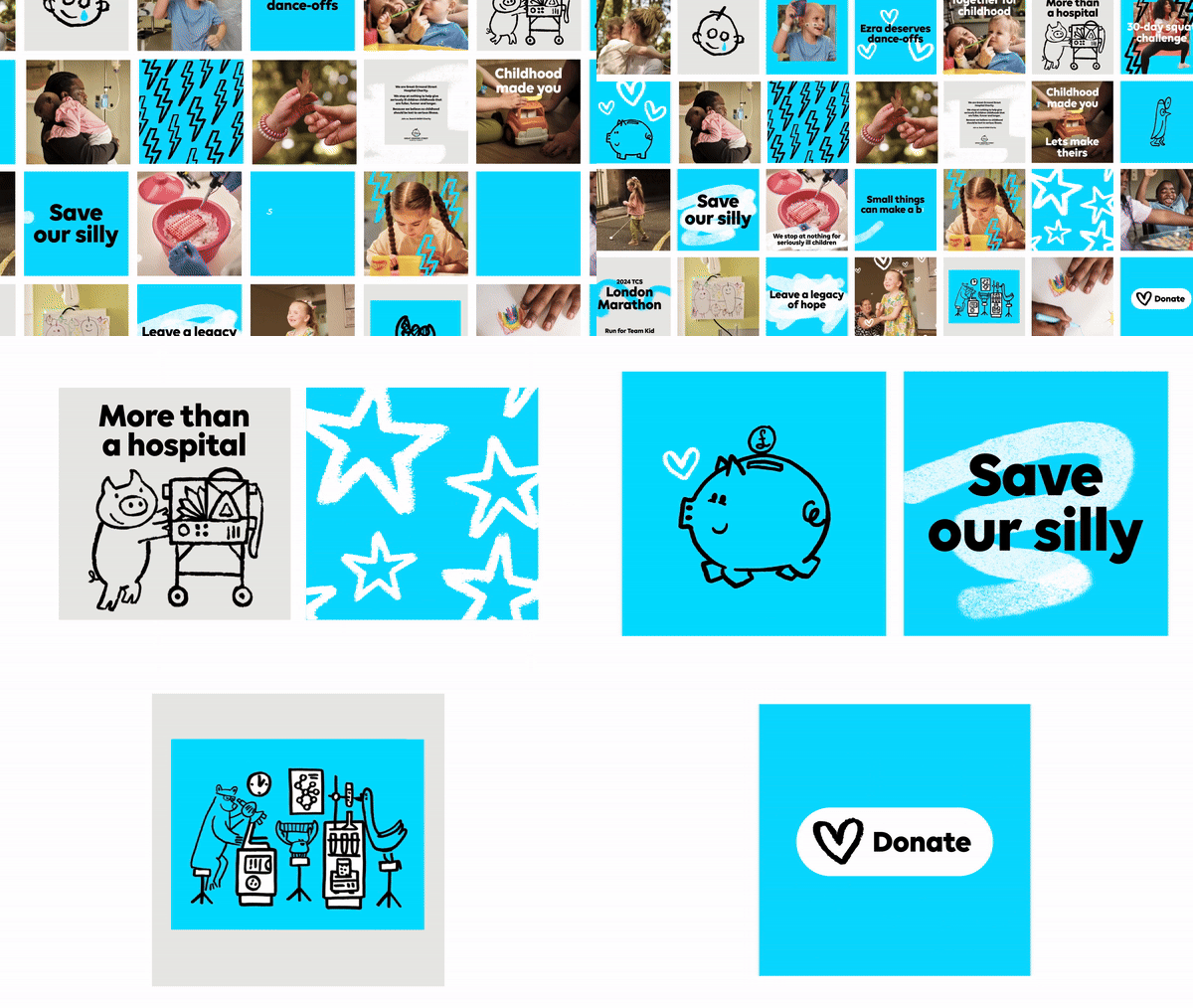
The Great Ormond Street Hospital Charity has introduced a new look and design to stand out, be more relevant, accessible, and inclusive. The rebranding was achieved through partnership with global branding agency Jones Knowles Ritchie (JKR), independent creative director Stuart Gough, and a team led by Ashley Johnson and Ruth Jamieson at Pentagram.

The charity wants to inspire everyone to join in and have the biggest impact on seriously ill children and their families. The Great Ormond Street Hospital Charity wants the masses to know the difference its making to the lives of seriously ill children every day.
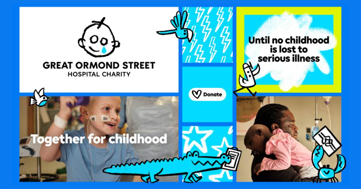
The refreshed look highlights the reality of childhoods hit by serious illnesses, hope, and determination to save lives. The updated brand is more accessible, inclusive, and digitally enabled. Its rooted in the Great Ormond Street Hospital Charity’s history. The updated logo captures the charm of the original sketch, which was inspired by a GOSH patient’s drawing and produced by the charity’s Wishing Well Appeal in 1987.

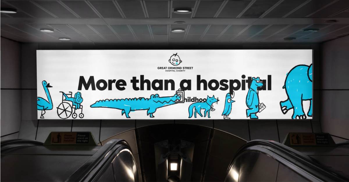
The charity also boasts charming new animal characters. It represents all the ‘doers’ who help to transform the lives of seriously ill children in the hospital and beyond. JKR said the new brand puts children’s lived experiences front and center by adding the voices of children and families at Great Ormond Street Hospital.
Gough said they saw a new opportunity to create a design system that reflected the love and character of the original sketch. He explained they wanted to embrace the energy of a child’s drawing, the charm, and mistakes to make a distinct and positive identity system that is recognizable through its entire personality.

Johnson shared that it has always been important to Great Ormond Street Hospital Charity to tell the real stories of the children and families welcomed by GOSH each year. “Together we have built on these foundations, translating the strategic platform into a fresher and more confident verbal identity that can advocate, challenge, champion, change things, and bring new and existing supporters closer to the vital work they do for seriously ill children.”
Gough added that they created GOSH’s first-ever motion identity. It’s versatile, designed with a dynamic tonal range, seamlessly adapts to all channels, and complements the brand’s distinct assets.
Also Read: Transport for London Opts for Integrated OOH, Digital and Social Campaign for ‘TfL Cycle Sundays’


