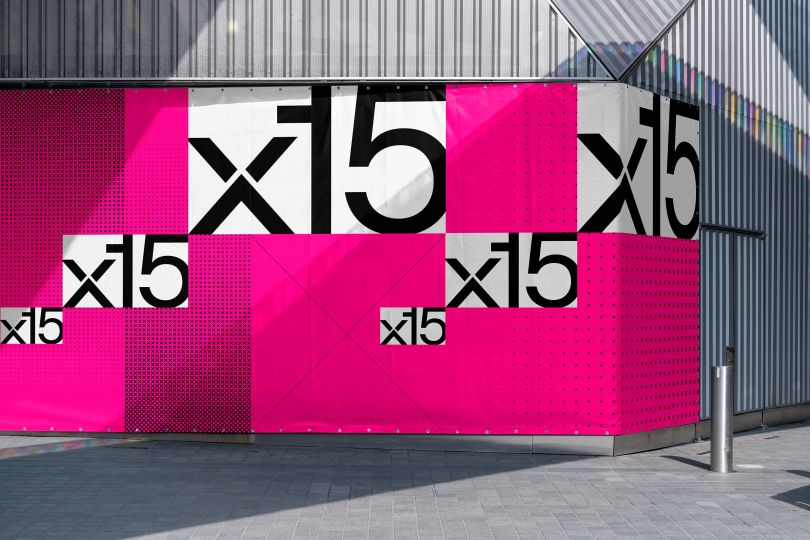
x15ventures is making a mark for itself in the ever-changing world of fintech with a design studio. Universal Favorite to craft a new visual and verbal identity. The Australia-based design studio gave x15ventures, launched by CommBank, a much-needed identity upgrade it was looking for.
Universal Favorite helped bring their strategy, and visual and verbal identity in line with the fintech company’s constant scaling, expanding, moving, and shaking. x15ventures went for the new visual identity because it was often misunderstood, inconsistently articulated, and didn’t have an accurate reflection of what the business had become.
Basically, x15ventures had outgrown its early brand work. As such, it needed a flexible yet recognizable brand system that would help distinguish x15 in the market, with the talent it required to build the next generation of digital solutions, founders, and peers in the venture capital industry. x15ventures needed to appeal and reach out to various audiences with a recognizable brand system that would distinguish it in the market.
Universal Favorite, in partnership with strategy studio Untangld, developed a strategy centered around access advantage. The concept focuses on the collision of corporate and venture worlds, and the unique mix of benefits x15 can offer by occupying the space between both. And then came the idea of “made to scale” – x15 is here to help take ventures and individual careers to the next level and give them the space they need to move, grow, and thrive. In other words, x15 occupies a space where ideas and expertise collide to create big, impactful things to push boundaries.
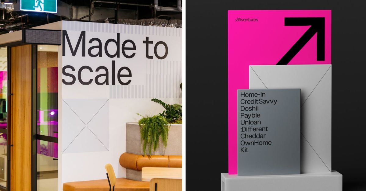
The design studio retained x15’s brand attribution by keeping the DNA of its original identity intact. It refined the existing logo retained the hero brand color, and pushed some boundaries with the wider design system. x15venture’s primary palette remains the same, neutrals did the grunt work, while the brand’s signature pink was saved for impactful highlights. A modern, simple, and geometric typeface – Catalogue – was introduced, striking a beautiful balance between consistency and flexibility, while bringing the brand into the modern space.
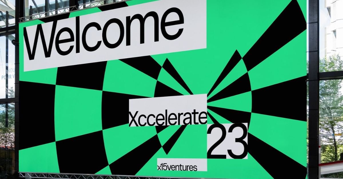
Furthermore, Universal Favorite also created a system of patterns, shapes, and wireframes, drawing inspiration from the early NASA prototypes of the X-15 rocket. The grids and symbols keep the brand working.
Also Read: Rebranding of Social Media Giants: Facebook’s Meta vs. Twitter’s X