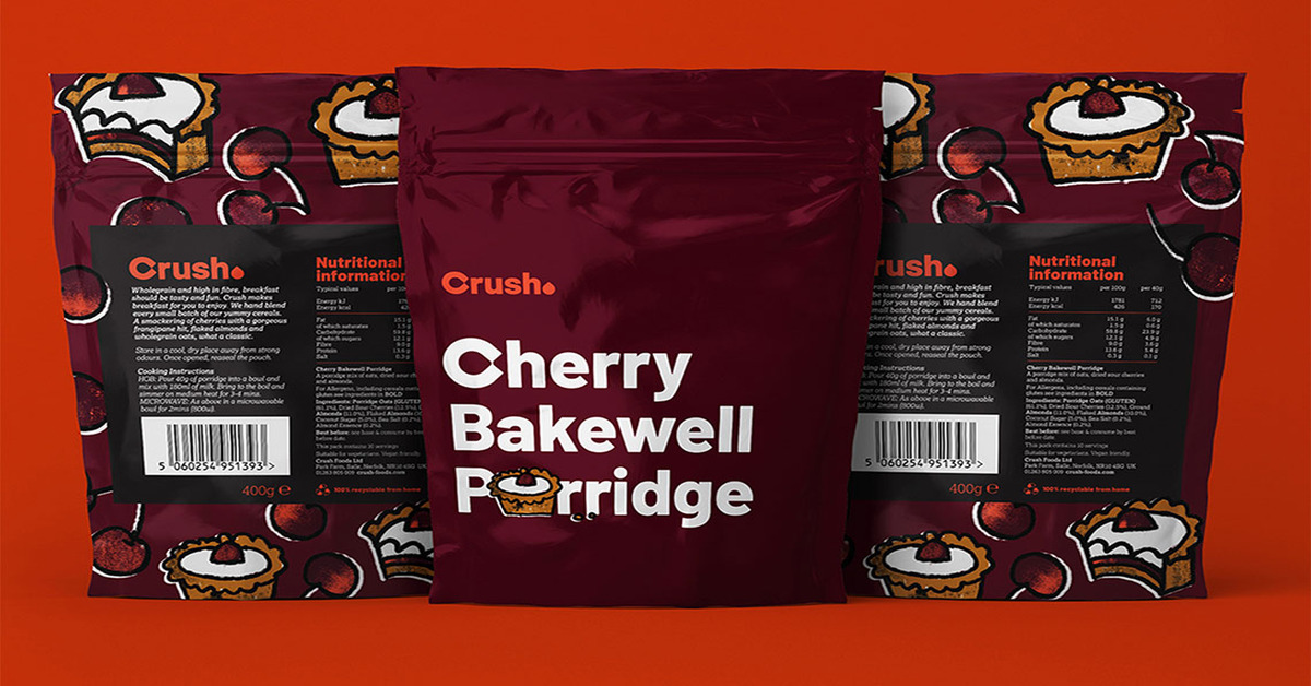
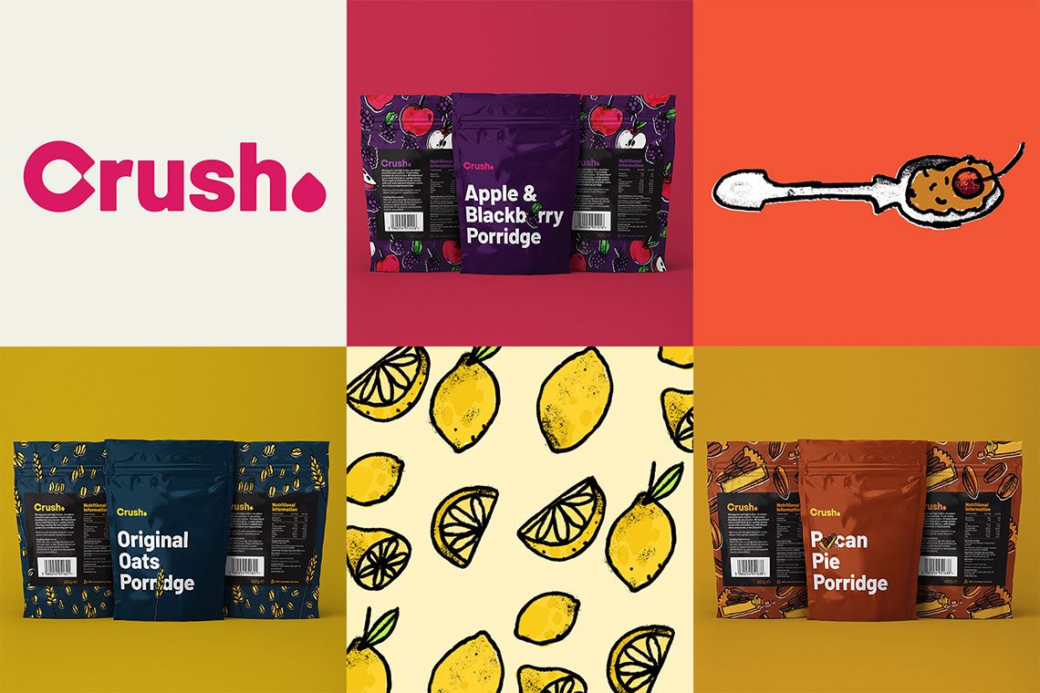
To keep up with ever-changing consumer needs, Crush Foods has adopted a new visual identity and packaging for its products. The Norfolk-based food and drink company partnered with Production Bureau, a branding agency, for the makeover.

Production Bureau worked closely with Crush Foods and established a brand stamp. Lee Norton, head of Design Studio, Production Bureau, said they wanted food to be front and center, and Crush to sit back. “So the brand had to be bold and clean, for it to be made as small as possible on the packaging.”
Norton explained they came up with the idea of the packaging to be a gift. “A treat for you, or for someone else. The simplicity of the front of the packaging, and the edible colors make you want to pick it up and find out more. The concept is, that when you pick it up and turn around, the back stripe and repeat patterned background, give that gift-wrapped effect, making it hard to put down, and easy to put in your basket!”

The executive highlighted that the new logo for Crush Foods started with the ‘droplet’. “The droplet represents a drop of oil. We felt that this shape really helps tell the story of Crush, with Rapeseed Oil being the first product they launched. The drop shape doesn’t just represent oil, it also nods towards food in general, whether that’s the water that feeds the crops, the grains used in their cereal, or the petals and leaves on fruits and flowers.”
Norton said the droplet turned 45° creates the counter within the ‘C’, and is also used for the full stop. The rest of the letters within the logo have radical corners that match those of the droplet giving the whole lockup a consistent, soft, and playful look.
Moreover, the illustrations used within the brand are all hand-drawn. Production Bureau used a mix of textures and various line weights and styles. It said the imperfections and roughness of the illustrations help create a sense that this is a handcrafted, artisan product.
Also Read: Nestle on Track to Reach 20% Absolute Reduction of GHG Emissions by 2025


