In a market dominated by conventional red, white, and blue toothpaste tubes, Paist, a groundbreaking plastic-free toothpaste brand, emerges as a beacon of sustainability and innovation. Paist positions itself as a provider of natural, sustainably packaged, and medically approved toothpaste—a rarity in a sector where finding a product free from artificial ingredients and additives is a challenge. Let’s explore more about this sustainable rebrand.
The Creative Process Behind Paist’s Identity
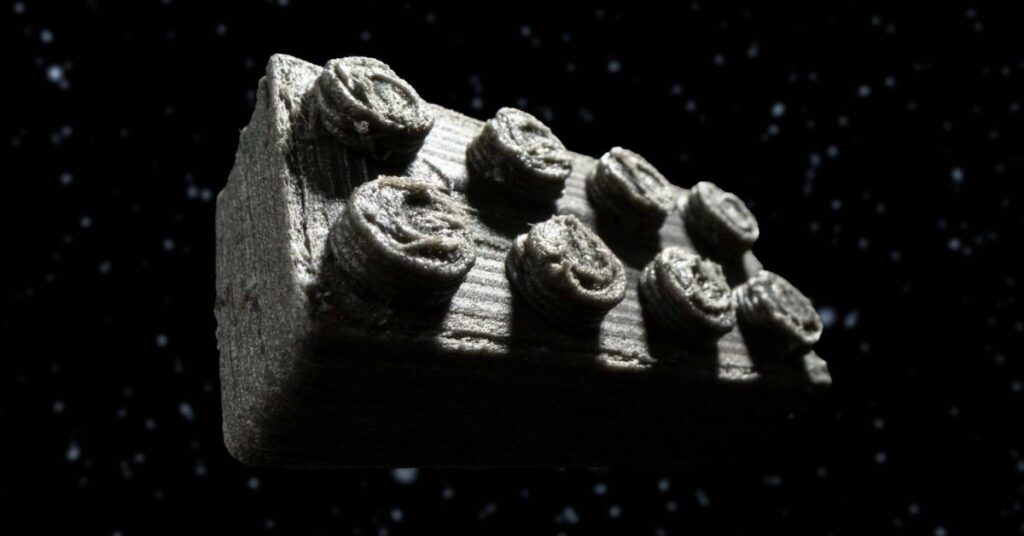
Two Times Elliott, the design mastermind behind Paist’s identity, have crafted a visually striking and clinically authoritative brand that challenges the industry norms. The design studio aimed to strike a balance between authority and playfulness in Paist’s identity. The studio ingeniously integrated a structured, modular typographic system with 3D forms and textures inspired by toothpaste states—paste, foam, and water. An authoritative yet lively brand that injects a sense of fun into the routine of oral hygiene.
Founder of Two Times Elliott, James Horwitz, shares insights into the challenges faced during the design process. Confronting the saturation of ‘same-old, same-old’ toothpaste offerings, Horwitz explains how the studio tackled creating differentiation and a clear tone of voice for Paist. Horwitz emphasizes the need to explore new avenues for design, packaging, and materiality, deviating from the clichés in the toothpaste market.
A Unique Color Palette Breaking Away from Tradition
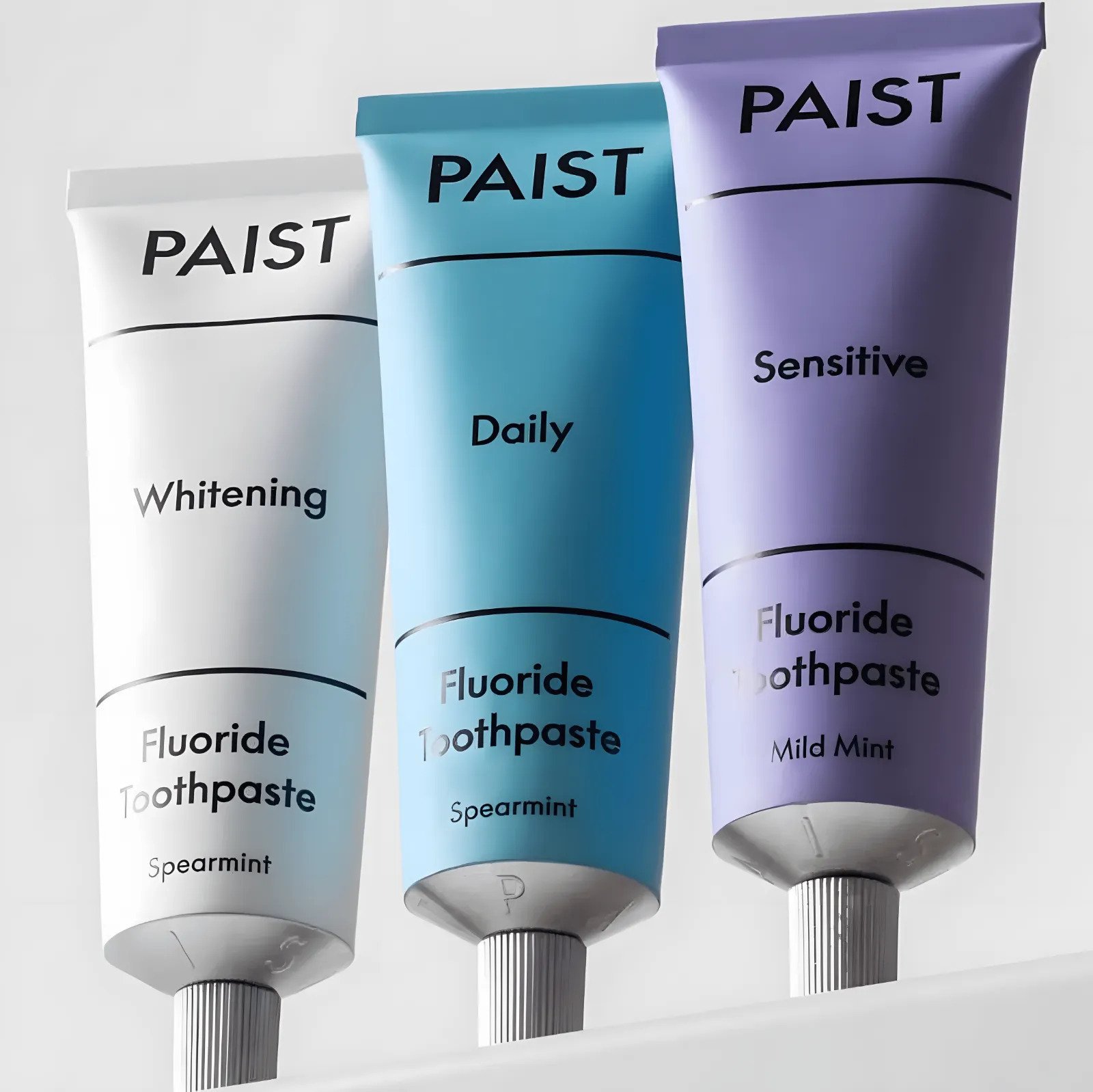
Paist’s unconventional choice of a pale purple, turquoise, and white color palette goes against the industry norm of using blue, red, and white. This unique color scheme adds a breath of fresh air and modernity to their typographic system. According to Horwitz, this bold choice not only enhances the clinical nature of the brand but also helps Paist stand out from its competitors.
A New Innovation in Packaging
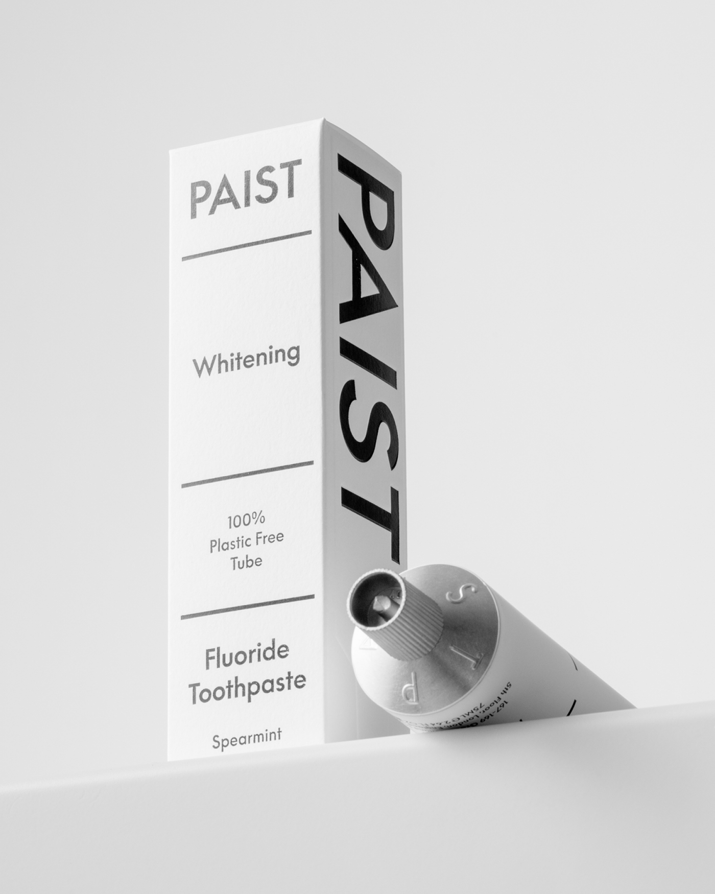
In order to showcase Paist’s commendable 0% plastic credentials, Two Times Elliott, a design firm, was faced with the challenge of creating packaging that would not appear too overwhelming for consumers. In response, the firm’s designer, Horwitz, came up with an elegant solution: a subtle blind emboss on the packaging that echoes the shape of the tube. This approach provides an added layer of transparency and honesty to the product without resorting to gimmicks or visual clutter. The result is packaging that is both aesthetically pleasing and environmentally conscious, effectively communicating the brand’s values to consumers.
A Future-forward Choice for Conscious Consumers
Paist is a game-changer in the toothpaste industry with its innovative approach to design and packaging. The brand has set a new standard by partnering with Two Times Elliott, a creative agency that adds its creative touch to Paist’s already impressive repertoire. By prioritizing sustainability and authenticity in the oral care sector, Paist stands out from its competitors. The brand is committed to bringing trust, playfulness, and an environmentally friendly approach to your daily oral care routine. In short, opting Paist allows you to experience a toothpaste brand that is not only unique but also conscious of its impact on the environment.
Also Read: World’s Biggest Brands in a Period of Stagnation: Report