Spotify, the popular music platform, recently launched its bespoke brand typeface, Spotify Mix. This new typeface represents a significant shift from Spotify’s previous font, Circular. With its expressive and versatile design, Spotify Mix aims to enhance the brand’s communications, marketing, and product experience, replacing the existing font used in the Spotify wordmark. Let’s explore the development process, features, and significance of Spotify Mix as it takes center stage in Spotify’s visual identity.
From Limitations to Expressiveness
Spotify’s decision to create a new typeface stemmed from the realization that Circular, their previous font, had certain limitations regarding options and expressiveness. Rasmus Wängelin, Spotify’s global head of brand design, recognized the importance of communicating a wide range of emotions and showing up in different ways across various platforms. The desire for a typeface that offered more character and personality became a crucial aspect of the brief, creating a need for a fresh and distinctive design.
Crafting a Typeface that Flows
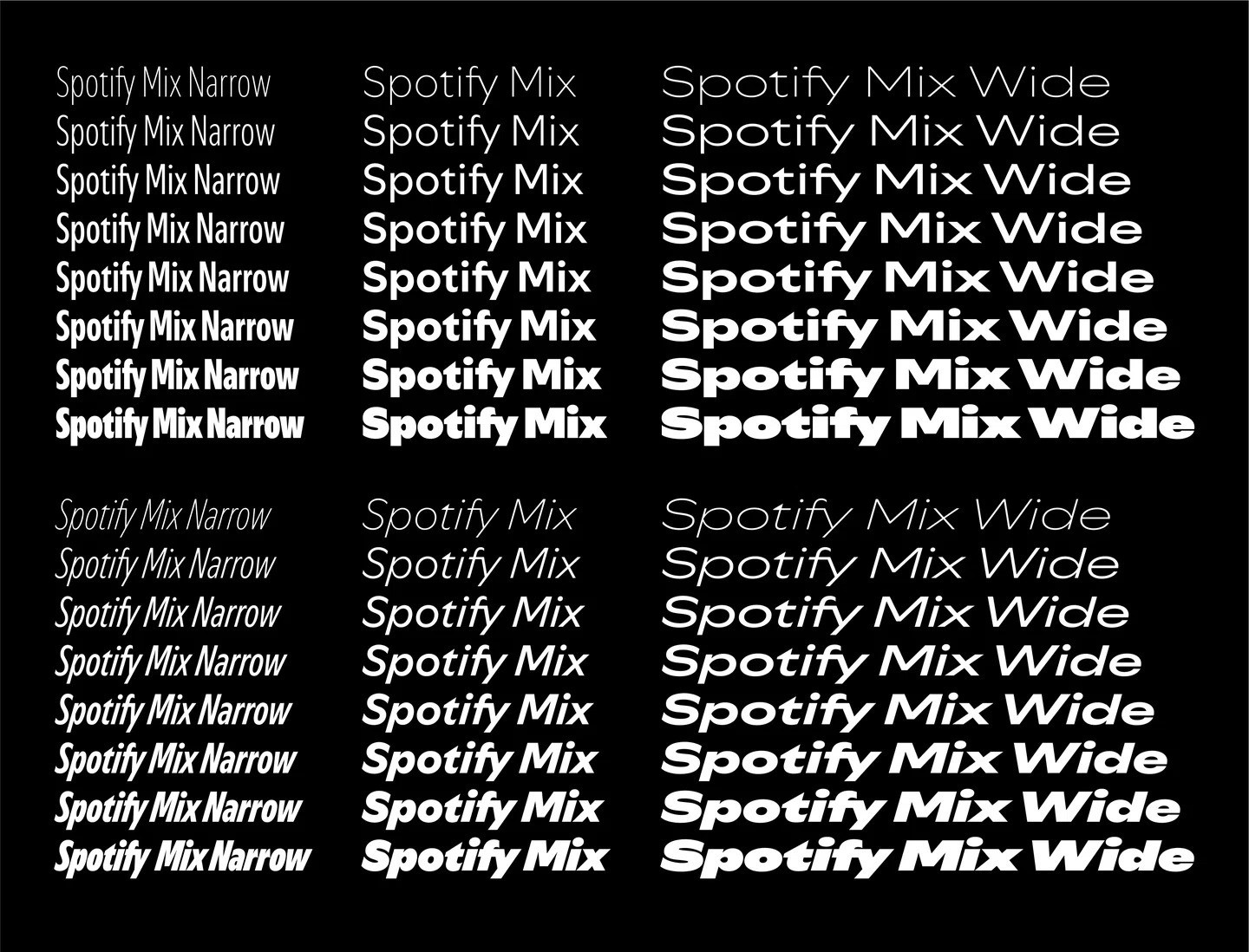
To bring their vision to life, Spotify partnered with Dinamo, a Berlin-based type design studio renowned for its expertise in music, art, and fashion. The collaboration began with an immersive information-sharing session during which the teams delved into audio culture, music history, and visual references, including album covers and posters. Inspired by dance, movement choreography, and audio waves, the teams aimed to create a typeface that flowed and broke away from conventional designs. The result is a typeface that balances expressiveness, character, legibility, and accessibility.
A Typeface with a Beat
The Details That Make Spotify Mix Sing The design of Spotify Mix is a nod to the brand’s roots in music and audio culture. As Rasmus Wängelin, explains, “We need to show up in different ways in a lot of different places.” Spotify Mix caters to this need, offering a range of condensed to extended options that allow the brand to communicate various emotions effectively. One of the most distinctive features is the “transmitter” shape within the negative spaces of letters like “p”, “b”, and “d”, a nod to audio amplification. Adding to this, the subtle flicks and diagonal cuts also contribute to the overall distinctive look of the typeface. Spotify Mix offers a range of alternatives and variations, allowing the design team to adjust the expressiveness of their communications. The typeface’s adaptability makes it suitable for a variety of use cases, including animation, ensuring a seamless and engaging brand experience across different platforms and screen sizes.
Final Thoughts
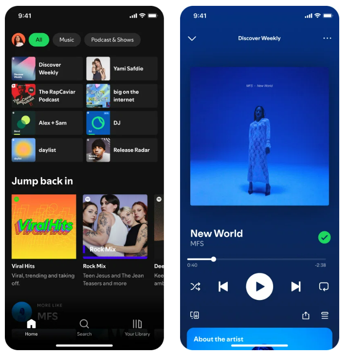
Spotify Mix represents a significant evolution in Spotify’s visual identity, replacing the previous font and infusing the brand with newfound expressiveness, character, and personality. Developed in collaboration with Dinamo, this bespoke typeface reflects Spotify’s commitment to creating a unique and cohesive brand experience. With an array of alternatives and variations, Spotify Mix empowers the design team to dial the expressiveness of any communication up or down, ensuring a seamless and cohesive brand experience across various platforms and contexts. As Spotify Mix is rolled out across the brand’s communications, marketing, and product interfaces, users will encounter a visually captivating and connected ecosystem that embodies the essence of Spotify’s music platform.
Also Read: How Spotify Wrapped 2023 Nailed its Branding Strategy?

