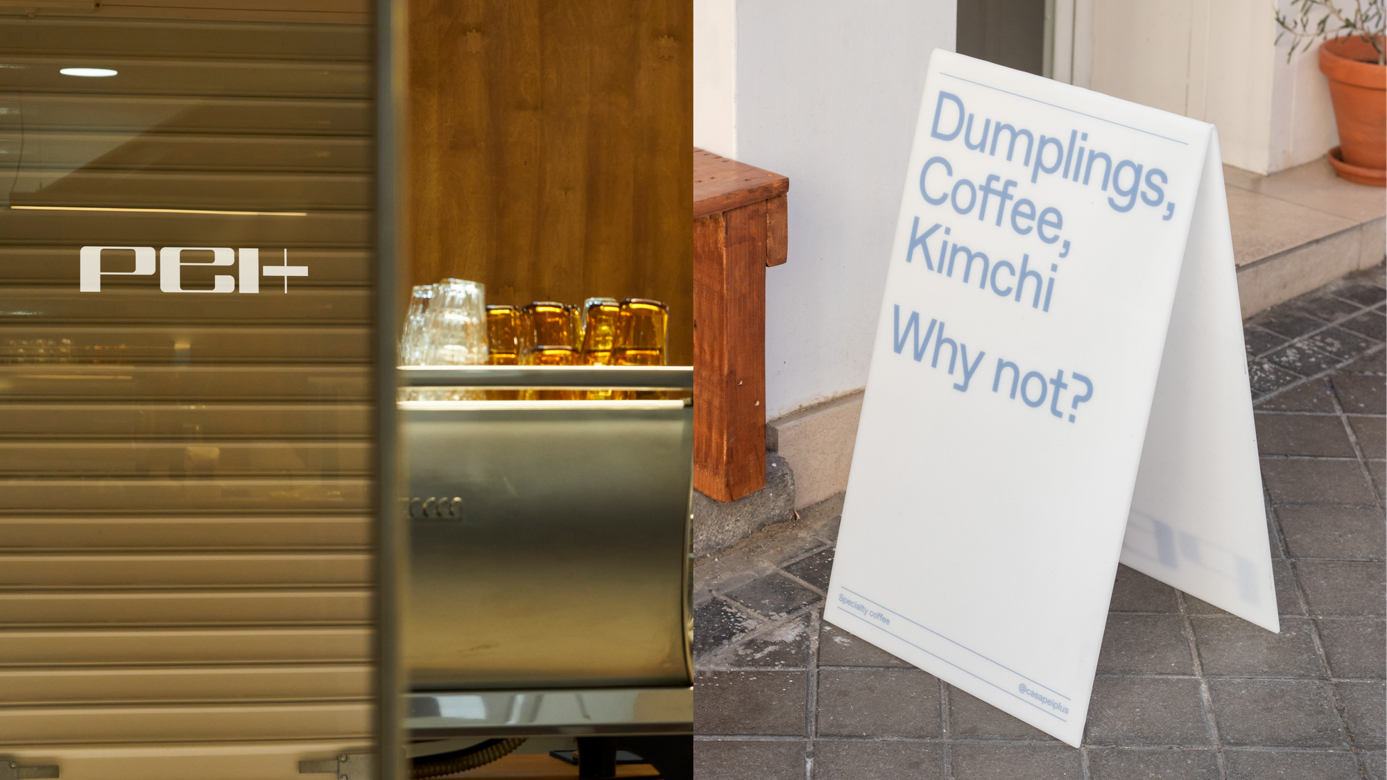
Pei Plus, a Korean and Chinese restaurant based in Madrid, recently underwent a rebrand, breathing new life into its visual identity. The new wordmark showcases a careful combination of elements that pay homage to the restaurant’s culinary heritage while embracing a contemporary and sleek aesthetic. Let’s explore the thought process behind the rebrand, the design choices made by graphic designers Lucía Peralta and Marco Cofrades, and how the evolving landscape of food branding influenced their approach.
Shifting Landscape of Food Branding
The COVID-19 pandemic has caused a major shift in the way people perceive social interactions. With going out becoming an infrequent and precious activity, individuals have started valuing each and every occasion as a celebration. This change in perception has led to an increased focus on creating a memorable experience rather than just providing a meal in the food industry. As a result, food brands have started expanding their borders of branding, pushing the limits of what was traditionally done. In addition, restaurants and food establishments now prioritize joy and meticulous attention to detail in order to provide meaningful experiences to their customers. This reflects the growing need for enhancing the overall dining experience, in light of the pandemic’s impact on social interactions.
A Creative Blend of Tradition and Modern References
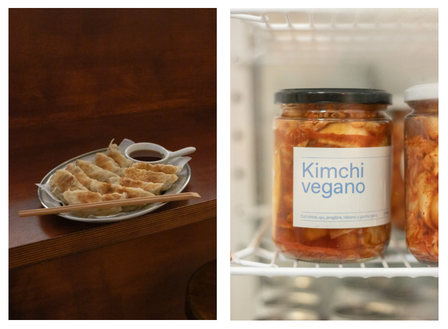
The new brand identity boasts a perfect blend of rounded curves and striking contrast. The rounded curves represent the plumpness of a delicious dumpling, while the contrast between weights mirrors the neat central fold line that one can find on a dumpling. The rebranding effort has successfully retained a sense of homeliness from the previous hand-painted signage, but with the inclusion of modern references, it also incorporates a touch of modernity, like the early Apple marketing. The color choice is also an essential aspect of the branding effort. The designers have opted for a dusty beige color palette, representing the primary ingredients of dumpling dough – flour and water. This color choice gives the brand a warm and inviting feel, which will resonate with the customers.
Typography Elegance with a Side of Sobriety
The typeface used by Dinamo, the Favorit Pro, is a perfect embodiment of sober elegance that complements the restaurant’s visual identity. Moving on, the popular restaurant Casa Pei Plus has undergone a name change and is now known as Pei Plus. The new name reflects the additional offerings of the establishment, including specialty coffee and an exclusive collection of curated objects that are sure to enhance the dining experience.
A Multisensory Dining Experience
From its playfully poetic packaging to its flawlessly formatted feasts, Pei Plus creates memorable moments that emphasize emotive elements beyond edibles alone. Pei Plus uses imagery to convey its brand identity and value, using curves that mirror its signature dumplings and pleasant palettes that partner with its prints. Pei Plus also uses merch mashups and meticulously married materials to create a discovery destination that delights its patrons. Pei Plus is more than just a culinary venture, it is an experiential enrichment that promises pleasures that penetrate deeper than sustenance alone.
Bottomline
Pei Plus’s rebrand successfully combines tradition and modernity, creating a contemporary and delightful visual identity. The designers’ focus on the core soul of the project, rather than fleeting trends, results in a unique brand experience. As the landscape of food branding continues to evolve, Pei Plus’s rebrand serves as a testament to the importance of celebrating moments, expanding boundaries, and creating joyful experiences for customers.
Read More: Navigating the Change: ESN’s Strong Identity Shifts Gears in Major Rebranding