


Read the architecture, not the wordmark
McLaren’s new identity is a brand architecture move dressed as a logo change. Uniting Racing and Automotive under one system is strategically coherent. The backlash is aimed at the most visible 5% of the work, and it reveals how sport fans now read any simplification as a loss.
On 22 September, McLaren unveiled what it called an “evolved identity,” a single visual system covering both McLaren Racing and McLaren Automotive. The centrepiece is a new wordmark, drawn from the sign that hung above the service station run by Bruce McLaren’s parents, Les and Ruth, in Remuera, Auckland. The wordmark is now set in capitals, with a line beneath the “C.” A bespoke typeface, McLaren Sans, carries the system, alongside an expanded colour palette drawn from different eras of the company’s history.
What did not change matters as much. The papaya orange and the Speedy Kiwi emblem stay. The Speedmark stays too, though it now steps back behind the wordmark rather than leading the logo.
Reaction arrived fast and ran mostly negative. Creative Bloq said the new logo “looks like a luxury fashion brand.” Car enthusiasts quoted by Yahoo Autos called it boring. Creative Boom ran a critique from a designer who had helped shape McLaren’s earlier brand work.
The McLaren Rebrand Is an Architecture Decision
Read the announcement carefully and the logo is not the main event. The main event is that two businesses with different customers, different economics, and different reputations now share one identity.
That is a real strategic choice. McLaren Racing is having its strongest commercial period in years. McLaren Automotive sells cars that cost more than most houses, to a customer base that buys on heritage and engineering credibility. Running them as visually separate brands made sense when the road-car business needed its own premium signals. Uniting them says the company now believes the racing halo should carry directly into the showroom, with no translation layer in between.
For practitioners, this is the useful part. A unified system reduces cost, removes internal confusion, and lets every podium do commercial work for the car business. The risk is the reverse flow: any racing controversy now lands on the road-car brand too. McLaren has decided the upside is worth it.
Why Heritage Logic Did Not Land
The rationale is unusually strong. A wordmark taken from the founder’s family garage is about as authentic as heritage sourcing gets. David Woodhouse, chief creative officer at McLaren Automotive, called it “a reflection of the journey we are on as a company.” Lou McEwen, chief marketing officer at McLaren Racing, said it “feels unmistakeably McLaren.”
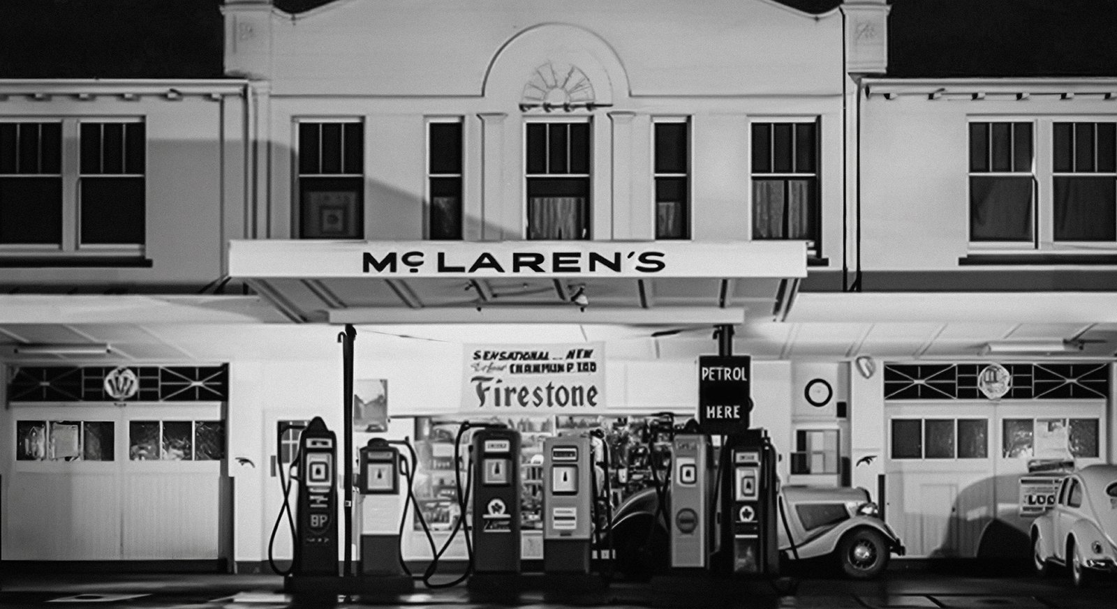
The problem is that fans do not experience rationale. They experience shape. The new wordmark is lighter and calmer than the one it replaces, and in a sport built on aggression and speed, lighter reads as slower. That is why the most common criticism compares it to fashion rather than motorsport.
This is the gap every heritage rebrand has to close, and it is the same gap seen in Jaguar’s rebrand one year on, where a defensible strategy was judged almost entirely on a single visual. A story about the founder’s garage explains a decision. It does not change how a thinner letterform feels on a car moving at 300 km/h. Heritage gives a brand permission to change. It does not make the change feel bigger.
One Identity Across Every Series
The new identity has to work well beyond Formula 1. McLaren also races in IndyCar through Arrow McLaren and is building a Hypercar programme, and each series brings its own partners, liveries and audiences. Under the old approach, every programme risked drifting into its own visual dialect. The new system gives them a shared grammar: one wordmark, one typeface and one palette, with room for each partner’s mark.
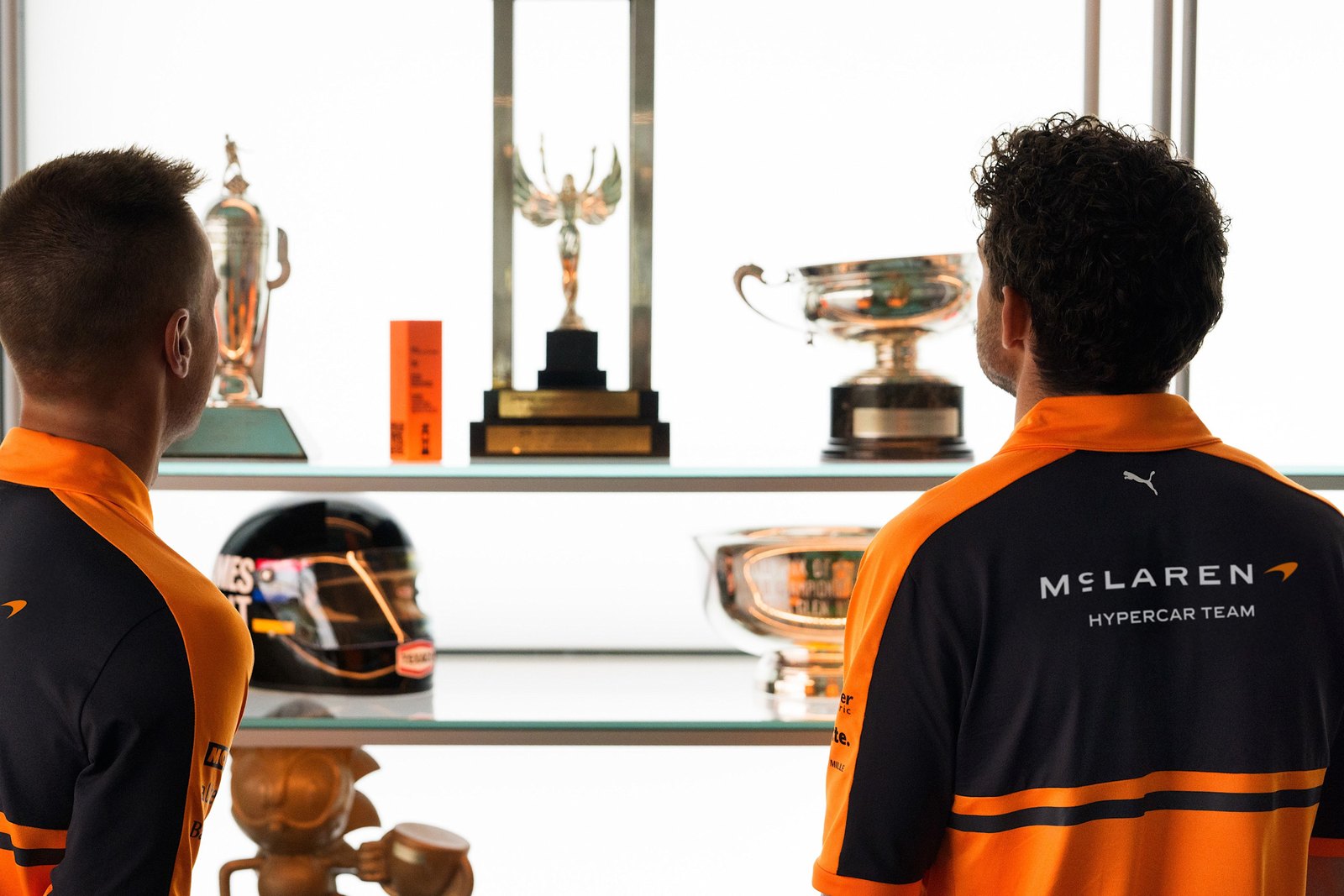
That matters commercially. Partners increasingly buy into McLaren as a whole rather than a single car. A consistent identity across series makes the McLaren name itself the asset partners pay to sit next to. It also makes the brand easier to extend into merchandise, collaborations and the road-car showroom.
The “Everything Looks the Same” Charge Is Partly Unfair
The “everything looks the same now” critique is real across sport, fashion, and tech. But it fits McLaren less well than it seems.
Brands that genuinely flattened themselves, the fashion houses that swapped distinctive marks for interchangeable sans-serifs, removed the assets people recognised. McLaren did the opposite. Papaya is still the single most recognisable colour on the F1 grid. The Speedmark is still in the system, just less prominent. The criticism is aimed at the asset fans look at least when they identify the team.
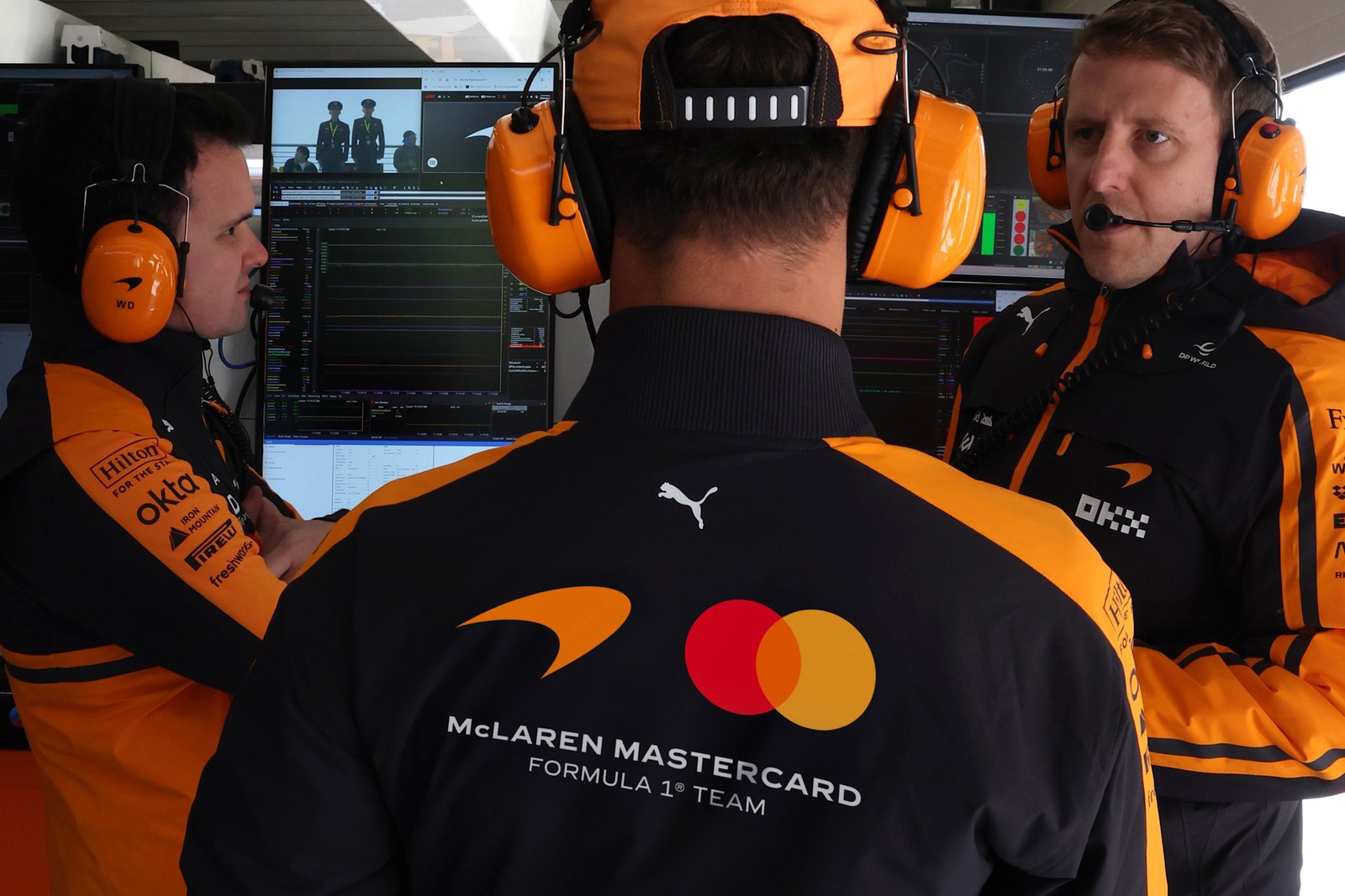
That is the practitioner lesson, and one Burberry’s decade-long rebuild also shows: heritage assets carry recognition long after a wordmark changes. Before judging a rebrand by its wordmark, map which assets carry recognition. If the colour, the symbol, and the livery survive, a quieter wordmark is a low-risk change that only looks high-risk on launch day.
What to Watch
The real test is not the launch-week comments. It is how the system performs on the 2027 car, in merchandise sell-through, and in the showroom. If McLaren Sans and the new wordmark sit naturally next to papaya on a race car, the noise will fade the way it usually does. If they look thin at speed, expect quiet adjustments within two seasons.
McLaren made a coherent architecture decision and a defensible design decision. What it underestimated is how much sport audiences now treat any simplification as a loss of character. That expectation is worth planning for in any rebrand where the audience is made of fans rather than customers.