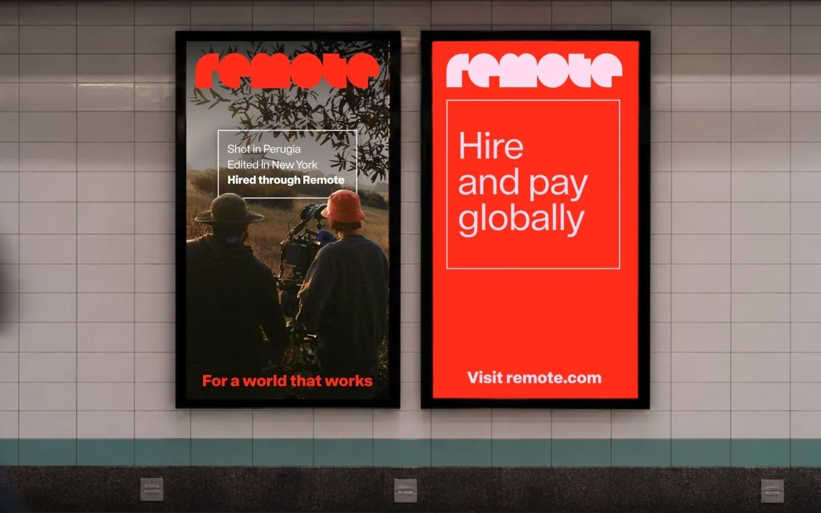
The Remote rebrand, a new brand identity and full repositioning, was unveiled on October 13, 2026 by Remote, which describes itself as the financial operating system for the global workforce. It was built with COLLINS, which the company describes as a seven-time Ad Age Agency of the Year winner. The San Francisco company helps businesses hire and pay people in more than 150 countries through one platform, and cites surging cross-border payroll complexity, billions of dollars processed annually, and 300% year-over-year growth in its payroll business as the backdrop for the rebrand. Remote’s announcement lists Anthropici, Box, GitLab, Lovable, Vercel, Miro, Datadog and Zapier among its customers, and reports growing demand from industries beyond tech.
The concept: a palette that is actually a map
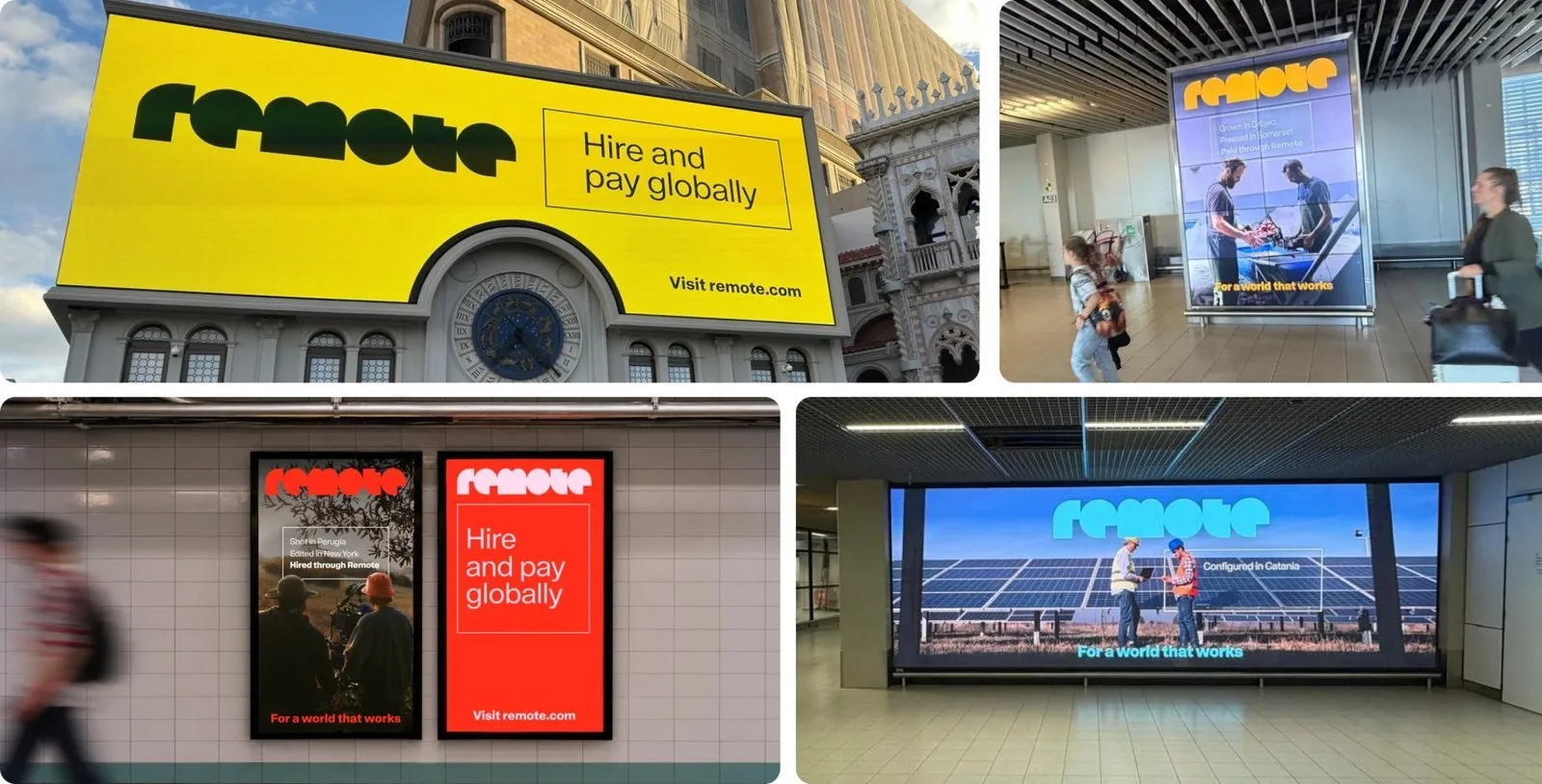
The headline design decision is a colour palette built from gradients of reds, oranges, greens, blues and violets, drawn from the colours of currencies Remote moves money through rather than from a mood board. It is a small move with an outsized effect on how the brand reads: instead of signalling “trustworthy fintech” through a now-generic blue-and-white system, Remote’s palette becomes a literal visual index of the scale and diversity of what the product actually does. The second device, a cube, works the same way. Remote describes it as representing infrastructure as a simple, repeatable unit that becomes larger when combined, which mirrors how its platform is assembled differently for each customer rather than sold as one fixed product.
A literal answer to “what do you actually do” is the differentiator, in a category crowded with blue logos and vague promises.
The campaign is the bigger bet
The identity sits underneath “For a World That Works,” described as Remote’s largest brand campaign to date, running across Amsterdam, Frankfurt, Madrid, New York, London, San Francisco and Paris through the fourth quarter of 2026, built around the faces of global work and culminating in a hero film produced with Stink Studios. CEO and co-founder Job van der Voort framed the company’s mission simply as “pay the world,” positioning the rebrand as evidence that the brand has caught up to the company’s ambition rather than driving it. That ordering matters for brand teams: this reads as a rebrand that followed proof (300% payroll growth, a widening enterprise customer list) rather than one trying to manufacture momentum it does not yet have.
Why this is a useful case for B2B brand teams
HR tech and payroll infrastructure are categories brand teams tend to dismiss as inherently unglamorous, which usually produces timid branding: safe blue, generic trust signals, a wordmark and not much else. Remote’s identity is a counterexample worth studying precisely because the underlying category has not changed, only the confidence of the visual answer to it. The lesson transfers beyond fintech: when a brand’s core value proposition is genuinely complex (moving money compliantly across 150-plus jurisdictions, in Remote’s case), the strongest creative territory is often the literal mechanics of that complexity, not an abstraction layered on top to make it feel more exciting.
What to Watch
Whether the “For a World That Works” campaign’s hero film and city rollout actually shift Remote’s positioning against rivals like Deel and Papaya Global over the next two quarters, or whether the identity change remains the more durable story and the campaign fades after its Q4 run, is the thing worth checking back on.
Keep reading