

BTC Lens
A brand identity built from a recording
Most identity work starts with a mark and commissions a sound to match it. Apple Music did the opposite: compose the music first, then let its physical behaviour draw the logo. That inversion, more than the mark itself, is the story for anyone who designs brand systems.
The Apple Music rebrand is the service’s first new identity since it launched in 2015. Apple introduced it on 21 October 2026 and switched its Apple Music page to the new look the same day. The replacement is unusual enough to deserve more than a product note: the new mark was not drawn. It was recorded.
The process, reversed
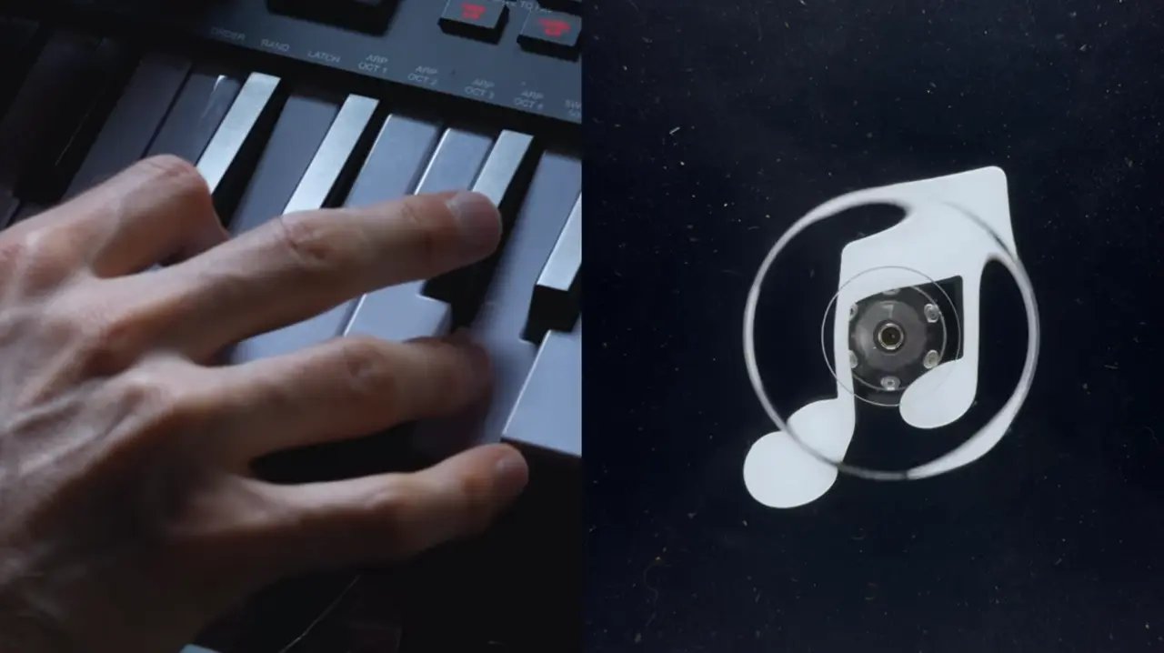
Identity design almost always runs in one direction: define the mark, then commission a sonic signature, an animation and a motion system to match it. Apple and its long-time agency, TBWA\Media Arts Lab, ran it the other way. British producer Fred again.., working with NEST Acoustics, composed a short piece of music and split it into individual notes. Each note was played through a transducer, a device that turns audio into physical vibration, resting in a shallow bath of mineral oil. The vibrations moved the oil, the moving oil was filmed in camera, and that footage became the raw material for the new icon and wordmark.

Apple introduced the identity on X and Instagram as “physically shaped by an original composition”: not an illustration of what sound might look like, but a physical record of a specific piece of music. The note-shaped icon and the wordmark, a custom bold, lowercase version of Apple’s SF Pro, both trace back to that footage, with type studio Plau reconstructing it into a usable vector mark. The behind-the-scenes film was directed by Joe Jackson, with production by Optical Arts, VFX by Time Based Arts, colour and finishing by Trafik and mixing by Model Citizen. Few rebrands disclose their own making in this much detail.
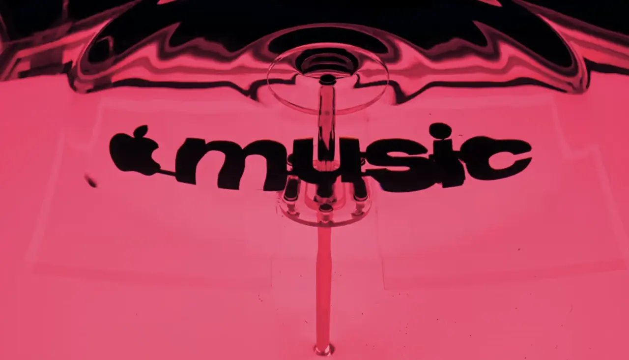
Fast Company describes it as a months-long process, and the reason is telling: too many notes, or notes pitched too high, created so much movement that the image became hard to read. The composition had to be tuned for legibility, not only for how it sounded. That is a new constraint in identity design. The brief was not “write a signature sound”, it was “write a sound that also draws a usable logo”.
The brief ran backwards: sound first, picture second.
What changed on screen
Set the process aside and the visible changes are more conventional, if still a departure. The logo, wordmark and app icon are black and white: black on white in light mode, white on black in dark mode. Apple has dropped the red Apple Music has carried since launch. The mark first surfaced in the iOS 27.2 and macOS 27.2 betas in early October, and the full rollout arrives with those releases.
Colour has not disappeared from the system entirely. Apple’s launch film and campaign artwork animate the wordmark with bright, shifting gradients that the static app icon does not carry, so monochrome looks like the baseline rather than the whole story.
Apple Music on X
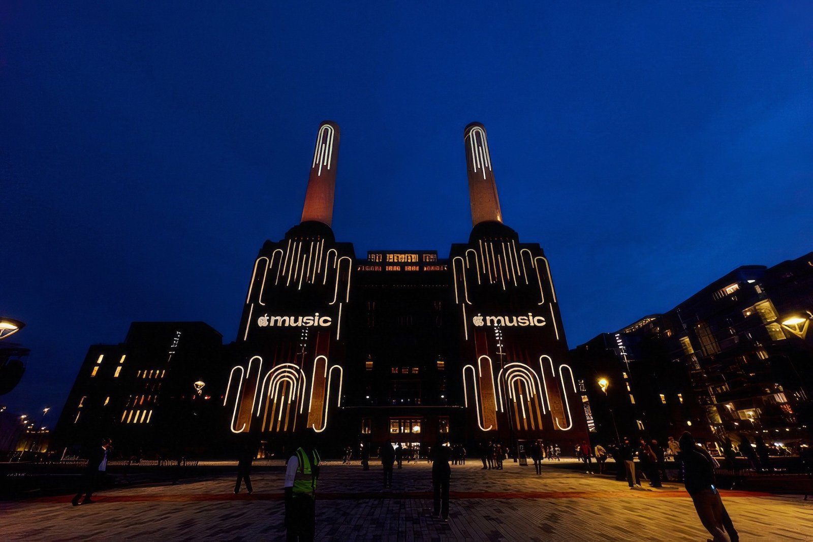
The same composition that generated the visuals now serves as Apple Music’s sonic identity, used across campaigns, original programming, live events and product experiences. That is the bigger commitment: the visual and sonic identity are literally the same artifact, not two systems designed to feel related. The mark was also used a month earlier to promote Apple Music Hall, the brand’s new live venue at Battersea Power Station in London.
The part worth watching
The sonic-to-visual process will get most of the attention, because it is the unusual, demo-able part of this story. The more consequential decision for brand strategists is the quieter one: Apple spent eleven years building recognition around a specific red and has walked away from it in favour of monochrome plus an animated flourish. Early reaction online has been mixed, with some users calling the new icon plain. Colour drop-offs like this tend to be judged in hindsight by whether the brand’s other equities, here the sound and the made-by-sound story, are strong enough to carry recognition without it. Spotify’s green and Amazon Music’s palette still lean on colour as a primary cue. Apple Music is now the outlier betting on sound and process instead.
Apple just spent months proving that a logo can be a recording.
For brand teams outside consumer tech, the transferable lesson is not the mineral oil. It is that Apple and TBWA treated the sonic identity as the primary asset and derived the visual system from it, instead of commissioning sound last as a layer on a finished mark. As brand systems have to work across voice assistants, AR and ambient audio, that ordering may prove more durable than any single logo shape.
What to Watch
Watch whether Apple Music brings colour back into the static icon after the iOS 27.2 rollout, and whether other audio-first brands start briefing sound before the logo.