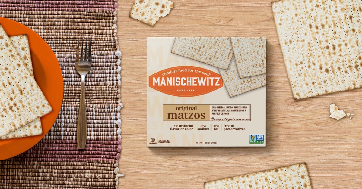
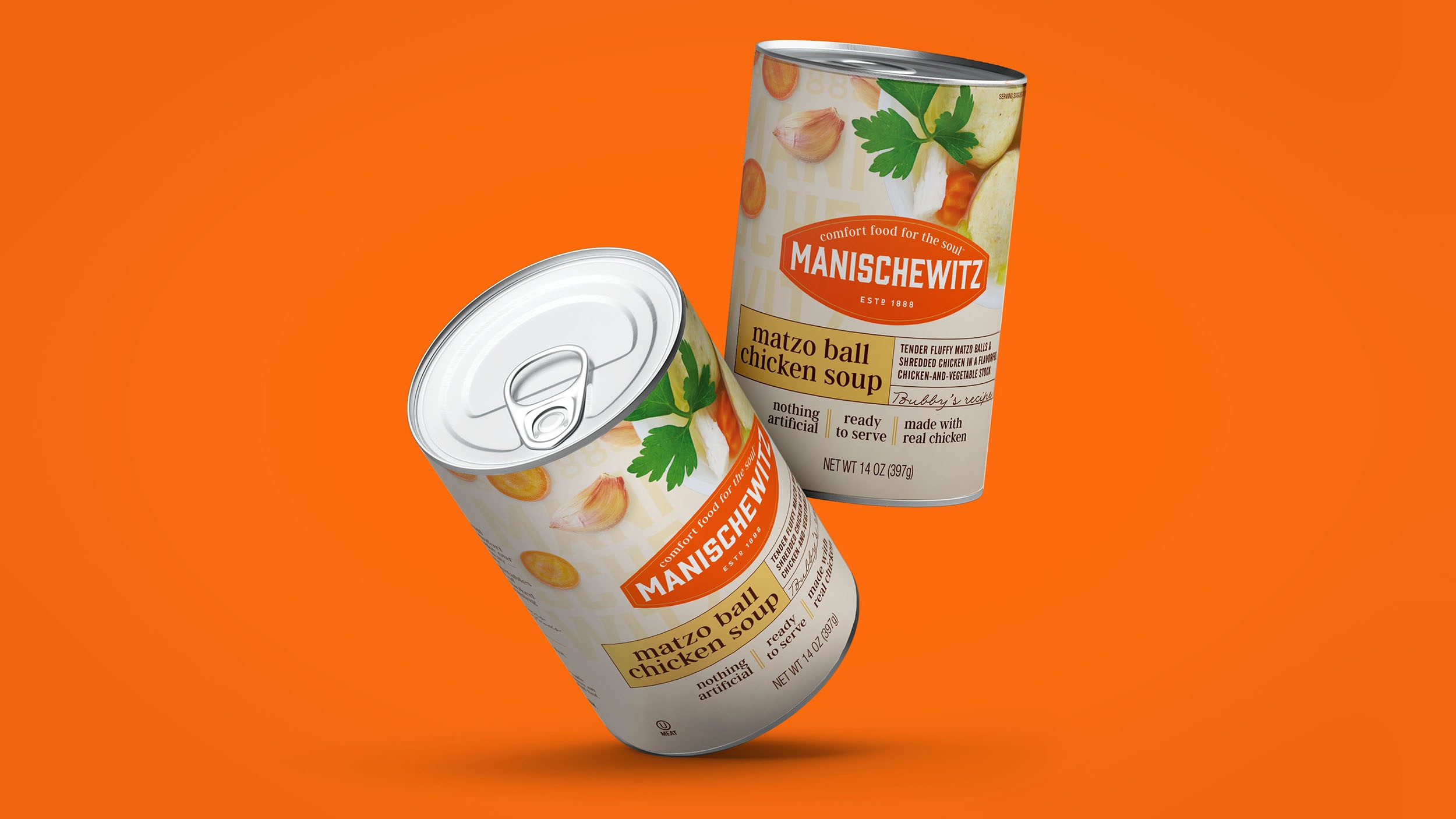
Manischewitz, a brand that has been making Jewish comfort foods for over 120 years, has undergone a brand refresh to stay relevant in changing times. It has now adopted a new logo and new packaging.

Shani Seidman, CMO of Kayco, the parent company for Manischewitz, said Manischewitz is well-known amongst its loyal consumers. “In an effort to update the cultural relevancy with a younger Jewish audience as well as the mainstream culturally curious audience, we have refreshed our brand with an exciting new look and feel on our current and new product offerings.”

Seidman said their consumers continue to embrace Manischewitz’s products in a delicious way. “What we really were trying to do is take the stuffiness out of this brand.” She said Manischewitz is more than just food. “It is about stories, heritage, and a sense of belonging. Through this rebranding, we aim to capture the hearts of the culturally curious and kosher-keeping alike, offering a taste of Jewish tradition that is accessible to all.”
Manischewitz, America’s leading kosher brand since 1888, partnered with creative agency Jones Knowles Ritchie (JKR) for the new look. The new look features a cartoon woman in checked pajamas lying on her stomach and lifting a bowl of soup to her face with a beatific smile, her nose upturned to savor the smell.
Lisa Smith, executive creative director, global at JKR, said Manischewitz holds a special place in American culture. “Simply mentioning the brand immediately evokes thoughts of Jewish cuisine, although people may not have had a clear visual of what it looked like. This presented an opportunity to establish a distinct identity that not only extends the understanding of Jewish culture through food but also beckons the mass-market consumer base to embrace a new category that goes beyond the confines of the Jewish food section.” Smith explained that they also wanted to respect and bring joy to Manischewitz’s loyal consumer base by enhancing their brand experience across all touchpoints.

The new logo emphasizes the iconic Manischewitz orange color. The new packaging reorganizes Manischewitz’s extensive product lines, with items grouped by their typical use. It adopted bold lettering, chic color palates, and a touch of nostalgia with the brand’s catchphrase “savor the tradition”.
Seidman explained that Manischewitz wanted to still look and feel familiar. “And it does, but the colors and graphics are now as warm and delicious as the food we make. The goal is to remain true to the heritage while opening up the brand to those who may not know Manischewitz.”
Also Read: Pop-Tarts Bites Refines Marketing Approach, Drives into Data-Driven Solutions


