The Dinner Ladies, a beloved Australian frozen meal service brand, has been serving delicious home-cooked meals for nearly two decades. But with the market becoming increasingly saturated, the company felt it was time for a refresh to stand out from the crowd. They have unveiled a new brand identity to capture their unique story, celebrate their growth, and resonate with their target audience. Let’s explore more about the rebrand.

Redefining the Dinner Ladies
The Dinner Ladies’ initial success was built on a simple, authentic approach by two busy mothers, Sophie Gilliatt, and Katherine Westwood, who saw a need for convenient, delicious meals and decided to fill it. Their ‘slightly audacious’ approach resonated with families, leading to a multi-million dollar business. However, over time, their brand identity became diluted, losing its distinct personality in a sea of similar offerings.

Universal Favourite, the design studio behind the rebrand, had a great deal in creating a brand identity that recapture the essence of The Dinner Ladies’ original spirit while reflecting their current position as a leading frozen meal provider. They understood that their target audience, time-poor families, craved genuine, homemade meals, and a brand that spoke to their needs in a relatable and authentic way.
A Brand Identity Built on Heart and Rebellion
The rebrand focused on the heart of The Dinner Ladies’ story, the founders’ passion, determination, and commitment to providing healthy, delicious meals. This led to the creation of the brand essence ‘Food From The Heart’, which permeated every aspect of the new identity.
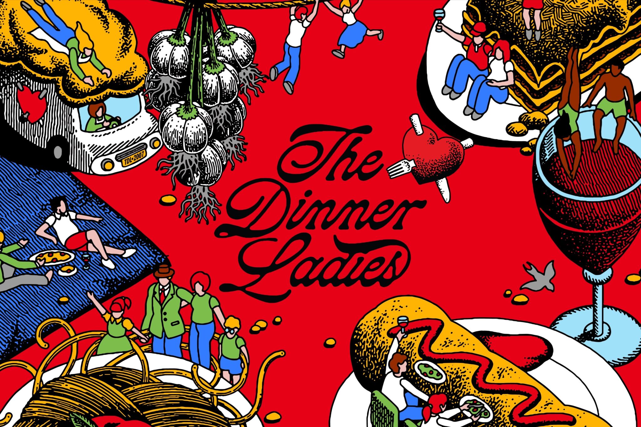
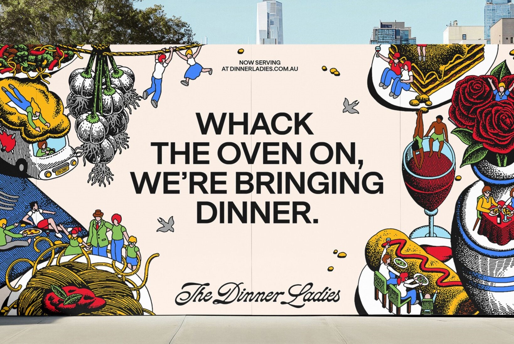
The logo was refined, decoupling the heart and script for greater flexibility. Illustrator Jake Foreman added his signature style, incorporating texture and gritty stipple to create a unique and memorable visual. The existing red color was modernized, and a secondary palette of warm, approachable hues was introduced, adding vibrancy and interest.
The tone of voice was carefully crafted to capture the brand’s ‘joyful, cheeky yet comforting’ personality. Copywriter Cat Wall ensured the brand’s voice balanced the empathetic caregiver with the charmingly rebellious tone of the ladies themselves, avoiding any patronizing ‘mumsy’ tropes.
Celebrating the Messy Reality of Dinner Time
Photography by Alana Dimou captured the authentic messiness of real-life dinner time, showcasing the raw moments that often go unseen in brand imagery. The styling, wardrobe, and production team helped create warm and inviting scenes with a touch of rebellion, reflecting the brand’s personality.
Illustrations by Jake Foreman, inspired by traditional tattoos, added a unique visual element to the brand. They served as both storytelling devices and functional elements, adding personality and character to the brand’s visual identity.
A Brand Ready for the Future
The Dinner Ladies’ refreshed identity not only celebrates its seventeen-year legacy but equips the brand for future decades of success. With a flexible design system, punchy tone of voice, and a focus on the founding ladies’ wholesome mission, The Dinner Ladies can now stand loud and proud, ready to bring joy back into dinner time for an entire nation. The rebrand captures the authentic essence of family dinners, embracing the chaos and joy that come with gathering around the table. From the vibrant color palette to the raw, unpolished photography and cheeky illustrations, every element resonates with the brand’s rebellious yet homely attitude, inviting time-poor families to experience the convenience of delicious, homemade meals without the fuss.
Also Read: Kurlon Rebrands with Dynamic ‘Hula Hula’ Ads and Fresh Logo for T20 World Cup


