A Gradient Glow-Up: Why Google’s Redesign Matters for the Brand?

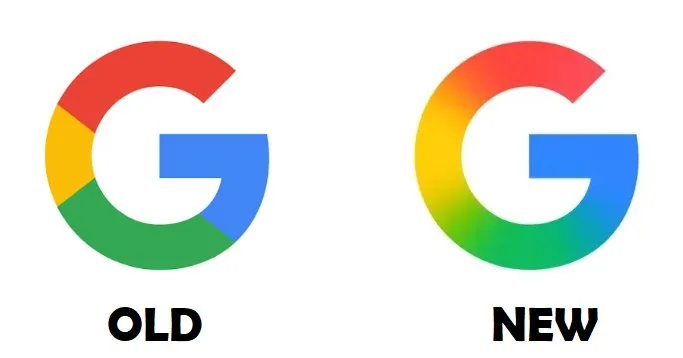
Google has just dropped a slick update to its iconic ‘G’ logo, and it’s the most eye-catching change we’ve seen in nearly a decade. Swapping out the classic four solid color segments for a smooth gradient of red, yellow, green, and blue, this redesign is all about modern vibes and a unified brand identity. Let’s check out what this means for Google and why it’s got us buzzing.
A Bold Step in Brand Evolution
Google’s new gradient ‘G’ isn’t just a random tweak. It perfectly aligns with the aesthetic of its Gemini branding and AI Mode in Search. This alignment sends a clear signal that the tech giant is striving for a cohesive visual brand across its vast ecosystem. The gradient style exudes a fresh, dynamic, and futuristic feel, showcasing Google’s commitment to innovative design. By maintaining a consistent brand look, Google builds trust and recognition, particularly as it ventures into new tools and platforms. This subtle update to the ‘G’ logo demonstrates the company’s willingness to evolve while preserving its core identity
Rollout and What’s Next?
If you’ve got the Google app on iOS or a Pixel device, you might’ve already spotted this new gradient ‘G’ popping up. It’s also rolling out with version 16.18 (beta) on Android, though the old segmented ‘G’ still lingers on other Android devices and web platforms. Google’s playing it slow, testing the waters before a full brand overhaul.
The catch here is that there’s no official word yet on a universal rollout. And while the main six-letter ‘Google’ logo remains untouched (for now), this change hints at potential updates to icons like Chrome or Maps. Could this be the start of a broader brand refresh? We’re keeping our eyes peeled.
A Look Back: Google’s Journey to a Unified Brand
Let’s take a quick trip down memory lane. Google last gave its logo a major facelift in September 2015, switching to a clean sans-serif font for a modern edge. That update was all about simplicity and adaptability, much like today’s gradient ‘G’ focuses on unity and innovation. Every tweak to Google’s brand reflects its growth from a quirky search engine to a global tech powerhouse.
This latest redesign isn’t just about looks, but a statement. Google’s telling us they’re ready to blend tradition with the future, ensuring their brand stays iconic in an ever-changing digital world.
Final Thoughts
Google’s updated ‘G’ logo is more than just a design tweak. It’s a statement of the company’s commitment to innovation and unity. As Google continues to expand its ecosystem, this new logo reflects its willingness to evolve while preserving its core identity. With a potential broader brand refresh on the horizon, Google’s move signals a new era in its visual branding, blending tradition with futuristic design elements.
Keep reading