Matheson Food Company, legendary Canadian chef Matty Matheson’s food brand, has drawn inspiration from the 1930s to give its product that sophistication but nostalgic imprint. Wedge took up the challenge to give Matheson Food Company what it was looking for.
The design studio translated Matty’s vision into a lasting brand that reflects his signature – Bold. Punchy. Memorable. Flavor – a brand that is focused on the product, a system that can expand across various future categories, and a world that inspires home cooks everywhere to cook like a Matheson.

Justin Lortie, Wedge founder and chief design officer, said for the design, they drew inspiration from Hereford Corned Beef. “The punchy primary colors reflect Matty’s punchy, classic flavors, but are also an extension of the visual language and vintage vernacular of Matty’s World.” He said when the products were introduced on the market in the 30s, the use of primary colors and appealing packaging was truly the start of commercializing food on shelves.
“Today, most products have a more elaborate color palette, making Matheson Food Company feel older and different by sticking to a back-to-basics color palette. The same thinking is applied to packaging forms. Even the name, Matheson Food Company speaks to the brand’s desire to situate itself in food history. Adding ‘Food Company’ adopts a vernacular you’d find on products like Hereford where ‘brand’ was written under the name, instead of adding a TM to the end of it.
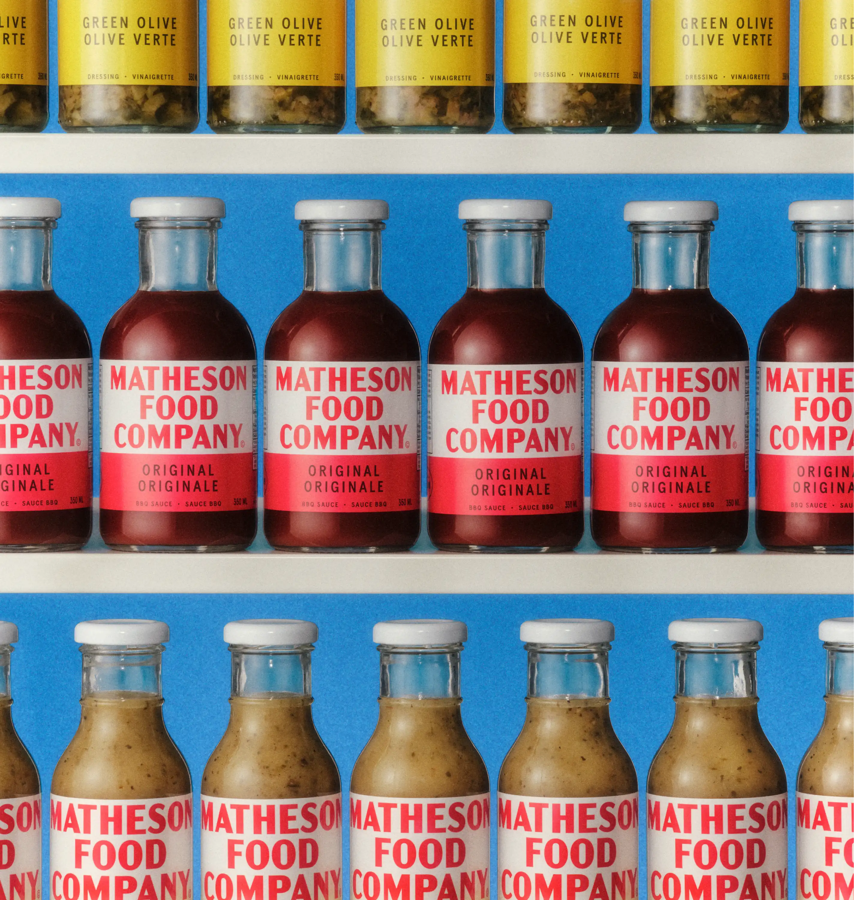
Matheson Food Company pushes boundaries and delights taste buds. It’s about being bold and designing too.
Also Read: PepsiCo Launches New Refreshing Flavor ‘bubly burst’ with Bold Fruit Flavors