InnTravel, a leading walking holiday brand, has embarked on an exciting journey of rebranding, unveiling a fresh new identity that celebrates life’s simple pleasures and the beauty of exploration. The brand’s revitalized image is a breath of fresh air in an industry often saturated with clichés and overindulgence. As such, the beauty behind Inntravel’s new identity is one to be explored.

A Grounded Approach to Design
At the heart of InnTravel’s rebrand created in collaboration with design agency SomeOne, lies a commitment to embracing the natural world and the joys of outdoor exploration. Departing from the typical tropes of sun-soaked beaches and extravagant luxury, the brand’s new identity exudes a grounded and comforting feel that resonates with nature enthusiasts and adventure seekers alike.
Symbolism in Design
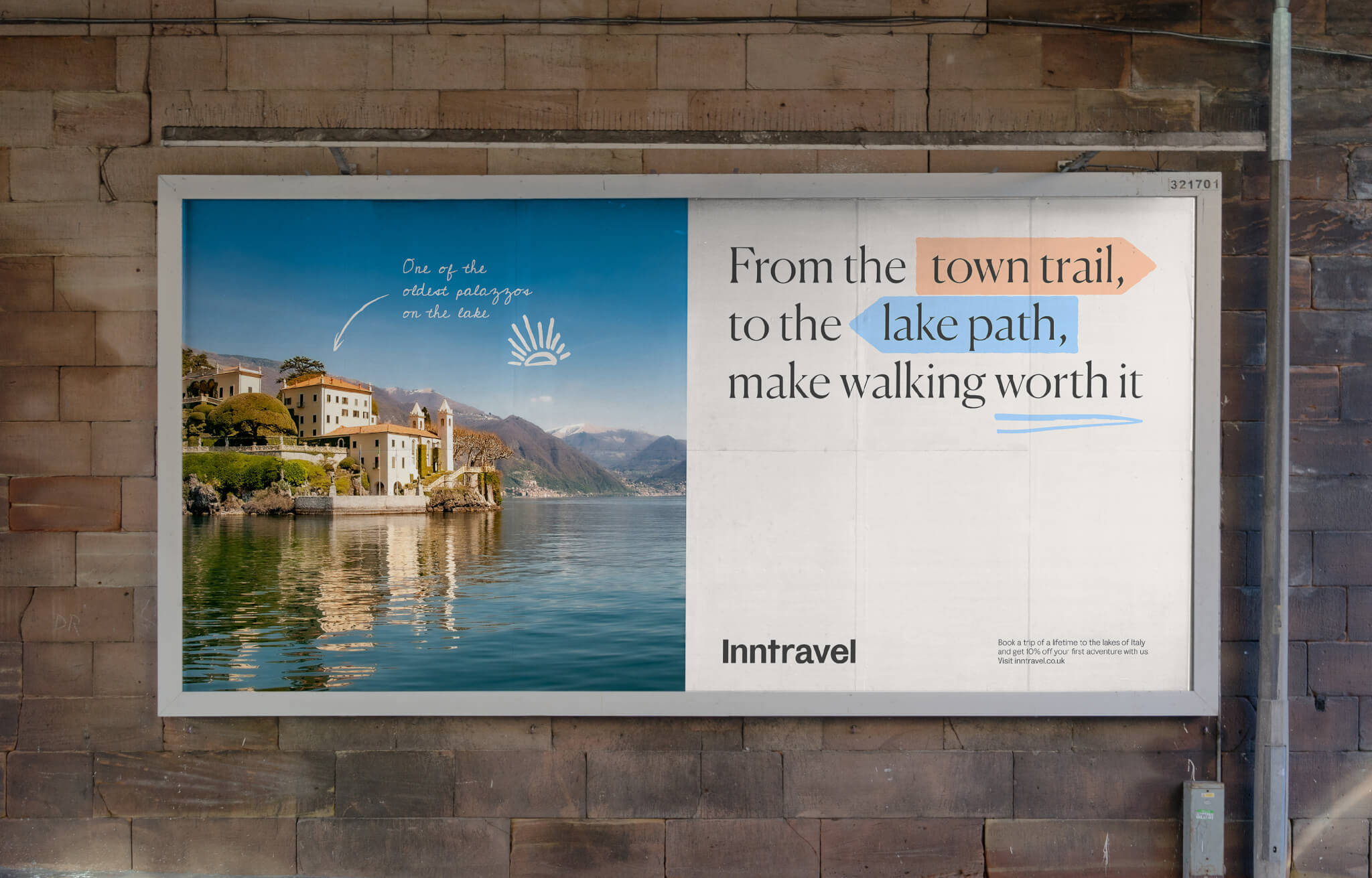
Central to InnTravel’s rebranding strategy is the fingerpost sign, an iconic symbol that has always been associated with travel and walking. This timeless emblem not only serves as a functional highlighter that directs customers to crucial information but also adds a touch of character and warmth to the brand’s graphics. Its charm and visual appeal have made it an integral part of the brand’s identity, and it continues to play a crucial role in reinforcing the brand’s image as a trustworthy and reliable travel companion.

Personalized Touches
The stripped-back design in InnTravel’s rebrand is elevated by a series of stylish illustrations created by the InnTravel Curator, adding a bespoke appeal to the brand’s visual identity. These delightful illustrations, coupled with personalized touches such as a script font and cleverly integrated signpost design in the logo, infuse the brand with character and individuality.

InnTravel’s rebrand is a stunning gem amongst competitors, bringing a unique and personal feel to the travel sector. It exemplifies the power of style through simplicity, making it a rebrand that feels poignant, purposeful, and unpretentious.
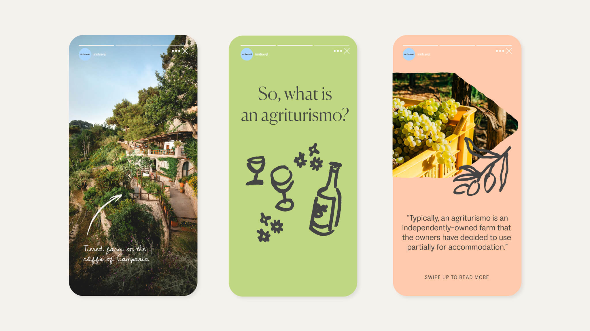
“The personal touches of the script font, illustrations, and signposts provide so much character and individuality,” says lead designer Flo Campbell. “Traveling is such a joyful thing to do – it had to be a joyful identity.” Campbell adds.
Bottomline
InnTravel’s rebrand represents a refreshing departure from the norm in the travel sector, offering a unique and authentic approach that resonates with travelers seeking meaningful experiences. With its emphasis on simplicity, nature, and personalization, the brand’s new identity is a testament to the power of thoughtful design in capturing the spirit of adventure. As travelers embark on new journeys with InnTravel, they can look forward to a redefined experience that celebrates the beauty of exploration in all its forms.