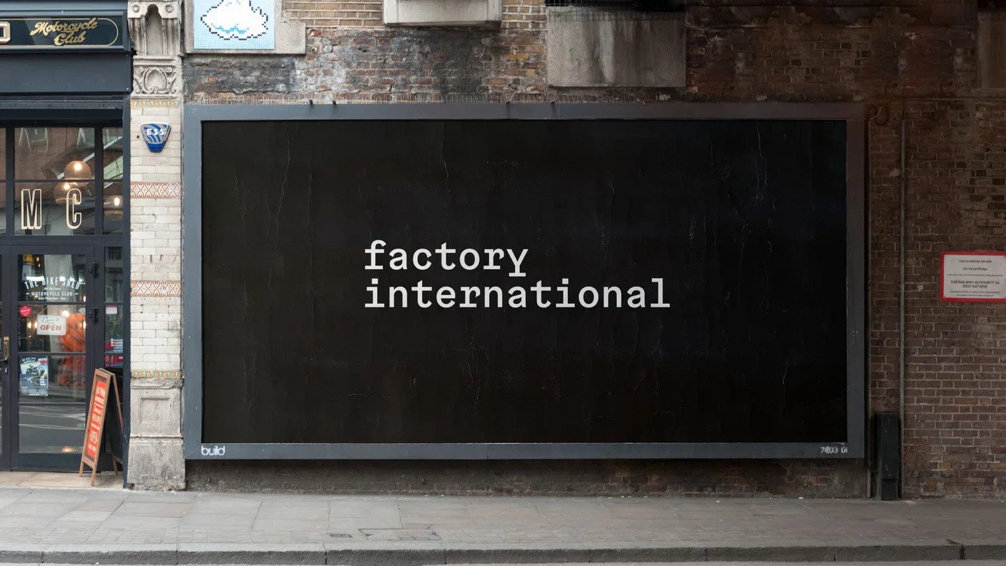
Manchester is once again making its mark on the global cultural stage with the launch of Aviva Studios and the new visual identity for Factory International. In a nod to Manchester’s cultural poster past, the new identity has been launched across the city on fly postings. The reimagined version of this classic medium signals Factory International’s arrival. Let’s explore the rebrand in detail.
Factory International’s Innovative Approach to Creative Events
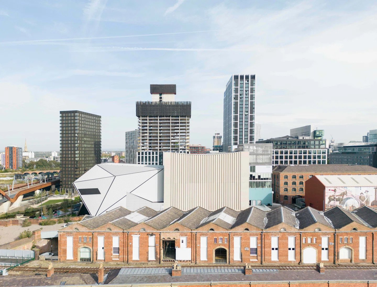
Factory International is a dedicated organization that commissions produces, and presents unique and creative works and events all year round. The organization has recently established its new headquarters and central hub of activities at Aviva Studios in Manchester. Factory International has a wide global reach through a network of co-commissioners and partners. One of their most notable accomplishments is the biennial Manchester International Festival (MIF), which takes place throughout the entire city.

Collaboration Between Creative Legends Spanning Decades
Design stalwarts North and Peter Saville collaborated on an identity capturing this continuum to unite the venue’s flexible future with the city’s illustrious past. This rebrand brings together the heritage of Manchester’s famously influential Factory Records. Saville has been evolving the visual identity of the Manchester International Festival since 2018, making this an organic next step. The aim is to unite Manchester’s varied artistic culture with Factory Records’ rich heritage, which was established in 1978. Additionally, the goal is to restructure the current MIF brand into an entity capable of managing the most substantial public investment in a cultural institution since the opening of Tate Modern in 2000.
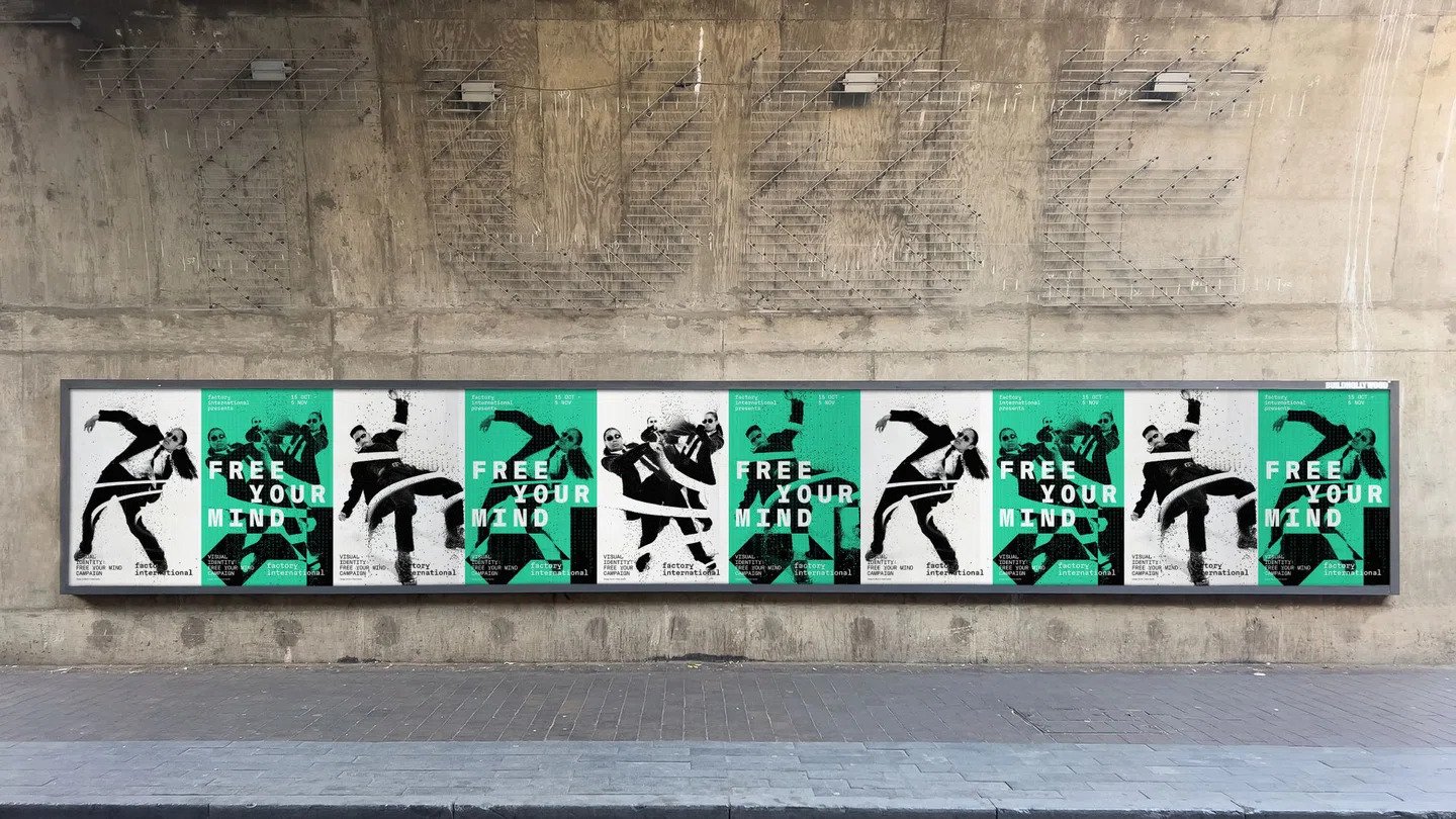
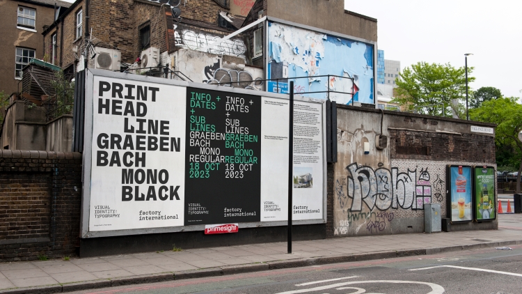
Old Meets New In Reimagined Fly Posting Campaign
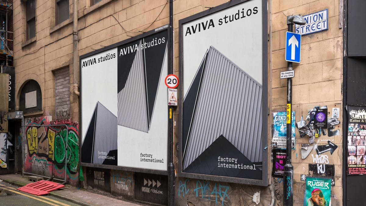
Manchester’s creative heritage continues its evolution with the opening of Aviva Studios. Led by North partner Jeremy Coysten, the team drew inspiration from the building’s adaptive architecture and Factory Records’ pioneering legacy. This bold new brand for Factory International leverages both ‘s rich creative history and its current cultural renaissance. The venue is set to shape the future of arts experiences not just for the city but worldwide. Their abstract logomark depicts Aviva Studios’ flexibility through angular forms also echoing Factory’s iconic symbol. Referencing Manchester’s creative DNA, the evolving identity balances heritage with invention.
Guiding Concepts with Found Heritage
Factory International’s guidelines take the form of paste-up fly-posters, celebrating the city’s prolific street communication. Printed materials bring the identity to life within Aviva Studios’ walls. North’s considered concepts ensure the legacy lives on through both homages and innovations. These guidelines also adds a tactile quality to the brand, bridging the gap between digital and physical expression. The use of colors like Pigeon Blue and Urban Purple, inspired by the Hacienda’s main color, adds vibrancy and balance to the identity.
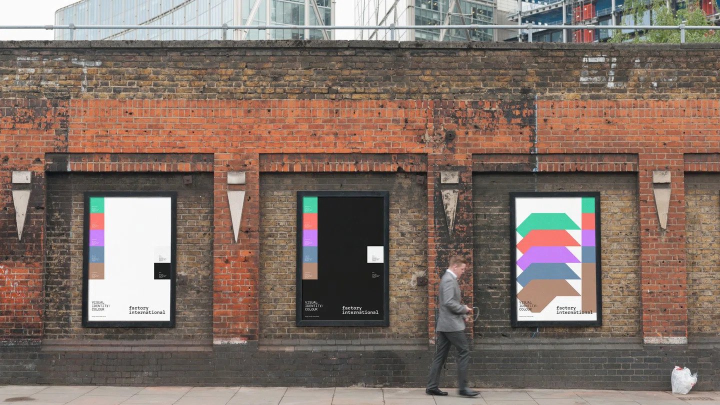
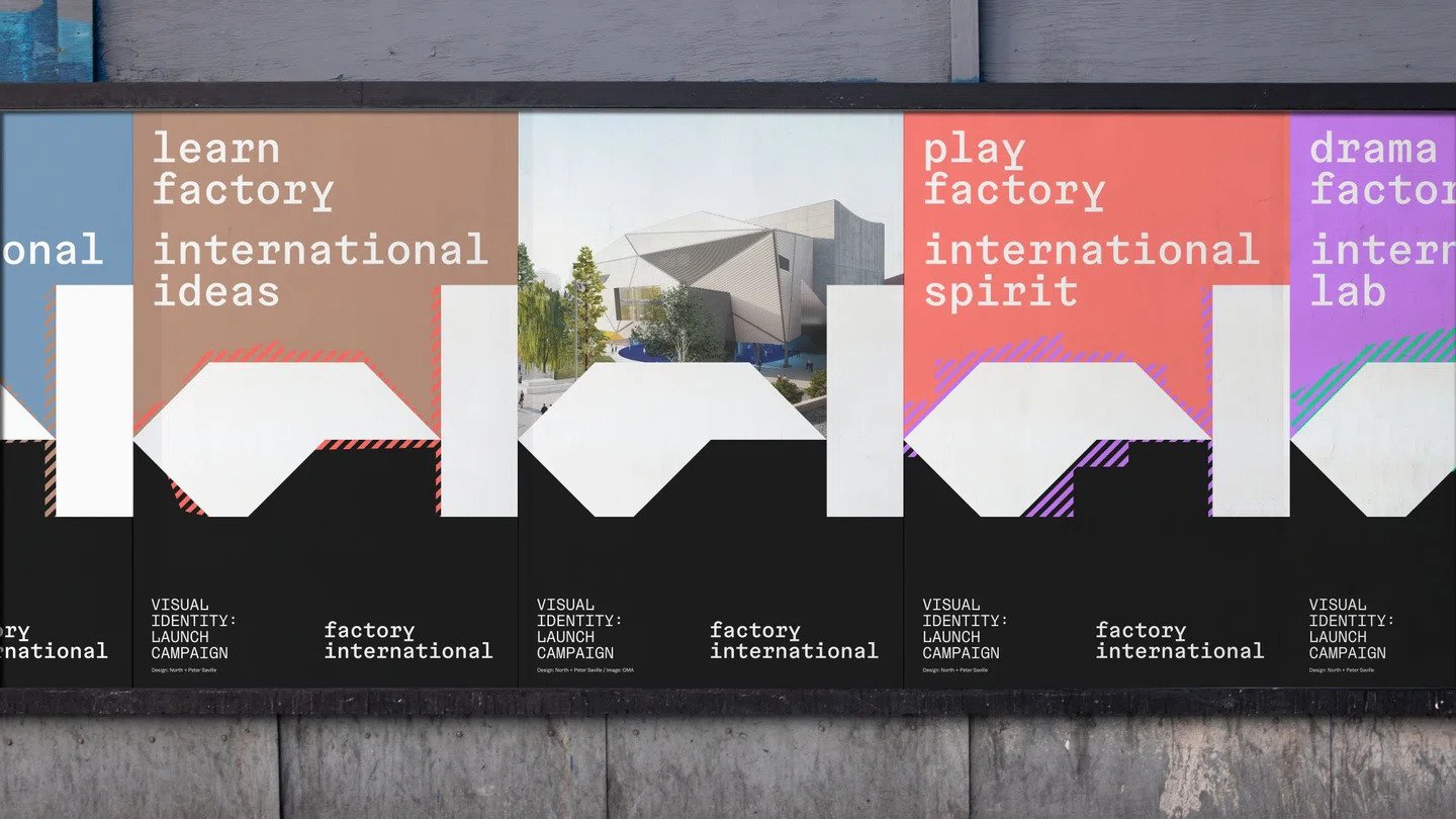
Vibrant Color Palette Reflecting The Diversity Of Performances
While the typography brings structure, the color palette is vibrant and varied. The complementary palette translates the spirit of Manchester’s ingenuity into a unified brand language. The flexible identity allows any color combination to represent the diverse range of productions hosted at Aviva Studios. This juxtaposition perfectly captures Factory International’s vision.
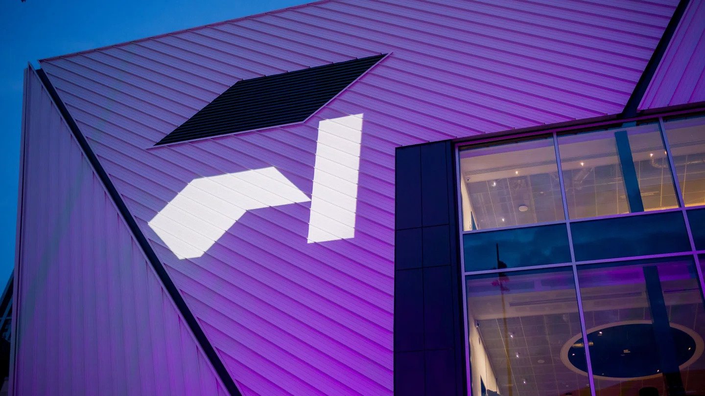
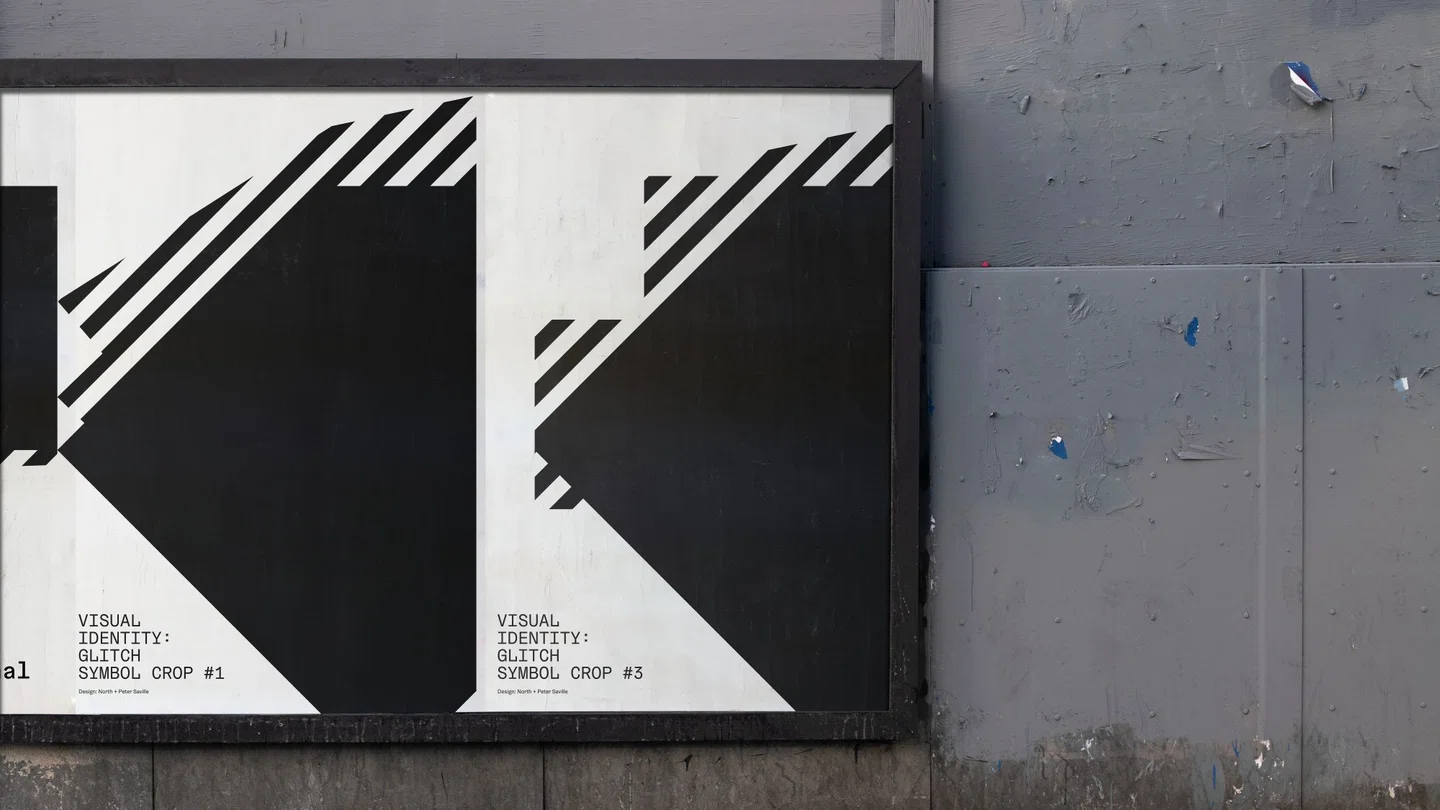
Dynamic Geometric Symbol Inspired By Aviva Studios Architecture
The standout element of the rebrand is an angular graphic symbol representing the ‘space, opportunity and blank canvas’ for future creativity at the venue. The shapes directly reference the architectural design of Aviva Studios by OMA’s Ellen van Loon. Through animation, the symbol morphs and adapts, evolving like the building itself.
Typography That Evokes Manchester’s Culture And Heritage
With North and Saville’s aligned vision, Factory International’s evolving identity bridges Manchester’s past and future through an adaptable symbol of the city’s enduring creative prowess. Respecting the connection, they aligned typographic voices through a monospaced font honoring both the cutting-edge venue and biannual event. The font chosen is Gräebenbach by Camelot, referencing the city’s industrial past with its machine-like aesthetic. For headlines, Gräebenbach Mono Black provides maximum standout. Together the typography and symbol form an iconic, ownable identity.
Pragmatic Wayfinding for Aviva Studios
Factory International opted for practicality by choosing low-fi long LED screens instead of employing an over-engineered and costly signage system. These screens support the building’s flexibility and can accommodate various events. This decision aligns with the company’s commitment to enhancing visitors’ experiences while maintaining the venue’s adaptability.
Overcoming Challenges: Name Changes and Negotiations
The project wasn’t without its challenges, including a name change halfway through the process. Additionally, securing a building naming rights partner with Aviva Studios posed a late hurdle. The Aviva Studios symbol, already trademarked, holds immense importance for both Factory International and Aviva Studios. It prominently appears on uniforms and inside the building, acting as a unifying element.
Bottomline
The new brand identity for Factory International and Aviva Studios honors Manchester’s creative history while also looking towards the future. Inspired by Aviva Studios’ architecture, the new logo represents the fusion of history and innovation. The rebranding is strengthened by consistent typography and guidelines. The use of street communication in wayfinding and pragmatic signage at Aviva Studios improves visitors’ experiences. This branding initiative showcases the power of creativity in branding and promises an exciting future for the cultural landscape it represents.