Color is more than just a visual experience. It speaks to us on an emotional level. In branding and design, thoughtful color palettes have become a key trend, transcending aesthetics to evoke feelings and connections. Today, brands meticulously choose colors to forge emotional bonds and create lasting visual identities. This deliberate approach helps build brand recognition and loyalty. Let’s unravel how these curated palettes shape brand identity and foster loyalty through emotional resonance.
The Psychology Behind Color Choices
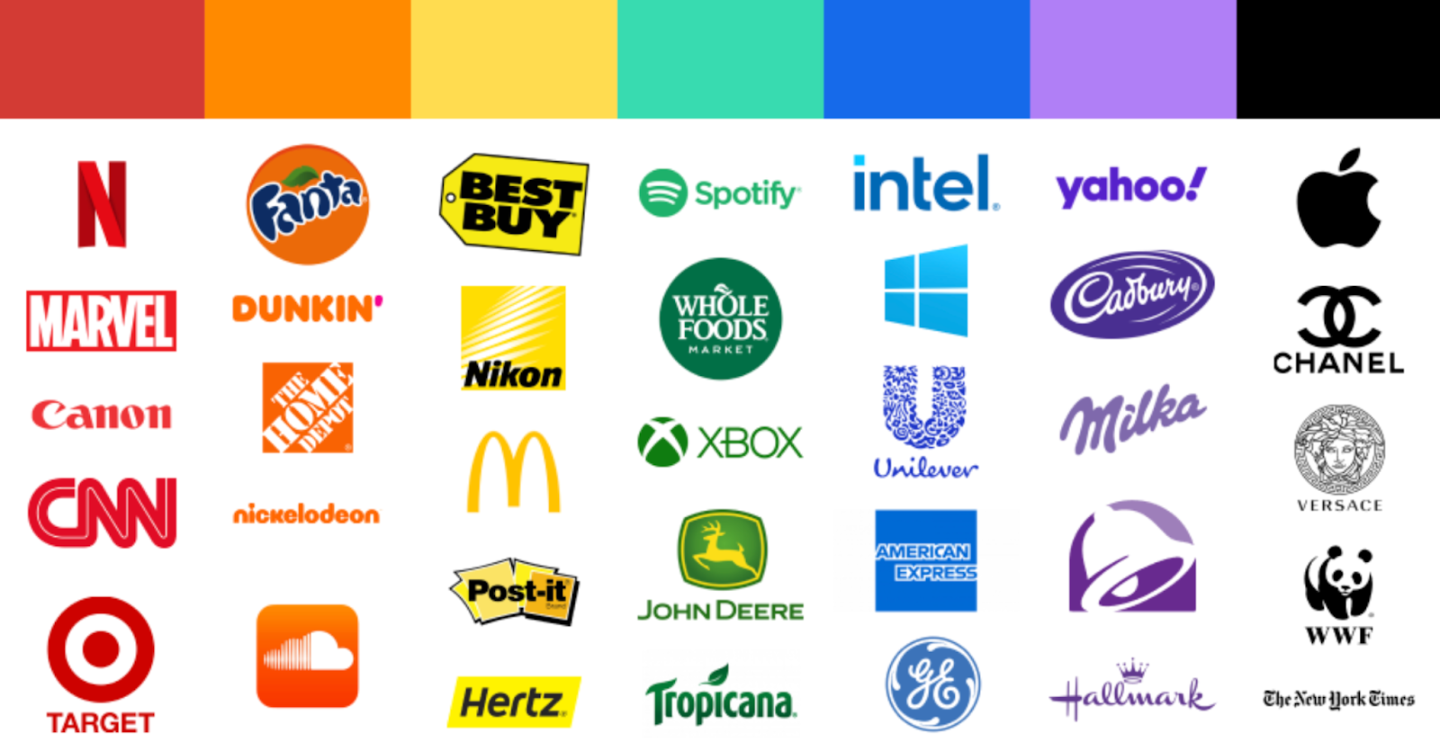
Every color invokes feelings and triggers subconscious associations. For instance, blue is often linked with trust, calm, and reliability, while red evokes passion, energy, and urgency. Designers tap into this psychological understanding when curating color palettes, creating visual narratives that align with a brand’s core values and target audience. When a brand opts for a particular color palette, it’s not just about looking good but about standing firm in what it represents.
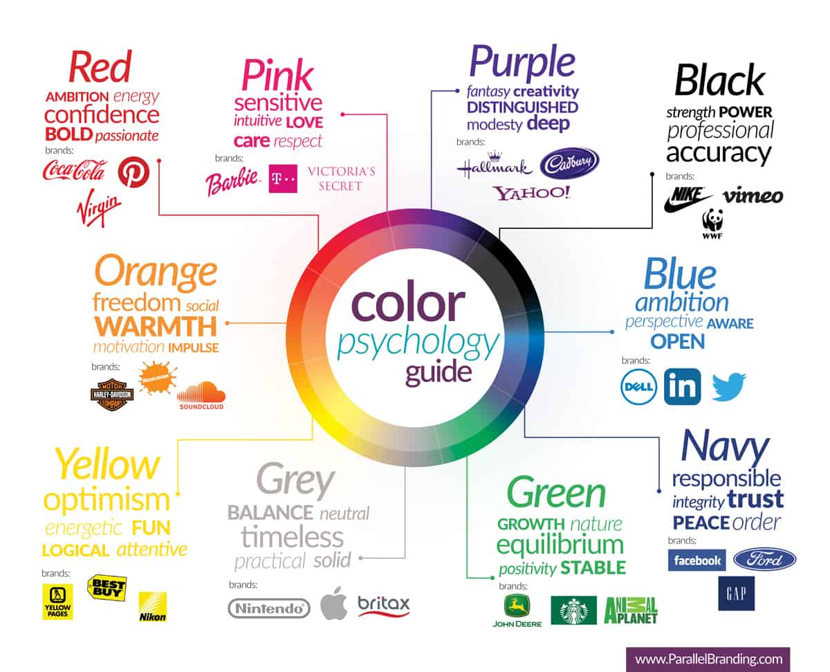
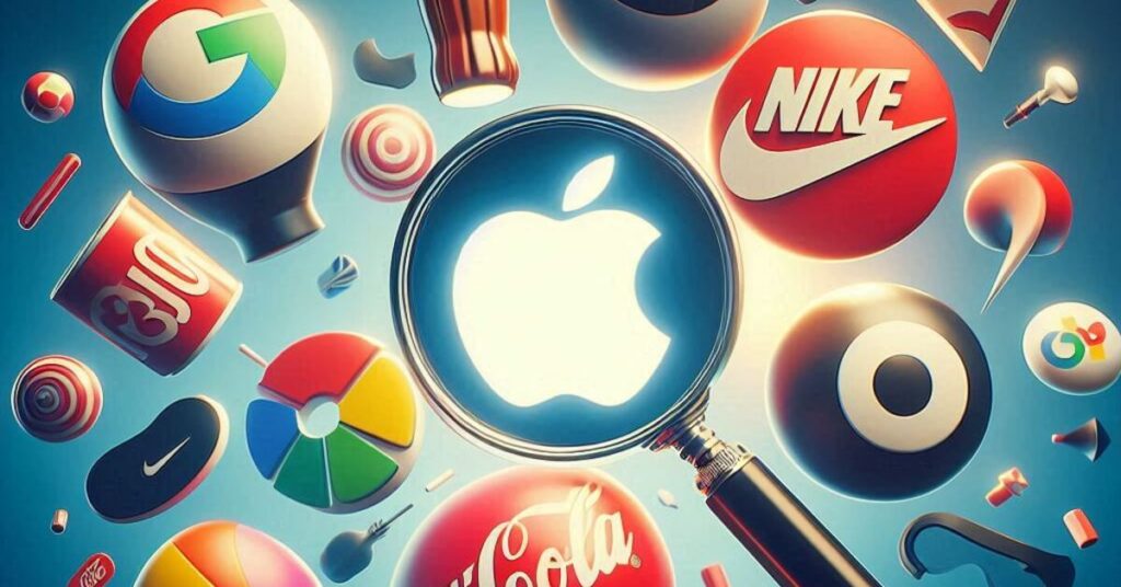
For example, think of the iconic brands like Coca-Cola and Tiffany & Co. Each has a distinct color palette that is instantly recognizable and evokes specific emotions. Coca-Cola’s vibrant red stirs a sense of energy and excitement, while Tiffany’s trademark blue exudes sophistication and luxury. By consistently employing these colors across various platforms—be it print, digital, or social media—brands enhance their recognition and foster emotional connections. This relevance is crucial as consumers today increasingly look beyond just the products they buy, seeking brands that resonate with their feelings and ideals.
Why is the process of Curating Color, Emotionally Resonating?
The journey of curating a color palette is akin to composing a piece of music—every shade plays a note that contributes to the overall symphony. Designers often start by identifying the brand’s core message and values. From there, they explore hues, tints, and shades that not only reflect these elements but also trigger the desired emotional responses.
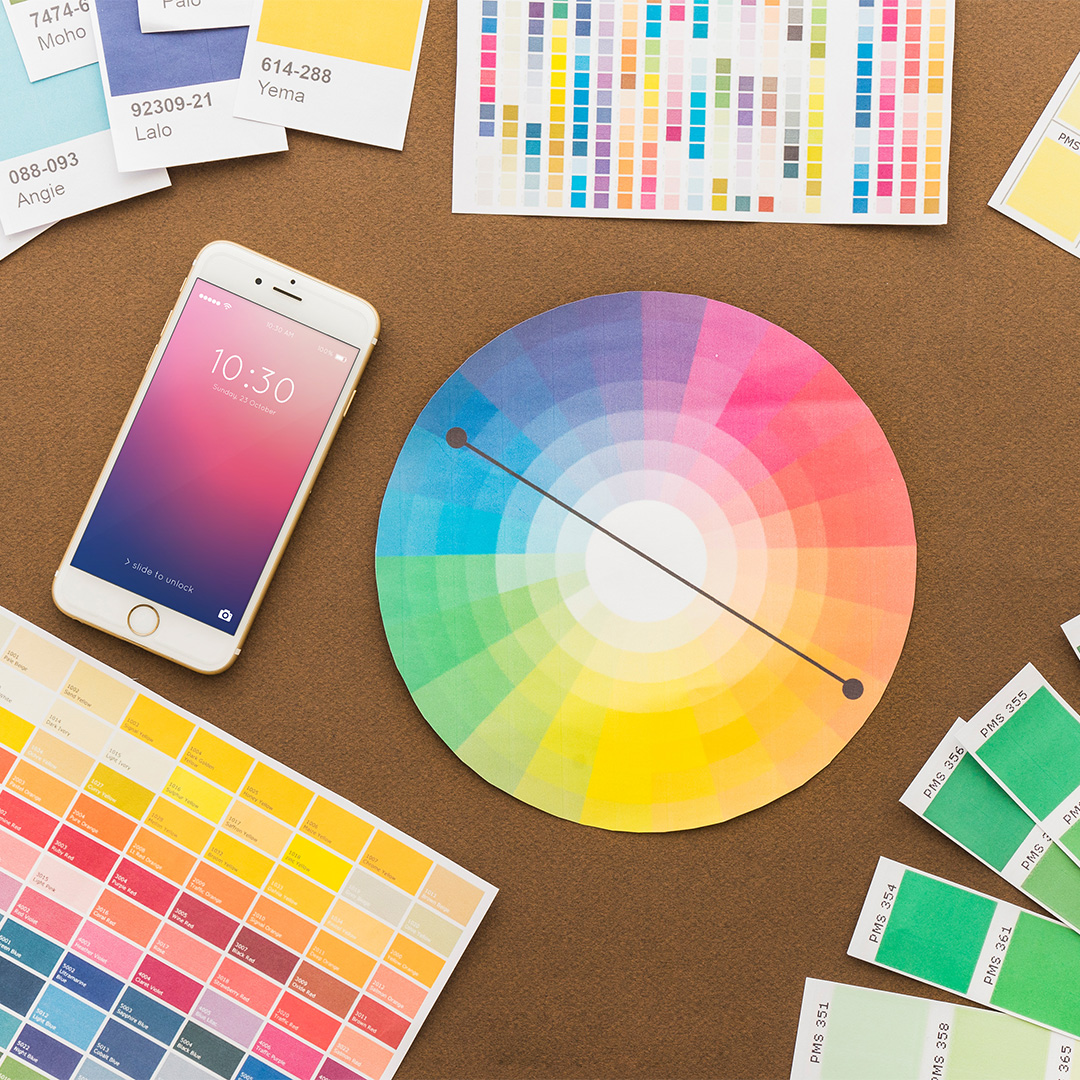
Once a palette is created, it is tested and refined. This meticulous process often involves feedback from focus groups or target audiences, ensuring that the emotions the colors evoke align with consumer perceptions. The goal is to establish visual consistency across all touchpoints. This consistency helps to create a cohesive brand image, facilitating deeper connections with consumers who come to understand and trust the brand through its consistent visual language.

Moreover, sharing curated color palettes has moved beyond internal processes, becoming a social trend among designers who showcase their work online. Platforms like Instagram and Pinterest have become popular avenues for designers to display their curated palettes, not only highlighting their taste but also emphasizing their branding expertise. This practice fosters authenticity, inviting consumers into the story behind the brand and creating a deeper connection with its visual identity.
The Impact of Color on Brand Loyalty
Consumers have become more selective, preferring brands that align with their personal values. Color is essential in cultivating brand loyalty. A well-curated color palette creates a lasting emotional impression, enabling consumers to develop meaningful connections with the brand.

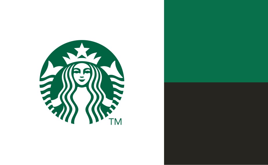
For instance, take brands known for their powerful storytelling through color, like Starbucks. The rich green used in its branding evokes feelings of growth, freshness, and connection to nature, appealing to environmentally conscious consumers. This emotional resonance contributes to a loyal customer base that identifies not just with the coffee but with the brand’s mission and values.
Color curation also brings a human element back into branding, counteracting the impersonal nature of automation in modern branding strategies. As brands highlight their unique palettes, they invite consumers to engage with their identity on a deeper level, moving from transactional relationships to emotional ones.

The Transformative Power of Color Curation
Color is far more than a design element. It’s an essential part of a brand’s identity strategy. Curating color palettes represents a profound shift towards understanding and leveraging the emotional dimensions of branding. As brands continue to explore and implement color curation in their strategies, they will discover that these emotional connections enhance recognition, foster loyalty, and encourage advocacy within their audiences. In a world saturated with choices, standing out is not just about visibility. It’s about evoking emotion. The right color palette can make all the difference in creating a lasting impact.
Also Read: PayPal Debuts New Look with Custom Font and Refined Double ‘P’ Logo