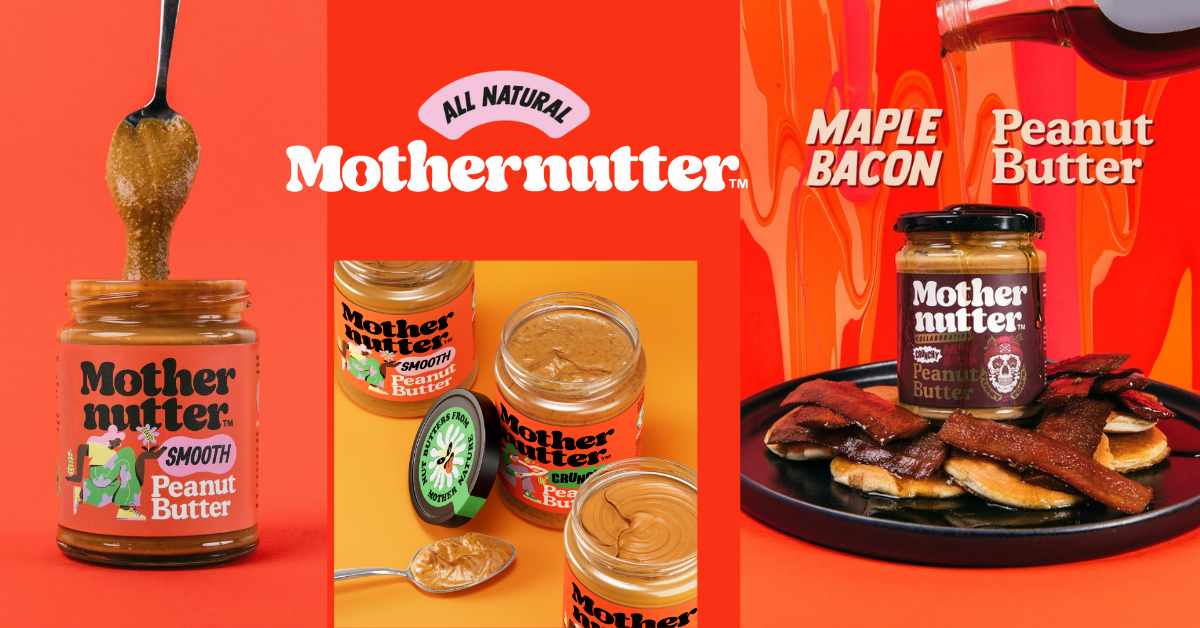
Mothernutter, a popular peanut butter brand, has drawn inspiration from the 1970s psychedelic visuals for its funky new look. It rocks bespoke illustrations for each flavor. The brand had roped in Analogue to create a bold, characterful, and innovative identity.
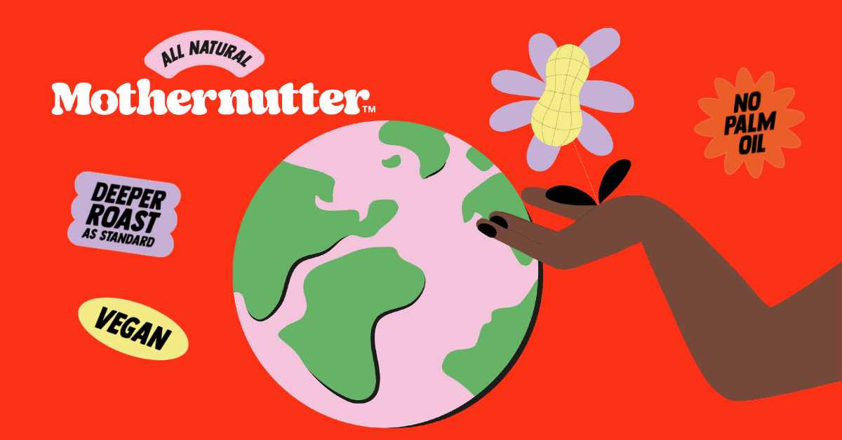
The new look reflects Mothernutter’s respect for the planet and the quality ingredients that it uses. Analogue’s in-house team did all the branding, illustration, and motion design. Thierry Ngutegure, Mothernutter founder and digital production lead, said the current market for peanut butter products was saturated with unhealthy options or natural offerings that felt a little dated and homogenized. Now, its exuberant modern-retro typeface is approachable and organic. Ngutegure said it matches the brand’s values and allows for a clever little feature in the negative space, with the center of the ‘o’ in the brand’s name forming the shape of a peanut.
Barry Darnell, Managing Director of Analogue, said tapping into an overcrowded market of natural and sustainable products with something original and relevant was the most challenging aspect of the project. He explained the studio created a typeface and color palette that nods to the positivity and vibrancy of the fun-loving 70s. Analogue used psychedelic illustrations to differentiate Mothernutter SKUs, giving them their own character.
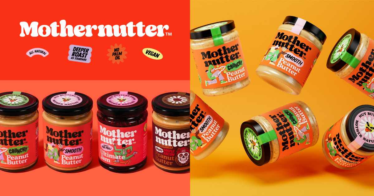
Mothernutter’s crunchy range features a character drawn with more angled lines cracking a peanut. The smooth version uses soft-edged illustrations each representing the qualities of the products. Darnell highlighted the font as a key design element. He shared that the studio wanted the bespoke wordmark, featuring a nut within the ‘o’ of ‘mother’ to be a focal point on the packaging and throughout the wider brand. “We chose a modern retro front which not only taps into the flower power aesthetic which runs through the brand but also resembles the soft and creamy nature of the product itself.”
Analogue used rich and natural hues to solidify a sustainable aesthetic in order to appeal to the modern-day consumer.