Magnum Photos, the internationally renowned photographic cooperative, has undergone a significant rebranding. The rebrand reflect the organization’s growth and future with visuals that are more adaptable and consistent than before. Let’s explore how their rebranding efforts successfully captured the essence of Magnum’s photographic excellence.

A Diagnosis Turned Overhaul
The rebranding process led by London-based design studio, North has their design team, composed of Jeremy Coysten, Josef Clinch, and Sean Perkins, initially set out to conduct a visual audit of the Magnum brand. However, their findings led to a more comprehensive overhaul of the brand system. They discovered that the existing Magnum brand was inconsistently applied, with distortions and edits of the logo, interchangeable typefaces, and multiple unnecessary sub-brand logos. As Jeremy, partner and creative director at North, puts it, “Magnum had moved forward and the brand needed to catch up.”
Evolution of the Logo
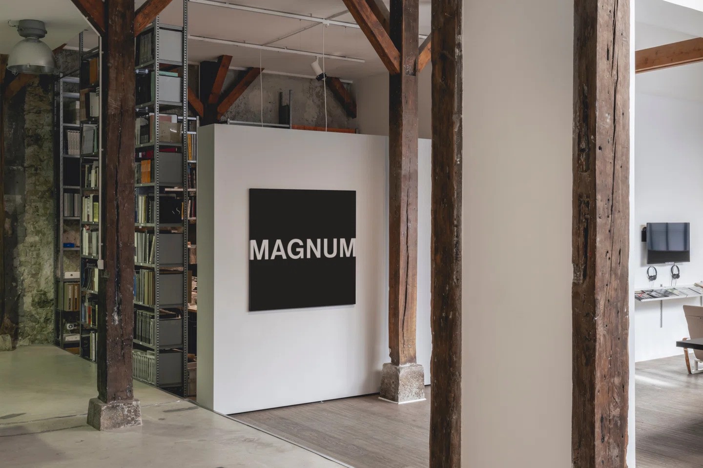
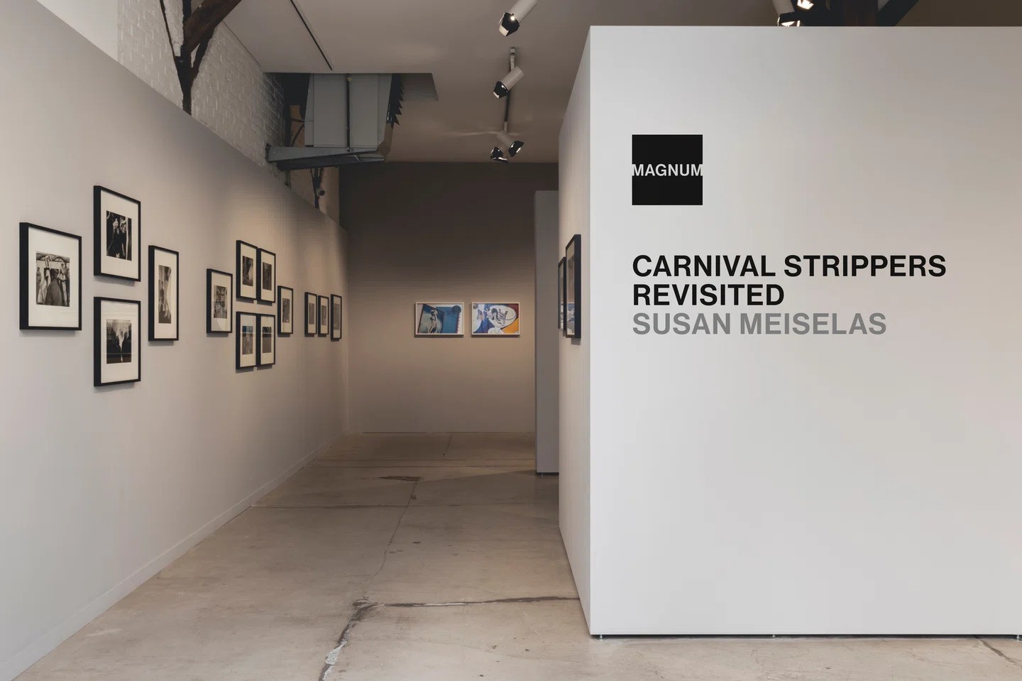
The team recommended an evolution of the logo, with the removal of the word ‘photos’ being a key change. This decision was driven by practical considerations, as the word was often illegible, particularly on screen, due to its small size in proportion to the black frame. Moreover, ‘photos’ were rarely used, either verbally or in-text. The logo has been expanded to the borders of the frame, with part of both M’s being transparent, symbolizing the cooperative’s openness and transparency in recent years.

Reflecting the Variety of Magnum
The rebrand aimed to reflect the complex and wide variety of images associated with Magnum. From images of war and peace to celebration and work across a variety of cultures and divides, everything is covered. As Jeremy shares, “These are very inspiring people that have independently and collectively produced an incredibly inspiring collection of work.” The new identity can now be stamped on the works, contributing to its long-lived acclaim.
Final Thoughts
The Magnum rebrand by North is a testament to the organization’s adaptability and commitment to reflecting its photographic and cultural acclaim. It’s a brand diagnosis that expanded into an overhaul, ensuring that the design system is as varied and adaptable as the organization’s work itself.
Read More: Higg Co Rebrands as Worldly to Reintroduce Itself to Fashion


