Convenience food has a bad reputation for being unhealthy, boring, and wasteful. But what if there was a way to make it more appealing, sustainable, and enjoyable? That’s the vision of Cherrypick, a new app that helps you find recipes, plan meals, and order groceries from local supermarkets in one place. Cherrypick wants to make cooking and eating at home easier and happier, and it has a branding that reflects that. Let’s explore more about the app and the charm behind its visual identity.
A Culinary Revolution
In a world where time and convenience often dictate our dining choices, Cherrypick is set to revolutionize how people approach food. The all-in-one app is set to simplify the culinary journey by offering a seamless experience for discovering recipes, planning meals, and ordering groceries from local supermarkets. The app is sprouting with a fresh identity befitting its ambitions of revolutionizing home cooking through a spirit of accessible innovation. From the looks of it, the app is sure to reap rewards with a charming character-led world bringing bountiful produce to the people.
The Story Behind the App
Cherrypick was born out of a collaboration between London-based design studio Otherway and the app’s founders, who wanted to create a brand that could live up to their ambitious plans. The first step was to rename the app, which was previously called Lollipop. The new name, Cherrypick, captures the idea of finding the best ingredients for your recipes, as well as the joy of choosing what you want to eat.
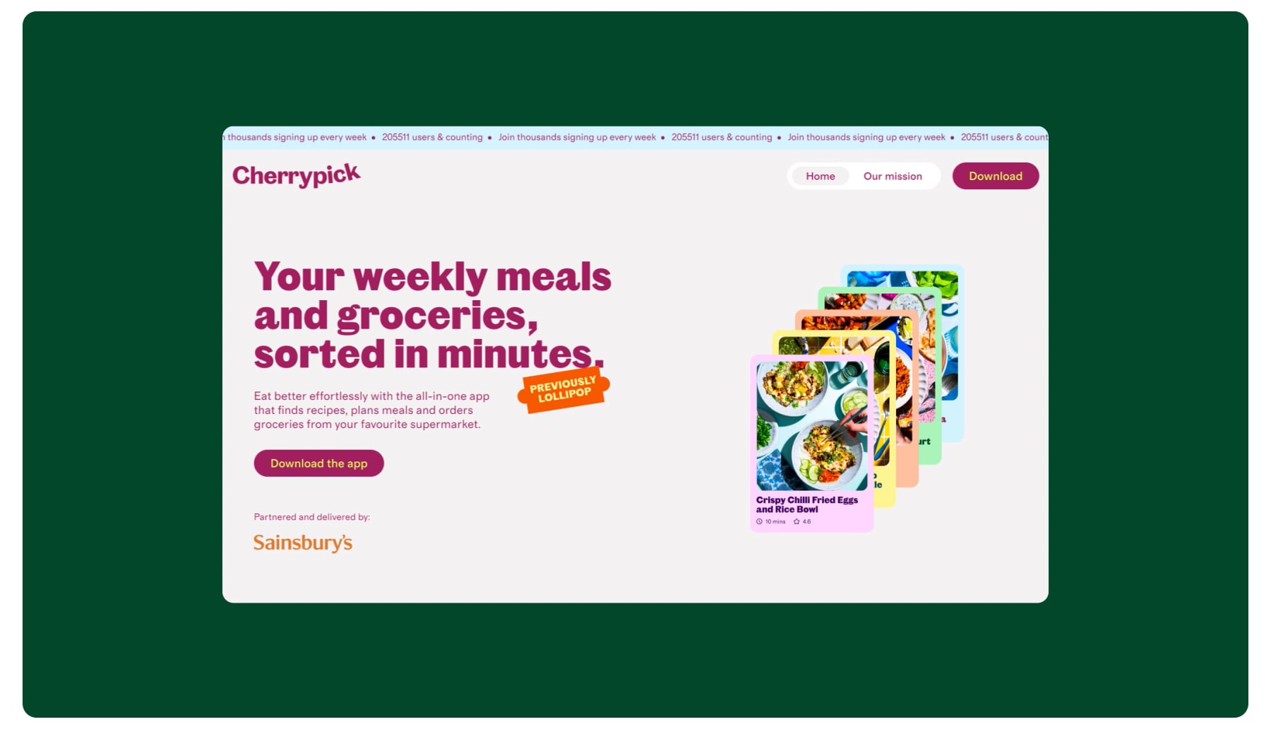
The name also inspired the design of the wordmark, which has a gentle curve that mimics the shape of a cherry or an ingredient being picked. The wordmark is part of a larger identity system that revolves around the concept of Cherrypick being a handy helper for its users. To illustrate this, Otherway created a new mascot called Handy, a friendly hand that guides customers through the app and shows them how easy and fun it is to use Cherrypick.
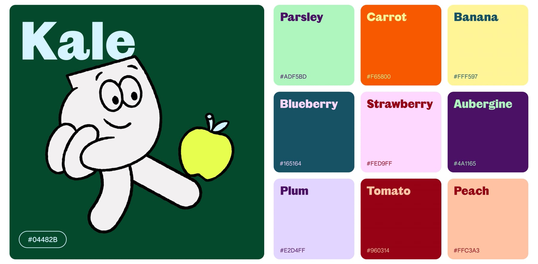
Handy was illustrated by Melbourne-based artist Steve Gavan, who gave him a variety of expressions and poses that reflect the playful yet practical nature of Cherrypick. Handy appears across the brand’s touchpoints, from the app to the website to social media, adding a touch of personality and humour to the brand.
Acres of Inspiration
Illustrated guides offer easy navigation while gallery-grade imagery bursts with bounty. Vibrant hues mirror ingredients’ freshness within digital fields and on plates readers plant virtually. Now optimizing nutritional options needn’t feel like an ordeal with Cherrypick’s cheery fix-ins. Handy’s helpful hints ensure harvesting homegrown happiness remains a perpetual perk.

Tastes as Bright as Ingredients
A vibrant colorscape mirroring foods’ fresh hues complements photography popping with prepped plates. Welcoming yet functional language and imagery seamlessly aid in exploring this playground of possibilities rooted in real, regional ingredients.
Now with an identity as cheerful as the dishes it inspires, Cherrypick promises to pick up steam in changing convictions that culinarily, convenient means compromised. Handy will handle navigating this new take on produce-powered provisions.
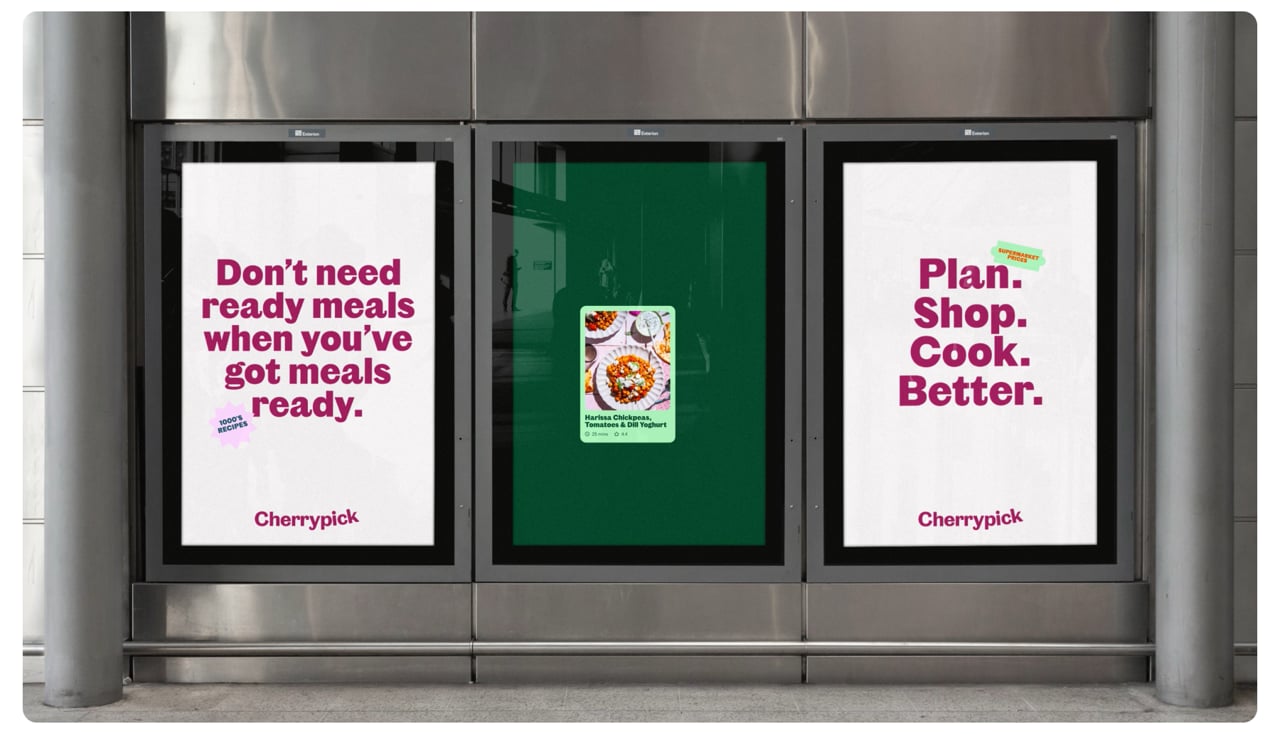
Vibrant Palette and Playful Photography
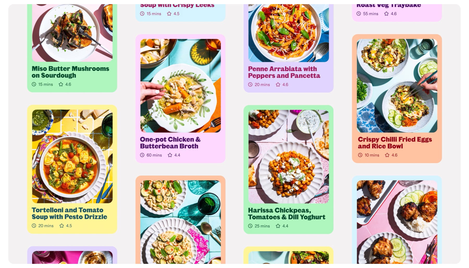
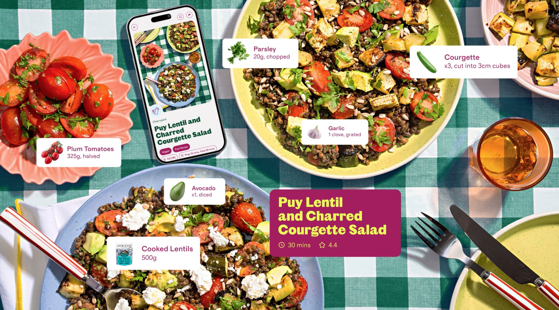
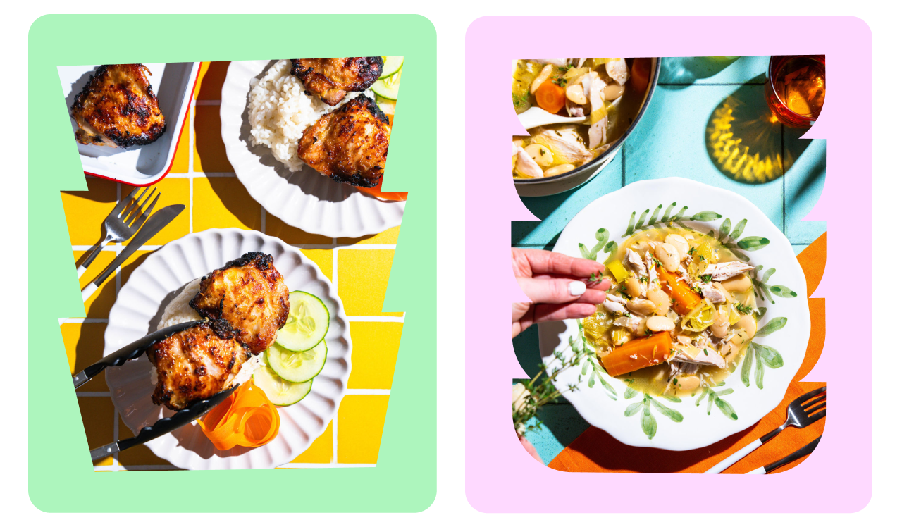
Cherrypick’s brand palette mirrors the natural tones of cherries, infusing vibrancy through a secondary set of hues inspired by the bold colors of freshly cooked food. The visual experience is further enhanced by lively photography, showcasing mouthwatering meals that can be effortlessly crafted with Cherrypick’s assistance.
More Than a Feast for the Eyes
Cherrypick’s photography strategy is dual-fold. Functional cut-out product images simplify the showcasing of fresh ingredients, while recipe imagery captures the joy of cooking from scratch—layers of color, well-styled crockery, and the vibrancy of shared meals, all contributing to the brand’s visual narrative.
A Brand with Fruitful Vision
Cherrypick is a brand that aims to redefine the convenience food category, by offering a solution that is healthier, greener, and easier than the alternatives. With fresh and fun branding, Cherrypick can convey its vision and values, and connect with its target audience. The branding is the result of a strategic partnership with Otherway, a design studio that helped Cherrypick create a brand that soars above the rest. From its produce-proud name conceived during inception to illustrations of Handy guiding users, the identity rings true to Cherrypick’s mission of making mealtimes merry through curated recipes, grocery deliveries, and culinary creativity.
Key Takeaways
- Cherrypick, a brand that aims to revolutionize the convenience food category, has undergone a rebranding venture curated by Otherway.
- The new visual identity is more than just a fresh look, it’s a culinary revelation that celebrates the brand’s joyful experience and its commitment to being a super useful companion in the culinary landscape.
- From the playful curve of its wordmark to the guiding presence of Handy, every element in Cherrypick’s new identity converges to convey its vision and values, which are centered around offering a healthier, greener, and more convenient solution than the alternatives.
- With this strategic partnership, Cherrypick has successfully created a branding that soars above the rest and connects with its target audience.
Read More: A Fresh Face for Food Activism: Bite Back’s Reimagined Identity