Coca-Cola’s AI Tool Keeps 200 Markets on Brand
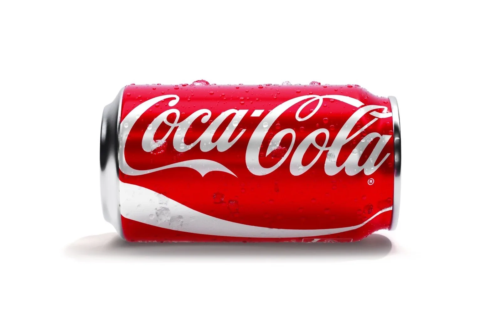
Every brand old enough to matter eventually develops the same problem. It is not a design problem. It is a drift problem. Coca-Cola has been in continuous production for 140 years, across more than 200 markets, through thousands of agency relationships, packaging suppliers, and local marketing teams, each making small, reasonable decisions in isolation. A slightly different red on a vending machine in São Paulo. A script that leans a little differently on a billboard in Jakarta. None of these decisions is wrong on its own. Compounded across two centuries and two hundred markets, they add up to a brand that exists more clearly in people’s memory than it does in the world. On July 20, 2026, Coca-Cola launched a refreshed Coca-Cola brand identity, a global visual system built to close that gap. It was developed with global branding agency Jones Knowles Ritchie, with packaging systems from The Superultrarare and typography from Brody Associates. The strategic principle behind it, repeated across every piece of Coca-Cola’s own communication, is deliberately unglamorous: make Coca-Cola more Coca-Cola.
What Actually Changed
The honest answer is: less than the press cycle suggests, and that is the point. The core assets are the same assets the brand has run for decades. The Dynamic Ribbon. The Spencerian script. The Arden Square device. The red-and-white palette. Coca-Cola was explicit that this was not a reinvention brief. The job was to take the most distinctive version of each existing element, define it precisely, and make sure it shows up with identical clarity everywhere it appears, whether that is a fountain dispenser in a Manila food court or a digital billboard in Times Square. A new photography direction sets a shared visual standard for how the brand is shot across markets. The rollout is reported to proceed region by region rather than on a single global flip date, with sources differing on which markets go first. For a brand team, the useful reframe here is this: Coca-Cola did not brief a redesign. It briefed a definition project. The creative work was deciding, with total precision, what “Coca-Cola” actually looks like, so that precision could be encoded and distributed. That distinction, between designing an identity and defining one precisely enough to scale, is the entire case study.
The Zero Sugar Problem
Not every consequence of that precision has landed cleanly. The most visible criticism of the new system is about differentiation, not consistency. With the flagship and Zero Sugar variants now sharing more of the same red-forward visual language, some consumers and design critics have said the new packaging makes it harder to tell Coke variants apart at a glance, with online comparisons noting the typography now reads closer to another well-known red-and-white pack identity than to Coca-Cola’s prior system. The read from several commentators: the convergence looks calculated, folding Zero Sugar’s equity back into the core red identity so that the company name and the color carry the brand signal, rather than full-sugar status being the visual hero the way it was under the previous packaging hierarchy. This is a genuinely useful tension for brand teams to sit with. Consistency and differentiation are not the same goal, and a system optimized hard for one will cost you some of the other. Coca-Cola appears to have made a deliberate trade: less at-a-glance product differentiation, in exchange for a cleaner, more disciplined masterbrand signal across a portfolio that has grown crowded with sub-variants over the past decade. Whether that trade holds up depends on whether shoppers actually struggle at shelf, which is a retail execution question the design press cannot answer from a press release. Worth tracking over the next two quarters of sell-through data if it becomes available.
The most interesting part of Coca-Cola’s rebrand is not the ribbon or the script. It is the AI that now checks whether a designer in Manila used the right red.
The Real Story: Project Fizzion
Here is the part of this rebrand that most coverage buried below the visual reveal, and the part that actually matters for how brand work gets done. Coca-Cola and Adobe built an AI-powered design governance system called Project Fizzion, developed before this identity launch. The mechanism is specific enough to be worth explaining properly. As Coca-Cola’s own designers work inside Adobe Creative Cloud tools, building layouts, refining typography, making the hundreds of small judgment calls that go into any piece of brand execution, Fizzion observes and captures that creative intent. It encodes those decisions into what Coca-Cola calls a StyleID: a machine-readable definition of what “on brand” actually looks like, learned directly from how the company’s own designers work rather than written down as a static PDF of guidelines. That StyleID then gets applied automatically across formats, markets, and platforms. Coca-Cola and Adobe report, though the figure has not been independently verified, that the system lets creative teams produce brand-compliant content up to ten times faster than manual guideline checks allow. Earlier coverage, predating this year’s identity launch, described Fizzion as mandatory for the company’s agency partners rather than an optional tool offered alongside traditional guidelines; treat that status as reported, not confirmed current practice, until Coca-Cola states it directly in connection with this rollout. This is worth sitting with for a moment, because it inverts the usual relationship between brand guidelines and brand execution. Most brand systems work like this: someone writes a guidelines document, agencies and internal teams read it, interpret it, and produce work that a brand team then reviews for compliance, usually after the work already exists. The review is a checkpoint, not a constraint. Fizzion moves the constraint upstream. The system is trained on what correct execution actually looks like, learned from the brand’s own best work, and it shapes output as it is being made rather than auditing it afterward. For a company managing more than 200 markets, that is not a nice-to-have. It is close to the only way brand consistency at that scale becomes achievable without an unworkable headcount of reviewers, or an unacceptable tolerance for drift.
Also readYour Brand Guidelines Now Have a Machine Reader. Most of Them Are Not Ready.
What This Means If You Do Not Have Coca-Cola’s Budget
Most brand teams reading this will never build a Fizzion. That is fine. The instructive part is not the specific tool. It is the underlying shift in how Coca-Cola is thinking about the problem. The old model treats brand consistency as a training and enforcement problem: write the guidelines, train the people, review the output, correct the drift. That model scales linearly with headcount and degrades as an organization grows past the point where a small central team can realistically review everything. It is the model almost every brand team currently operates under, and it is the model that produces exactly the kind of 140-year drift Coca-Cola was trying to fix. The new model treats brand consistency as an infrastructure problem: define the system precisely enough that correctness is closer to automatic, and build tooling that enforces the definition rather than tooling that merely documents it. You do not need an AI model trained on your archive to borrow this logic. A well-built Figma component library with locked styles, a template system that makes the wrong choice harder to make than the right one, or even a rigorously maintained asset library that people actually use instead of a 90-page PDF nobody opens, are all smaller versions of the same idea. The principle scales down even when the specific technology does not. The other lesson sits in what Coca-Cola chose not to touch. The temptation in most refresh briefs is to justify the project by changing something visible. Coca-Cola resisted that temptation almost entirely. The script, the ribbon, the palette, all held. What changed was precision and enforcement, not identity. That restraint is a strategic choice, and it is the harder one to make internally, because “we made the guidelines more precise and built a system to enforce them” is a much less exciting story to tell a board than “we redesigned the logo.”

Three questions for your own brand
Three questions worth asking about your own brand’s consistency problem, prompted by this case.
Is your drift a design problem or a definition problem? Most brands do not actually need a new identity. They need the existing identity defined precisely enough that two different people, in two different markets, executing the same brief, would produce visibly the same result. If your guidelines allow for interpretation on the fundamentals, redesigning will not fix that. Tightening the definition will.
Where does your enforcement actually happen? If the answer is “a brand team reviews things after they are made,” you are running the old model, and it will not scale past a certain size without either more headcount or more drift. Worth asking whether any part of that review could move upstream into templates, locked components, or automated checks, even without AI in the loop.
What did you resist changing, and could you say why? Coca-Cola’s discipline in this refresh was not visual innovation. It was knowing exactly which assets carried real equity and refusing to touch them for the sake of having something new to announce. That kind of restraint is rare, and it is usually the difference between a refresh that strengthens a brand and one that just resets the clock on brand recognition the market had already built.
What to Watch
Whether shoppers actually struggle to tell Coca-Cola and Zero Sugar apart at shelf over the next two quarters of sell-through data, and whether Coca-Cola confirms Fizzion’s mandatory status for this rollout directly, are the two open threads worth checking back on.
Keep reading