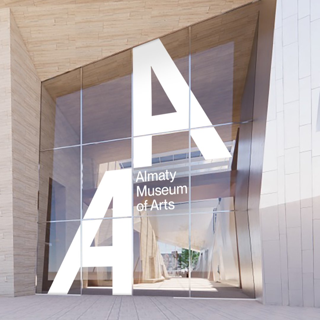
The newly unveiled Almaty Museum of Arts located in Kazakhstan has an eye-catching architectural design that features slanted walls that face both the city and the Alatu mountains. The museum’s new brand identity draws inspiration from its unique duality. Let’s delve into how this new identity extends beyond the physical space and enhances the public’s appreciation for art and culture. We’ll also take a closer look at the museum’s innovative design approach, dynamic logo system driven by motion, and vibrant color palettes that define its new identity.
Embracing Duality
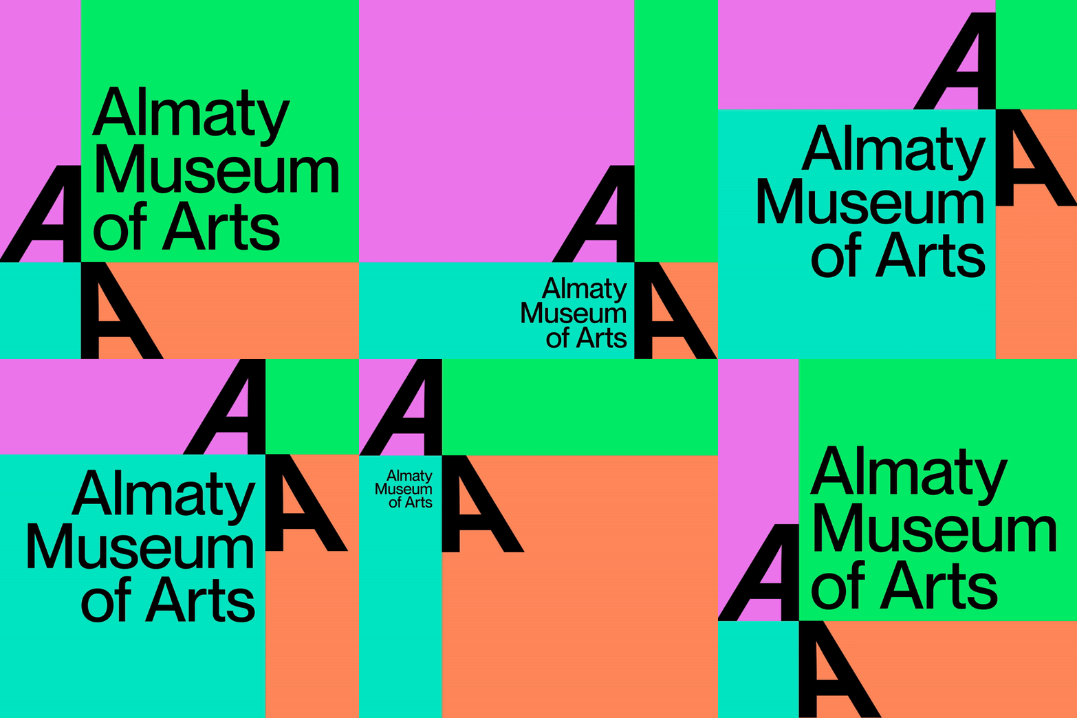
At the heart of the Almaty Museum of Arts’ new identity, created in collaboration with the design agency Studio Thonik, is a dynamic logo system that captures the essence of duality. Two capital A’s, representing the museum’s unique architectural orientation, interact playfully, bouncing side to side in unison. This motion-driven design embodies the museum’s distinctiveness while creating a simple yet thoughtful brand that resonates with the institution’s core values. The dynamic nature of the logo serves as a visual metaphor for the museum’s harmonious coexistence between urban vibrancy and natural serenity.
A Cohesive and Versatile Identity
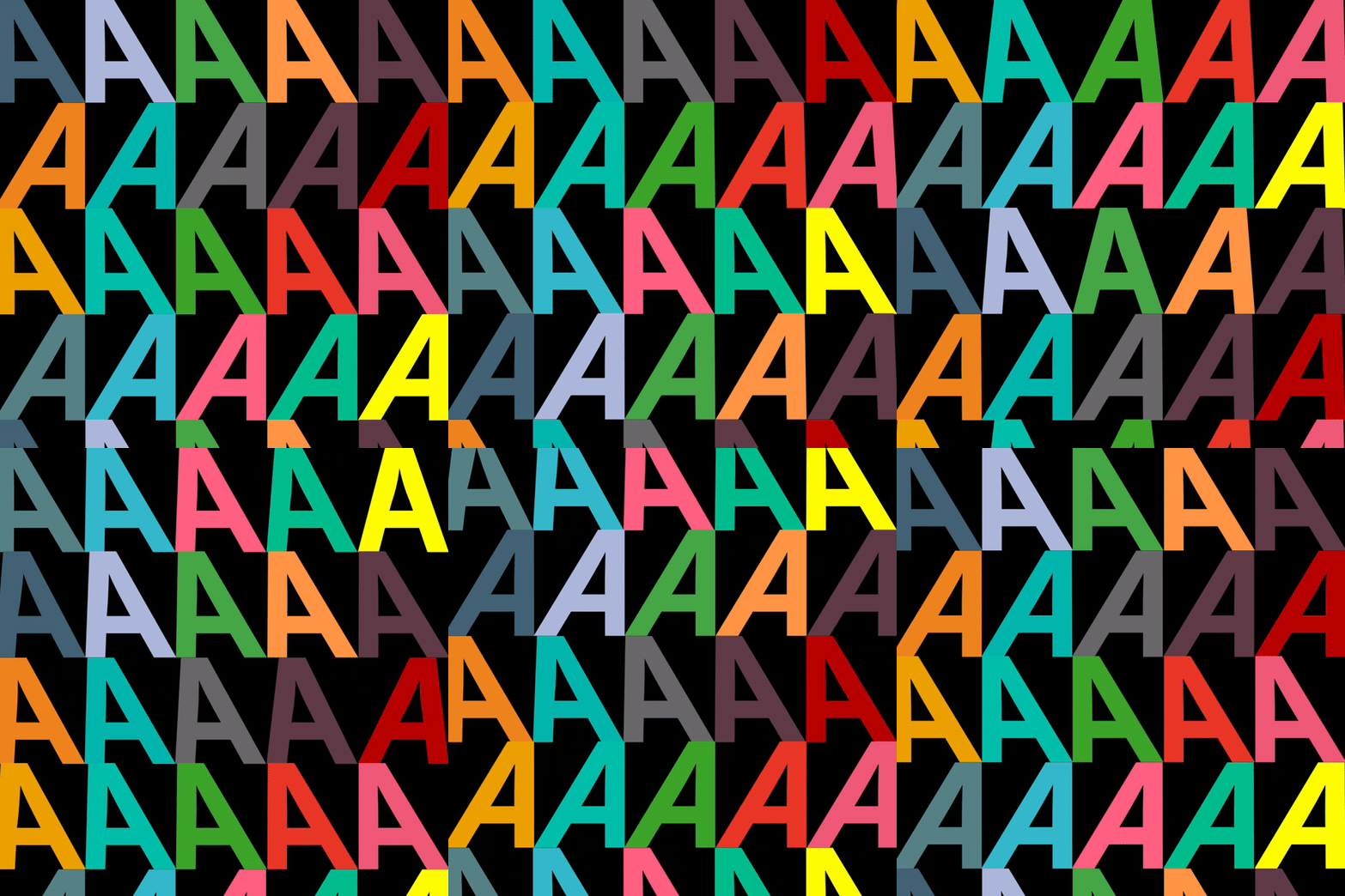
Thonik’s meticulous design process extends to the museum’s color palette, drawing inspiration from the vibrant hues of autumn in Almaty. The central color scheme, featuring four shades of yellow paired with black or white typography, reflects the museum’s connection to its surrounding environment. Also, a secondary, ever-changing color palette is drawn from the museum’s artworks, set to transform with every new exhibition. This dynamic color set allows for versatility in communication while maintaining a strong visual connection to the museum’s collection. The grid for these moments of block color follows the same logic as the logo, ensuring cohesion across communication materials. The selection of PangramPangram’s Neue Montreal as the secondary type fulfills linguistic requirements, accommodating Cyrillic, Russian, and Latin characters, further enhancing the museum’s visual and linguistic diversity.

Reaching a Broader Audience
For Almaty Museum, the primary objective behind developing an identity is to establish a presence that extends beyond the confines of the physical gallery and attracts a larger audience. With this in mind, the design endeavors to encourage people to visit the Almaty Museum of Art while simultaneously enhancing their understanding and admiration of art and culture. In essence, the identity seeks to create an immersive and engaging experience that captivates the public and inspires them to explore the world of art in greater depth.
The Takeaway
Studio Thonik’s design for the Almaty Museum of Arts is a truly remarkable achievement. The design is innovative, bold, and transcends traditional museum branding, offering a dynamic and versatile identity that extends beyond physical gallery spaces. The new identity is characterized by a vibrant color palette, harmonious logo system, and an infusion of motion that embraces duality and artistic expression. The use of a forward-thinking approach in the new identity enriches public engagement with art and culture. By promoting visits to the institution and fostering a deeper appreciation for creativity and expression, the museum hopes to encourage a wider audience to engage with the arts. The designers’ approach to the identity is grounded in a belief that art should be accessible to everyone, and this is reflected in the design’s bold, vibrant, and dynamic aesthetic.


