Why Adobe’s Brand Refresh Is More Than Just a Pretty Logo?


When you’re the brand behind the software that every designer uses, your branding game has to be on point. Adobe gets this, which is why their recent brand refresh is a masterclass in evolving a global icon. In 2025, a solid brand is what makes or breaks corporations, and Adobe’s timely evolution has resulted in a more streamlined version of itself.
A Logo That Feels ‘Inevitable and Timeless’
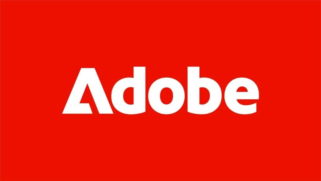
At the heart of this refresh spearheaded by the brilliant minds at Mother Design, is a confident new logotype that honors Marva Warnock’s original 1982 design. Mother Design aimed for something that feels both ‘inevitable and timeless,” as if it were always a fundamental part of Adobe’s identity. The redesigned Adobe brand achieves this feeling by fusing the ‘A’ icon and ‘Adobe’ wordmark into a single design which makes it more cohesive and less corporate.
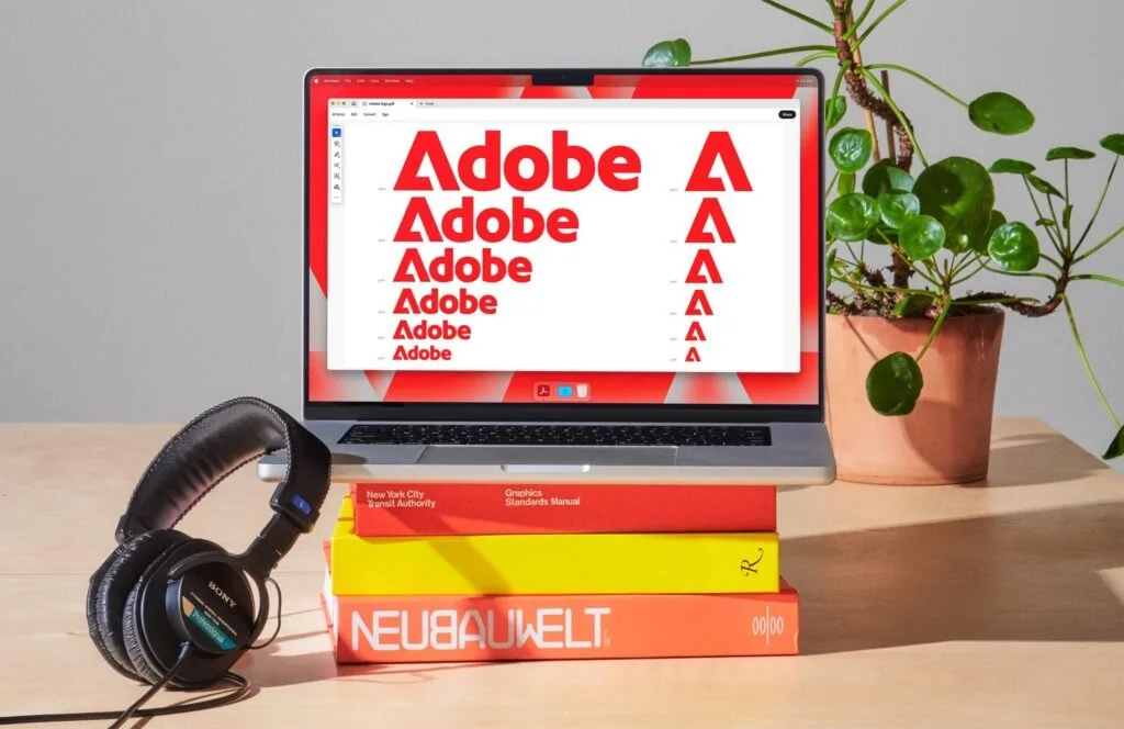
This isn’t just about aesthetics; it’s about brand clarity. Previously, the icon and wordmark felt disconnected. Now, they’re united in a positive-space expression that streamlines Adobe’s visual communication.
Strategic Simplicity with a Sharper Palette and ‘The Adobe Lens’
Adobe’s brand refresh goes beyond just the logo. A move that colour theorists will love, Adobe has focused its colour palette on black, white, and a bolder, clearer Adobe Red. This strategic simplification makes the design system easier to maintain and harder to forget. And with the Adobe Lens a red frame that highlights images and offers instant brand recognition across diverse applications has been meticulously designed for flexibility and adaptability across platforms. This symbolizes Adobe’s role as a portal to creativity.
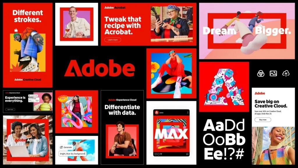
The new Adobe Brand has evolved throughout the entire product ecosystem which uses Adobe Clean Display and the unified motion behaviors of Spectrum, Adobe’s product design framework. From redrawn icons to flexible containers, everything has been touched with the intent of brand alignment.
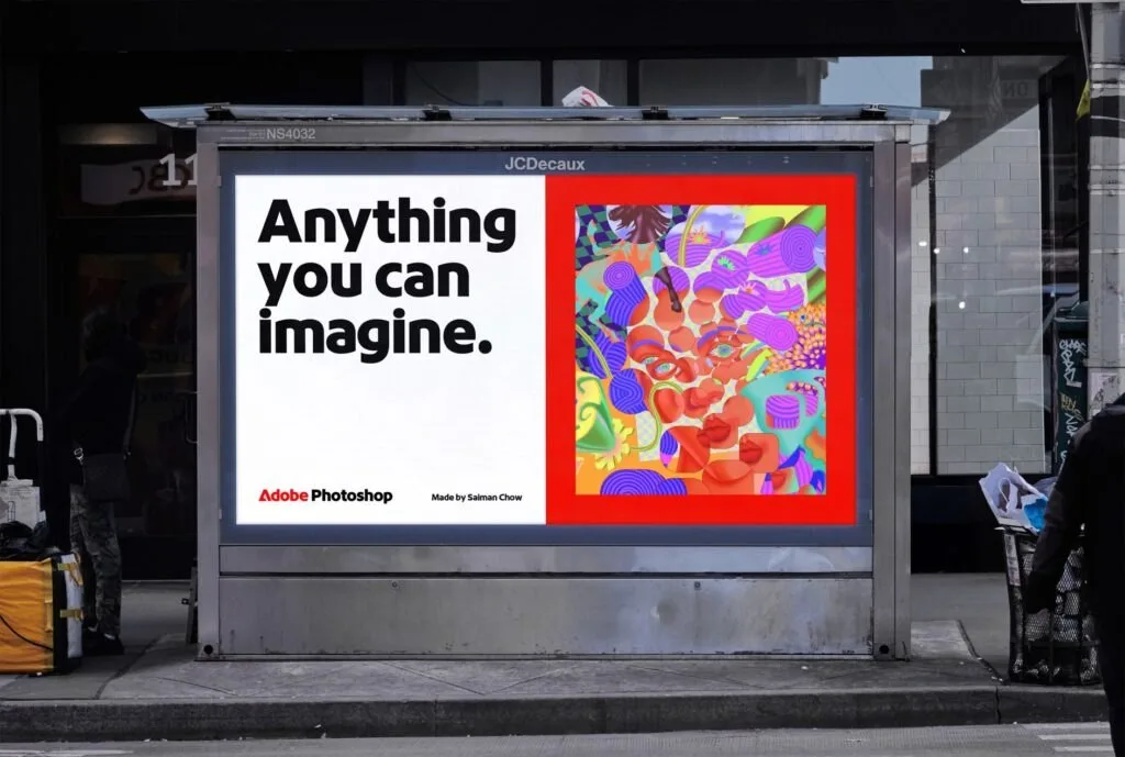
Lessons For Brand Designers
What makes this redesign so effective is how unshocking it feels. The visuals are fresh and vibrant, yet everything feels natural, as if it’s always been there which is exactly what Mother had envisioned. This is a prime example of evolving a global brand with deep heritage, maintaining recognition while preparing for future expansion.
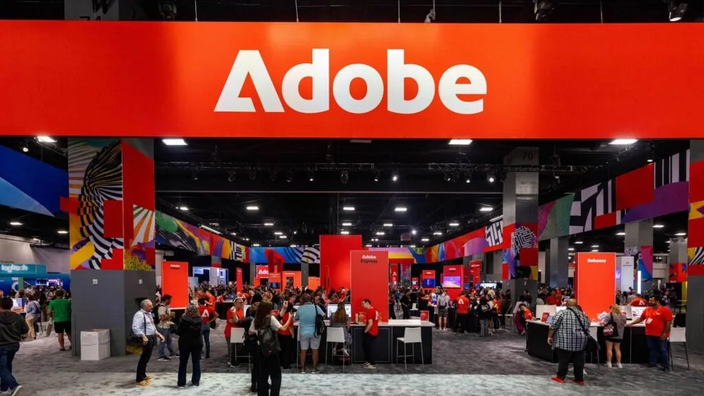
Mother Design didn’t scrap the old logo and branding. They evolved it. This is a reminder that smart redesigns don’t alienate long-time users. Instead, they make everything feel just a bit more… inevitable. This Adobe Brand evolution is mature and more of a “realignment” rather than a “rebrand” which can offer long-time users and new ones alike something to align with.
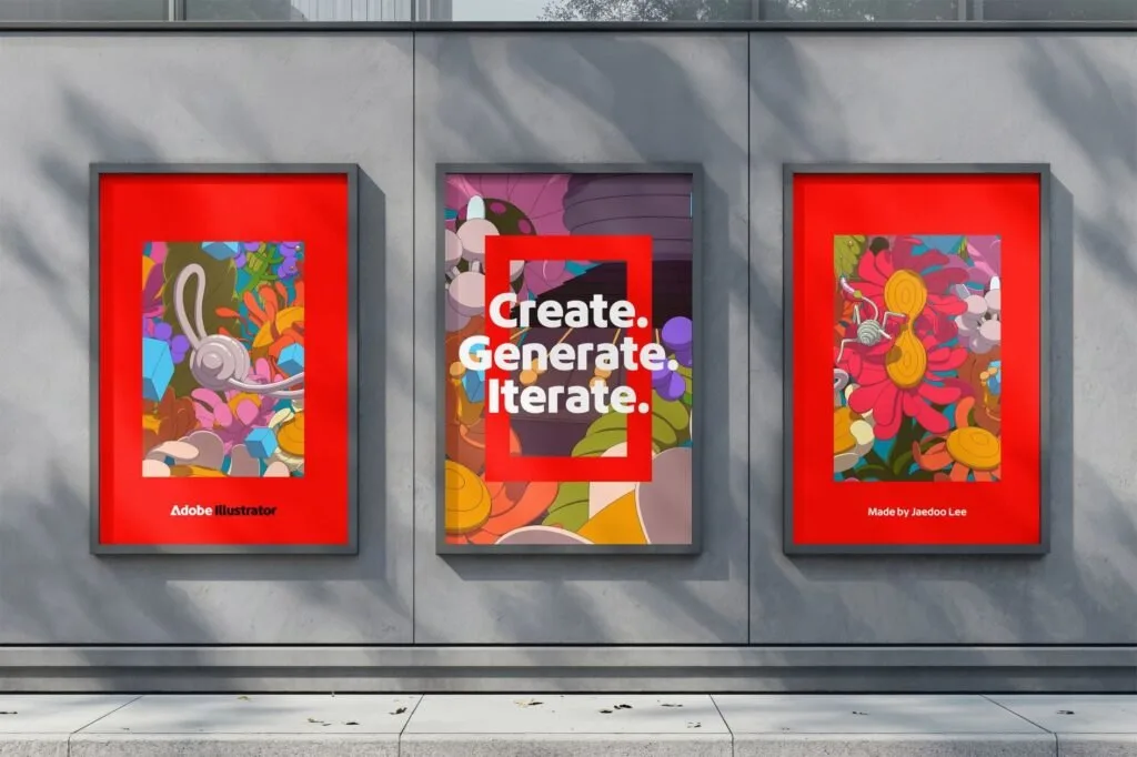
The Big Picture
Adobe’s recent brand refresh is a masterclass in evolution, blending heritage with modernity. The redesign feels inevitable and timeless, with a cohesive logo and streamlined visual communication. The focused color palette and Adobe Lens add to the brand’s clarity and recognition. This refresh demonstrates that smart redesigns can maintain recognition while preparing for future expansion, offering a valuable lesson for designers. The result is a mature brand evolution that resonates with both long-time users and new audiences.
Keep reading