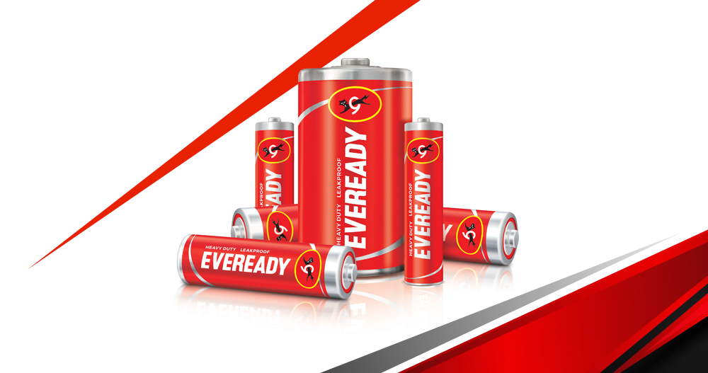
Eveready Industries India Ltd has introduced its new brand logo and tagline for a contemporary new identity. It seeks to connect the new generation with its power of infinite possibilities in the future. The iconic Eveready logotype held within the Red Ellipse or a disc power button brought together the typeface and the Cat-O-9 reflecting strong cues of energy and authority.
The Eveready brand ended up defining a generation. It transcended the boundaries of advertising and became a youth slogan in the 90s – an attitude, an endless craving for the power to express youthful energy. The brand identity and tagline needed to be dynamic and relevant. As such, the brand refresh drew from Eveready’s inherent association of power/energy, giving rise to a contemporary new identity with infinite possibilities.
It’s a transformation towards a future committed to innovation, vibrancy, modernity, trust, and empathy. Anirban Banerjee, Sr. Vice President and SBU Head (Batteries & Flashlights) of Eveready Industries India Ltd said the iconic Eveready brand has enhanced its respect, reach, and recall over time, matching its products and quality with the best in the world. “With evolving consumer needs, the brand needed to transform and expand its portfolio, offering powerful, premium, and innovative products.”
Banerjee said it was important for the brand to be seen as relevant and contemporary across age groups in the new world as it straddled the new portfolios. “What happens when you pass energy through the Eveready disc? It starts to move and gather momentum. As the pace of the spin increases, the moving shape assumes the form of an infinity symbol. The new logo in motion stands for the brand’s vision of limitless progress and infinite power.”
Sukesh Nayak, CCO, of Ogilvy India, believes Eveready stands for limitless power and dynamic possibilities. “It is ever evolving, constantly changing and forever transforming to keep India moving towards exponential progress. This zest for dynamism, infinite energy, and endless possibilities finds form in the newly revamped Eveready logo. The new logo is a symbol of power without a pause. Revamped and animated, it evokes the idea of momentum, forever on the go.”
Eveready is a leading brand in enhancing people’s quality of life with innovative, transportable energy and lighting solutions. With over 50 percent of its share in the Indian consumer battery market, Eveready has long become a name synonymous with the category. The brand’s legendary catchphrase “Give Me Red” continues to resonate with consumers even after decades of its inception.
Also Read: Brand Transformation: Espirit Preparing for Major Relaunch
