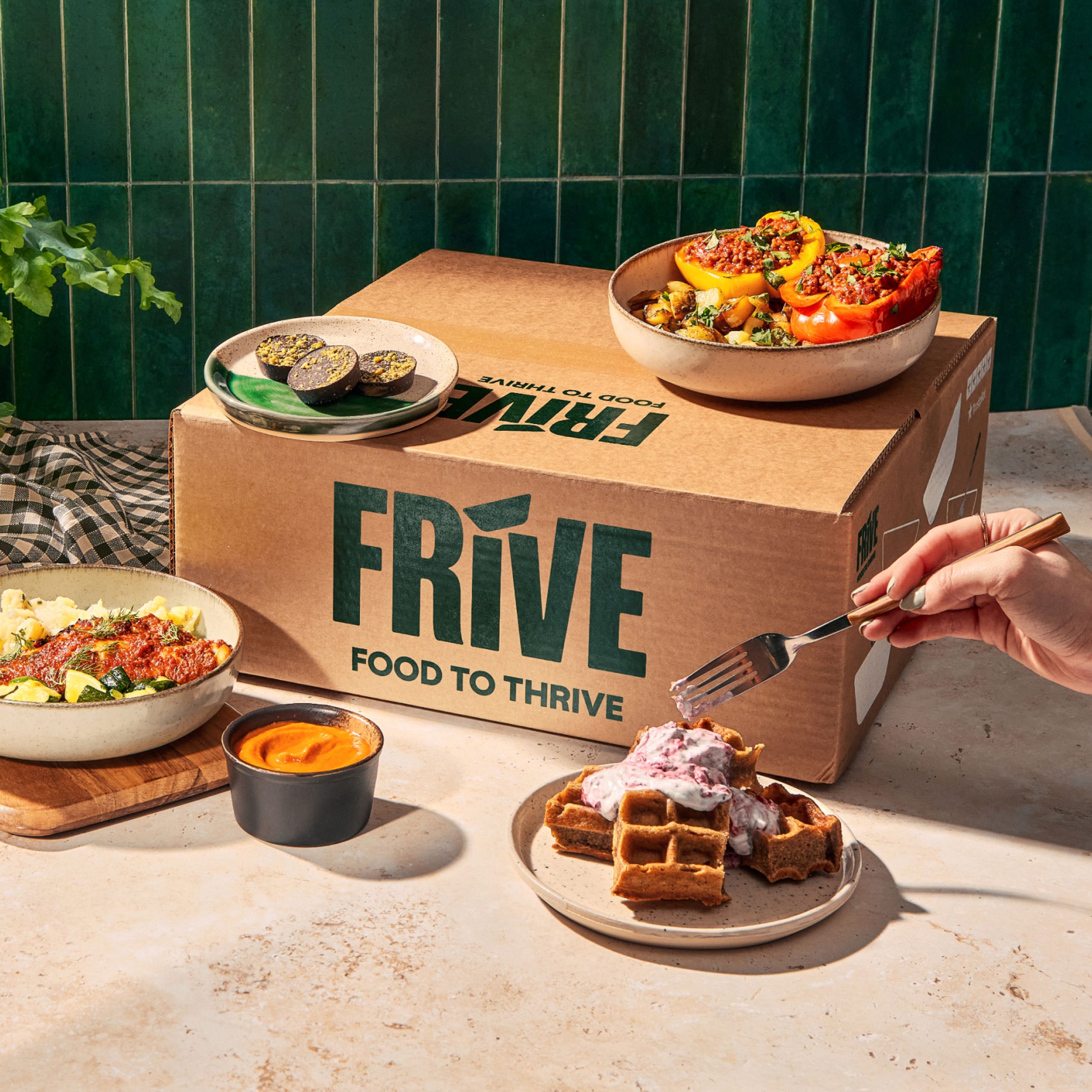
Frive, the UK’s top ready-to-eat meal brand, has launched its new identity and revolutionized the way people eat in the UK. Initially known as Lions Prep, Frive catered to gymgoers and fitness enthusiasts with its convenient and healthy meal options. However, the brand saw an opportunity to expand its reach and provide a new way for everyone to eat well. With the rebrand, Frive aims to challenge preconceived notions about quick and healthy meals. Let’s delve into the journey of Frive’s transformation and its mission to make nutritious eating accessible to all.
Lions Prep: A Success Story in the Fitness World
When Lions Prep entered the ready-to-eat food delivery market in 2016, it focused on appealing to gymgoers and fitness lovers. The brand quickly gained popularity by offering quick and convenient healthy meals and became the highest-rated ready-to-eat meal delivery subscription in the UK. The success of Lions Prep was fueled by its presence as a health and fitness social media sensation and received rave reviews from renowned publications like Vogue, GQ, and Cosmopolitan.

The Journey to Frive
Recognizing the opportunity to reach a wider audience, Lions Prep embarked on a rebranding journey by joining forces with the creative agency Among Equals. The goal was to provide more people with a new way to eat well while maintaining convenience. George Taylor, the CEO of Lions Prep, emphasizes the need to cater to millions of individuals who strive to lead a healthy lifestyle but cannot sacrifice convenience due to time constraints. This realization prompted the transformation of Lions Prep into Frive, representing the brand’s commitment to providing food that helps individuals thrive in every aspect of their lives.

Making Health and Convenience Coexist
Frive aims to challenge preconceived notions about ready-to-eat meals, debunking the belief that quick and easy equates to ultra-processed, while healthy implies time-consuming. The brand’s new name, an abbreviation of ‘food to thrive’, encapsulates its guiding principle and tagline. Frive’s mission is to offer nutritious meals that support holistic health without compromising on convenience. By redefining the perception of ready-to-eat meals, Frive seeks to make healthy eating accessible to everyone.
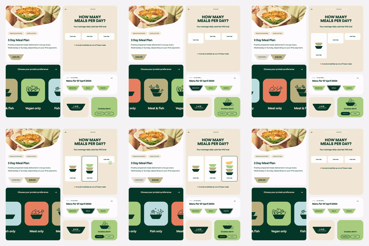
Crafting a Distinctive Identity
Among Equals emerged as the natural choice to assist Frive in transitioning from a niche market to the mainstream. The collaborative effort aimed to make the brand accessible to diverse individuals, ranging from busy professionals seeking healthy options to families in need of quick and nutritious meals. The strategic partnership with Among Equals played a crucial role in reshaping Frive’s identity, ensuring that it resonates with a broader target audience while retaining its loyal customer base.
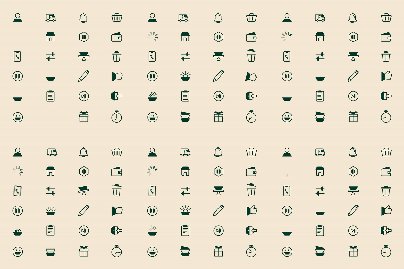
To communicate Frive’s product in a saturated market, Among Equals adopted a bold approach, tapping into the health-conscious and purposeful elements of the company. The rebranding efforts focused on infusing the brand with a distinctive visual identity, incorporating a simple food tray as a central graphic element. This versatile asset, integrated into the logotype and various brand elements, serves as a unifying symbol across Frive’s visual ecosystem, reflecting the brand’s commitment to delivering ready-to-heat meals with a strong emphasis on convenience and nutrition.
Reinforcing Brand Cohesion
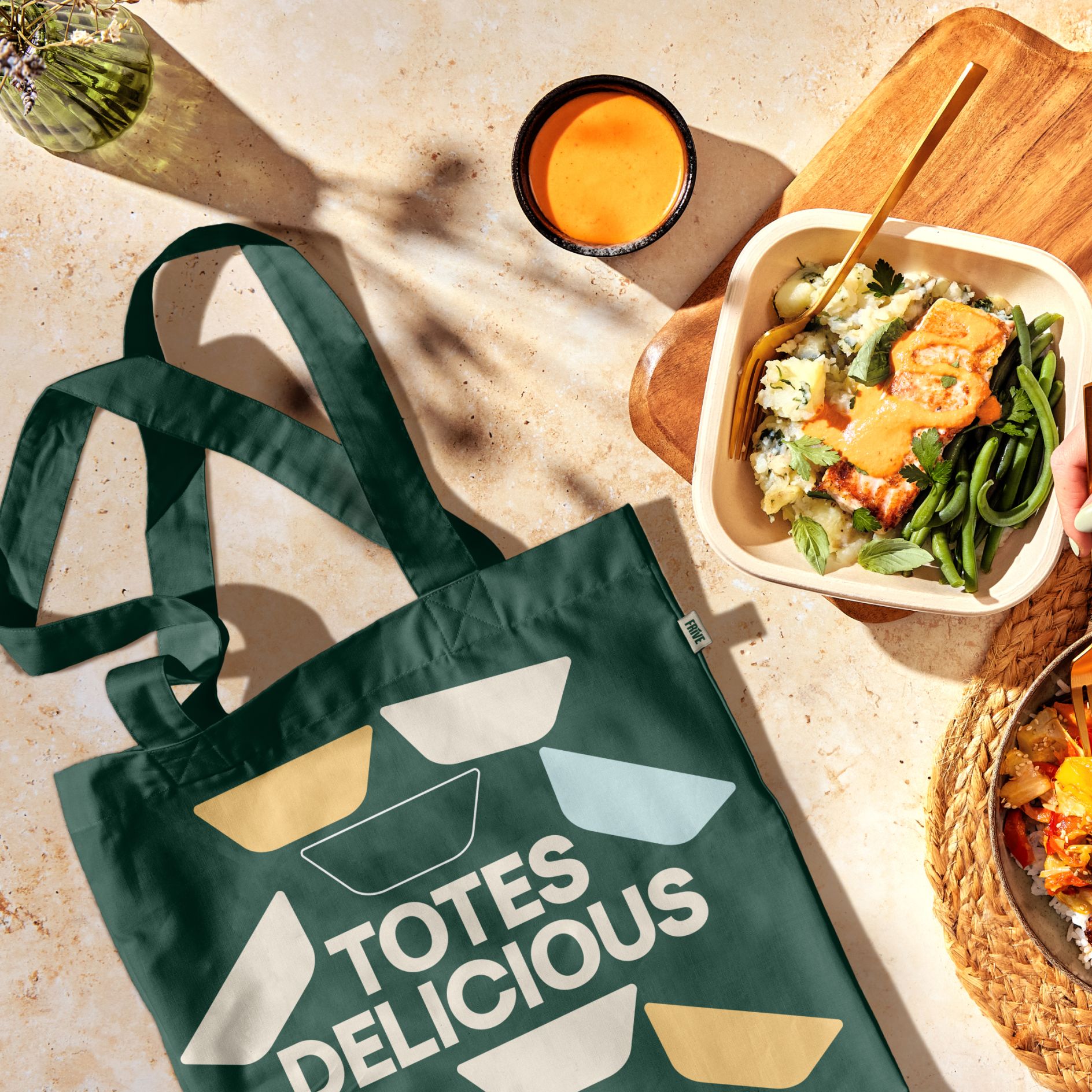
Frive’s new logotype, based on the Old School Grotesque by Kilotype, underwent meticulous editing to seamlessly integrate the bowl device, symbolizing the brand’s core offering. The brand’s typography, developed in collaboration with type foundry Displaay, further reinforced Frive’s visual identity, reflecting a balance of modernity and functionality. The color palette was refined to evoke a fresh, natural, and sophisticated aesthetic, aligning with the brand’s mission to offer organic yet contemporary meal options.
A Gloriously Simple Design Process
The design process, marked by a seamless collaboration between Frive and Among Equals, was characterized by trust, shared ambition, and a deep understanding of the brand’s vision. The partnership facilitated a swift yet thorough design process, resulting in a brand that heralds a new era for the business. The cohesive relationship and collaborative spirit between the teams underscored the simplicity and effectiveness of designing an impactful brand that resonates with a diverse audience.
Final Thoughts
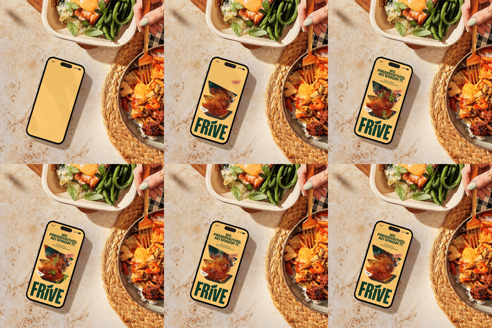
Frive’s collaboration with Among Equals marks a significant milestone in the evolution of ready-to-eat meals. By rebranding and challenging preconceived notions, Frive aims to revolutionize the way people eat in the UK. With a focus on providing nutritious meals without sacrificing convenience, Frive seeks to make healthy eating accessible to all individuals, regardless of their busy lifestyles. The transformation from Lions Prep to Frive reflects the brand’s commitment to helping individuals thrive holistically, and the partnership with Among Equals has been instrumental in achieving this ambitious goal.
Also Read: Potluck’s New Identity: Brightly Colored Branding Celebrates Korean Tradition

