The English Premier League unveiled a refreshed brand identity at the start of the 2023/2024 season. The update aims to make the Premier League’s iconic assets ‘bigger, bolder and brighter’. Let’s delve into the magic behind this iconic rebrand.
Building on a Years-Long Brand Evolution
While the essence of the Premier League brand remains intact, it undergoes a process of ‘everyday iteration’. This approach ensures that the league keeps evolving in close collaboration between Nomad Studio and internal teams. Nomad Studio, a creative agency, has been instrumental in shaping the Premier League’s brand evolution. Nomad, also the League’s current creative partner, has worked on branding for everything from anti-racism campaigns to ePremier League. Their goal is to bring the brand forward through everyday changes. They continue that evolution following a major overhaul in 2016 by DesignStudio and DixonBaxi.
Making the Assets More Recognizable
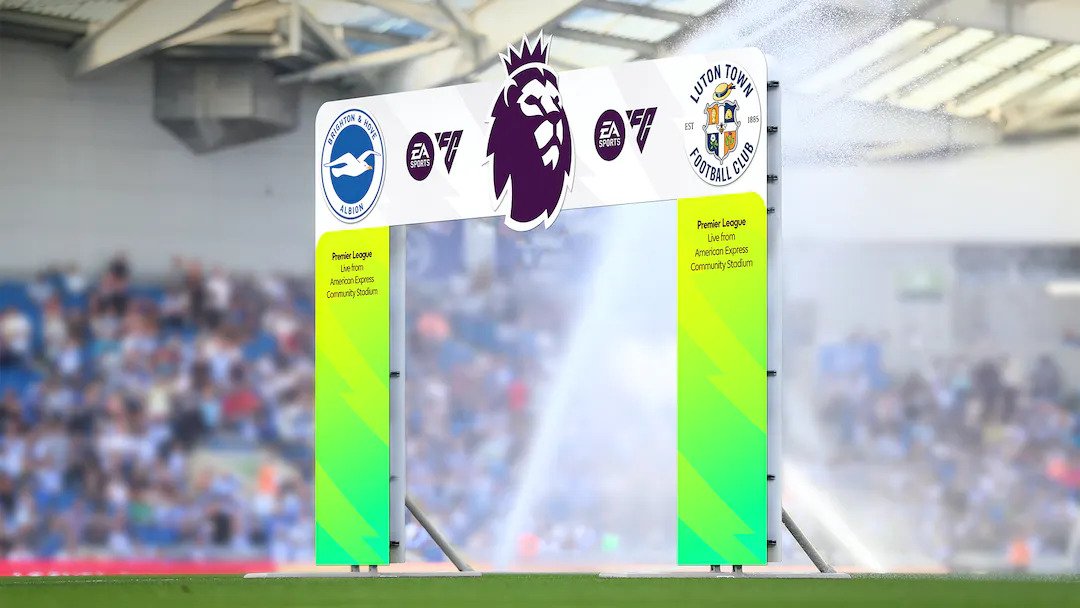
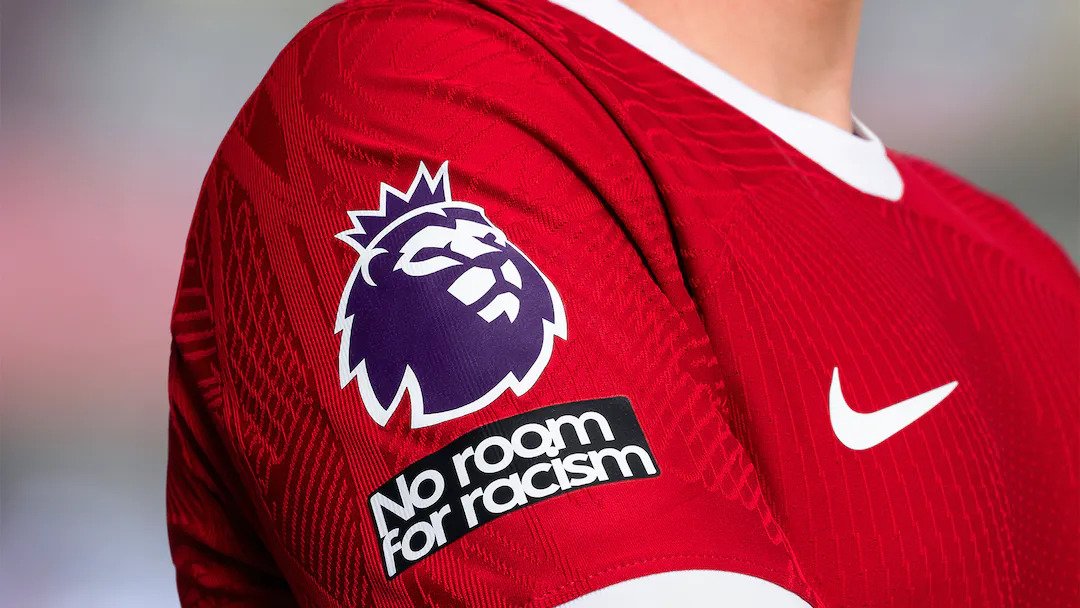
For this update, the focus was amplifying the Premier League’s presence on match days and broadcasts. Nomad Studio places the lion logo at the forefront of the brand. This iconic symbol becomes a ‘much more robust asset at the heart of the action’. The lion, often seen as the figurehead of the Premier League, takes on a central role in the league’s visual identity.
Refining the Brand Elements
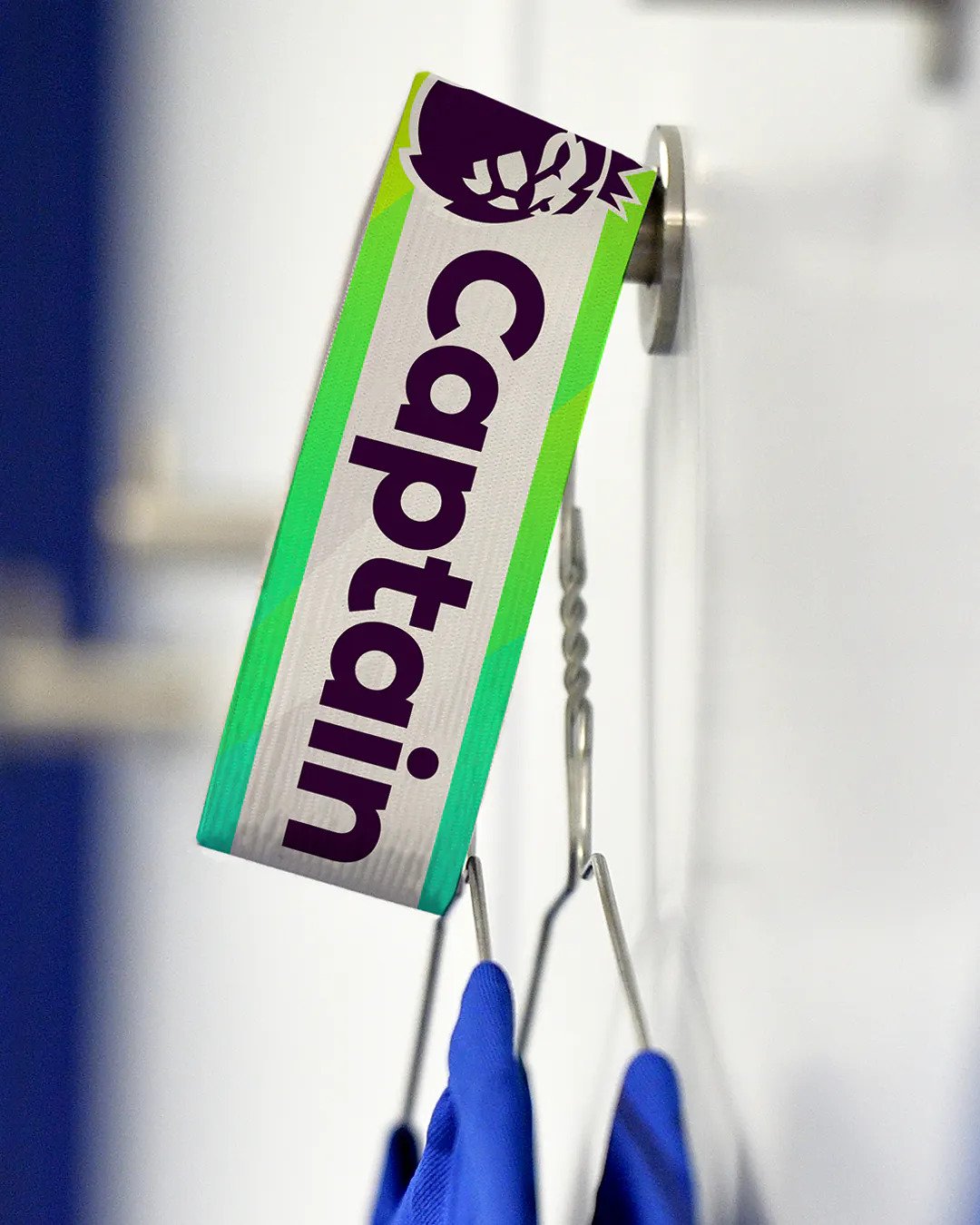
The brand update includes refinements in the color palette, simplifying vibrant tones into gradients for recognizability. Typeface choices are streamlined, balancing action with information and excitement. The showstopping graphic pattern, while still relevant, takes a secondary role to highlight the Premier League’s messaging and individual clubs.
Sleeve patches at the season opener displayed the lion front and center. Unifying the previous light and dark lion logos makes it more versatile and avoids visual issues like ghosting.
The wordmark can stand alone for flexibility. Refined colors and typefaces balance information. Graphic patterns take on a secondary role to highlight the Premier League name. All these shifts make the branding more iconic in the vein of powerhouses like Apple and Nike.
Careful Iteration of a Well-Loved Brand
Updating such an established brand requires care to maintain equity. Like Google‘s subtle logo changes, these measured updates bring the Premier League up to date. With so many touchpoints from broadcast to community outreach, consistency across mediums is also crucial. Premier League’s extensive creative team ensures alignment.
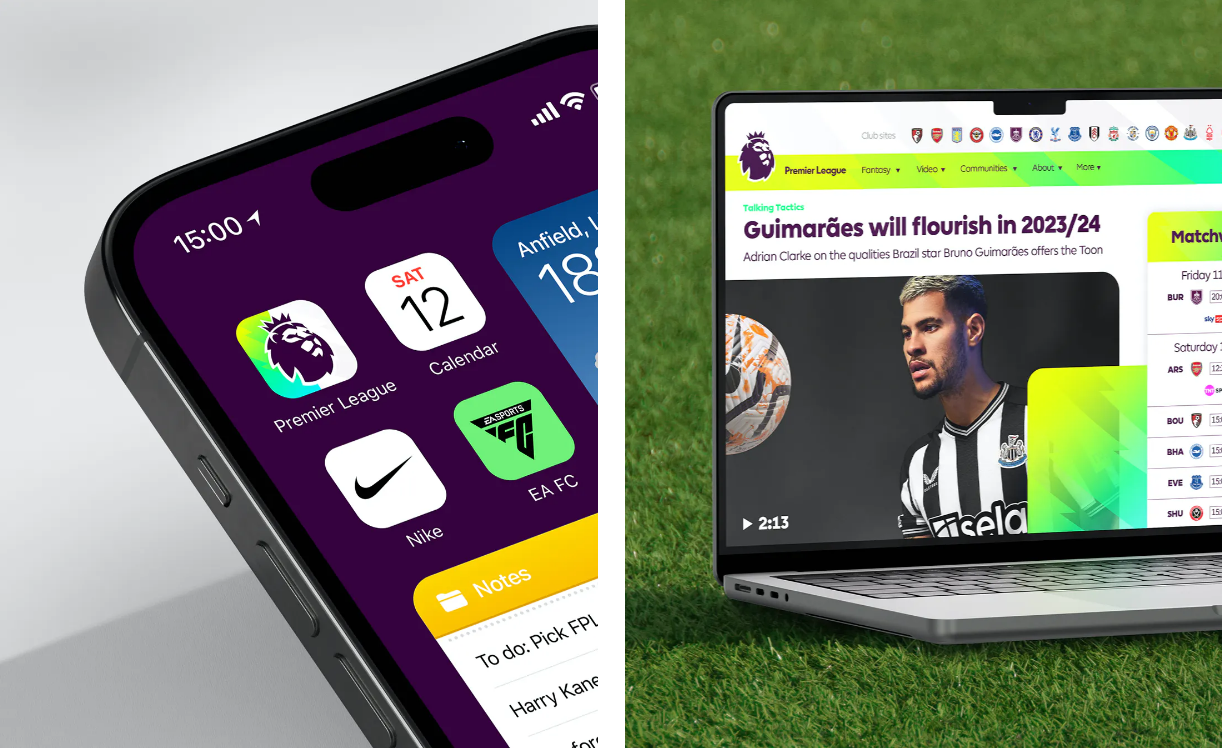
By retaining what fans know while amping up recognizability, the Premier League strides into its latest season with a look that builds on its legacy. The bolder branding aims to extend its already-passionate following. This thoughtful revitalization shows why the Premier League remains a beloved global sports phenomenon. Fans can expect the same excitement from their favorite football league, now wrapped in a bigger, brighter package.
Final Thoughts
The Premier League has updated its brand with a more robust lion logo, refined color palette, and simplified typefaces. The update makes the brand more iconic and recognizable while retaining its core essence and resonating with fans. The league’s commitment to staying relevant and capturing the imagination of football enthusiasts is a testament to its commitment.
