The CW, the home of popular shows like Riverdale, The Flash, and Superman & Lois, has unveiled a new logo and brand identity that aims to reflect its transformation and growth as a network. The new look, which debuted on Sunday during the Critics Choice Awards, features a bold and vibrant color palette, a simplified and modernized logo, and a unique symbol that represents the network’s creative vision. Let’s explore how The CW reinvented its brand image and what it means for its viewers and fans.

‘The’ Drop
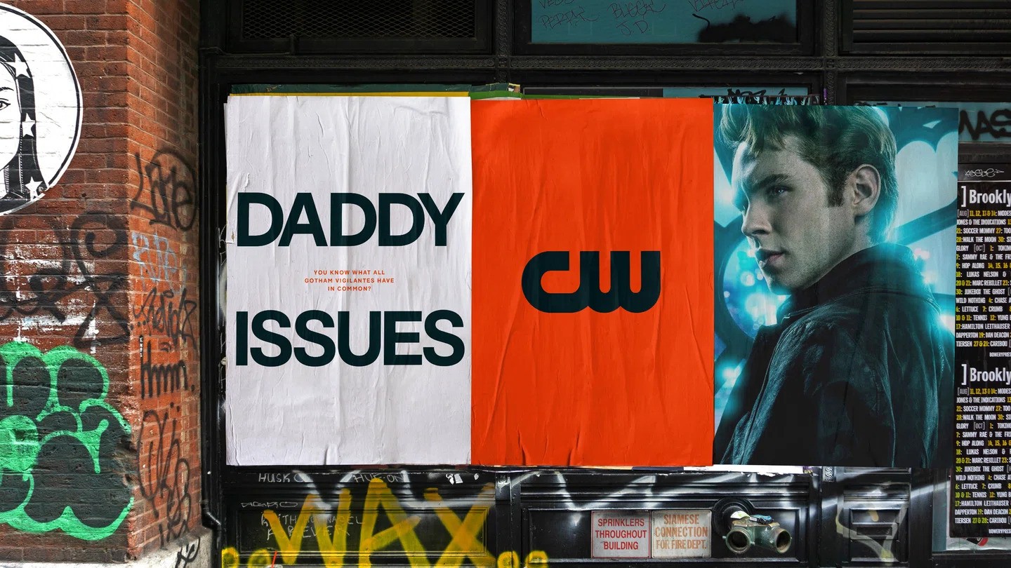
The CW has a new logo that removes the word ‘The’ to make it more adaptable to different platforms. The network’s chief marketing officer clarified that the name will still be ‘The CW’ and dropping ‘The’ was done to improve the design and functionality. The new logo has a bolder typography and retains the shape of the original one. The rebranding was done by London agency DixonBaxi, which has also worked with other major names in television, such as Max, Hulu, and ITVX.

A More ‘Spicy’ Color Palette
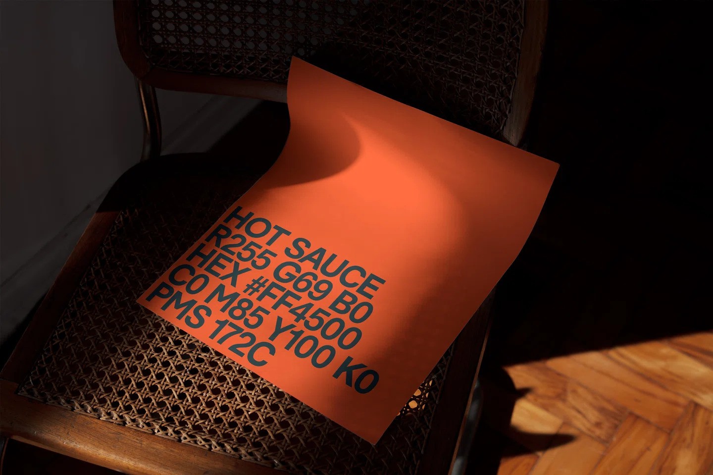
For CW, DixonBaxi has introduced a new color palette called “CW hot sauce” with a red-orange hue as the main color, complemented by pink and light green. Complemented by colors like Pepper and Salt, the new visual identity creates a vibrant and memorable experience for viewers. This change was made to stand out from competitors and convey the network’s personality and energy. The new palette replaces the previous green color, which became generic over the years.

The Stage
The CW’s brand DNA inspired the creation of a new symbol called “the stage.” This symbol, derived directly from the logo, serves as a flexible and dynamic element in on-air spots. It acts as a holding device for curated content, enabling the network to showcase its stars, show titles, and share information with viewers. The stage symbolizes The CW’s commitment to delivering captivating and engaging programming.

Curiosity Igniting Sonic Branding System
The CW aims to captivate audiences with a unique sonic branding system. The audio element, obtained from the sound of a striking match, signifies the role of igniting curiosity. This sonic branding aligns with the network’s ‘hot sauce’ color palette and serves as an emotional trigger, enticing viewers to discover what The CW has to offer. The network plans to further develop this element to create a memorable and distinctive audio identity.
Crafting Attitude for a Diverse Audience
Navigating the diverse regions of the United States, DixonBaxi prioritized tone of voice as a key element in The CW’s rebrand. The challenge was to deliver messaging that allows the brand’s voice to shine through, creating a final aesthetic that is both “premium” and “deadpan,” with a strong emphasis on attitude. The choice of the sans serif F37 Bolton font contributes to the direct and concise foundation DixonBaxi aimed to achieve.

Ditching the Slogan, Embracing the Story
The CW has decided to retire its previous tagline, “Dare to Defy.” Instead of relying on a short, pithy line to encapsulate the network’s essence, The CW aims to let its shows and personalities speak for themselves. Although not ruling out the possibility of a future tagline, the network believes that its programming and brand experience should be the driving force behind its identity.

When Can We Expect to See The Change?
The CW’s brand refresh is now available to watch on-air and across its social media handles. However, the full implementation of the new brand identity across all platforms, including the network’s streaming platform and affiliates, will take some time. The CW acknowledges the challenges posed by the evolving landscape and is committed to making its brand more easily accessible to viewers nationwide.

The Big Picture
The CW’s brand evolution marks an exciting chapter for the network. With a refined logo, a vibrant color palette, and innovative symbols, The CW aims to captivate audiences and create a consistent brand experience. The network’s commitment to engaging programming, live sports, and a diverse array of content will be supported by its refreshed brand identity. As The CW continues to evolve, viewers can look forward to an immersive and unforgettable entertainment experience.
Read More: Beyond Conventions: Paist’s Rebranding Ignites a Fresh Wave in Toothpaste Design


