In the Japanese city of Kurashiki, sisters Yumi and Hito ditched their dull office jobs to pursue their passion for baking. The result was Bakery Two, a charming neighborhood spot overflowing with warm smiles and delicious bread and pastries. Behind this charming bakery lies a remarkable story of passion, determination, and creative branding by Stamp Works that has contributed to its success. Let’s explore the story of how Bakery Two crafted a branding that stands out in Japan’s competitive bakery scene.

A Fresh Start for Yumi and Hito | Bakery Two
Yumi and Hito, two sisters from Okayama, were tired of their dull jobs and felt the need for a change. Their mutual aspiration of setting up a bakery filled them with enthusiasm and gave them the courage to start a new chapter in their lives. With their savings and a firm resolve, they said goodbye to their old professions and opened Bakery Two.
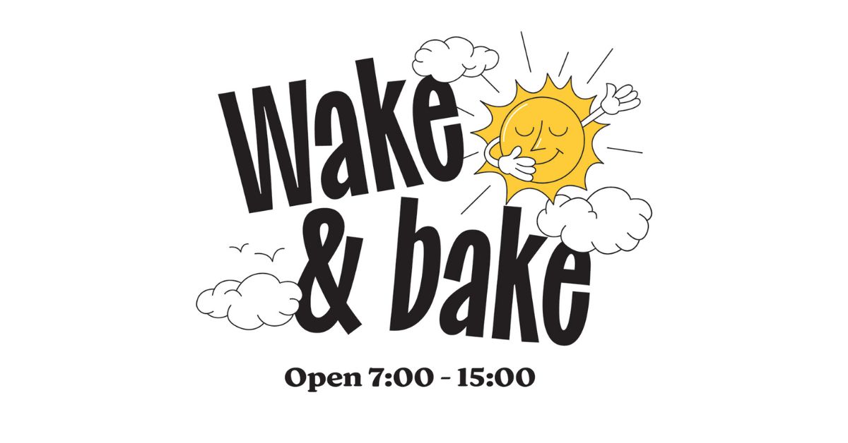
Early Mornings and Flour-Filled Dreams | Bakery Two
As the sun rose, early mornings became a routine at Bakery Two. Flour filled the air as Yumi’s artistic flair gave birth to delightful pastries and Osouzai bread. Hito’s precision ensured every creation was a masterpiece. The bakery’s warmth and the sisters’ genuine smiles soon became a magnet for locals seeking a taste of something special.

Fun Personality-Packed Illustrations
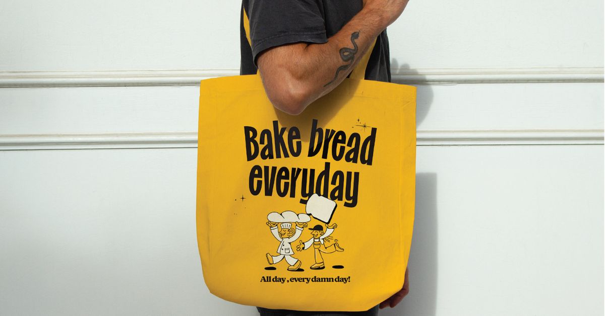
To brand their bakery, Yumi and Hito turned to Jin Fujiwara, the creative mind behind Stamp Works. He created an identity that reflects the personalities of the two founders to use them as the brand mascots. Fujiwara focused the branding around playful illustrations of the two sisters. Yumi, known for her playful and easy-going nature, specializes in Osouzai. In contrast, Hito, the perfectionist, is responsible for the bread’s quality. Quirky drawings capture Yumi crafting pastries and Hito ensuring top quality. These lively characters become the face of Bakery Two, infusing the brand with personality.

Vibrant Colors for Eye-Catching Appeal
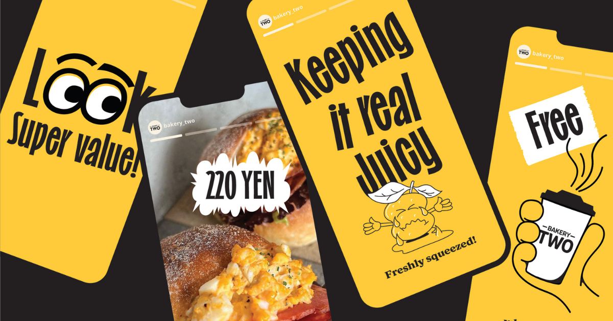
The illustrations pop with vibrant yellow and black. The bold, contrasting hues create standout visual branding. Yellow evokes cheerfulness and warmth fitting for a neighborhood bakery.
Lyrical Inspiration in the Hip-Hop Spirit
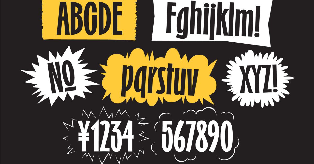
To match the owners’ hip-hop spirit, the branding takes inspiration from rap lyrics for its playful copy. The tone is upbeat and fun-loving.

Customers connect with the illustrations and remember Bakery Two’s lively attitude. The sisters beam as their passion comes across in the branding. It’s a small bakery making a big impression thanks to the power of creative design.

With witty wordplay and humorous drawings baked with heart, this branding captures Bakery Two’s charm. The sisters’ personalities shine just as brightly as their cream puffs. It’s a template for crafting a bakery brand brimming with personality.
Final Thoughts
When starting a new food business, developing a brand identity with character and visual appeal is key to standing out. Bakery Two’s delightful branding shows how infusing your logo and designs with the founders’ spirit can make a lasting impact.
Also Read: Aldi’s ‘Get a Proper Raise’ Campaign Gets a Whimsical Twist with Bread Billboard


