Dinosaurs face extinction. Again. This time, as the bold new symbols of an eco-rebellion against single-use plastics. When sustainable packaging startup De-extinction wanted to disrupt the industry, they turned to the branding agency Koto. Their goal? Craft a rebellious new identity to revitalize perceptions. The surprising solution? Revive dinosaurs as the vibrant voice of waste reduction. Let’s delve into how Koto’s creative vision has birthed a brand that embraces rebellion, sustainability, and the unexpected.
Channeling Extinct Appeal
De-extinction’s rebrand centers on an unexpected theme – bringing dinosaurs back to life as the friendly face of Eco-packaging. These prehistoric creatures ignite curiosity while sending an urgent call to action against waste.
![]()

Forging a Rebellion Against Waste
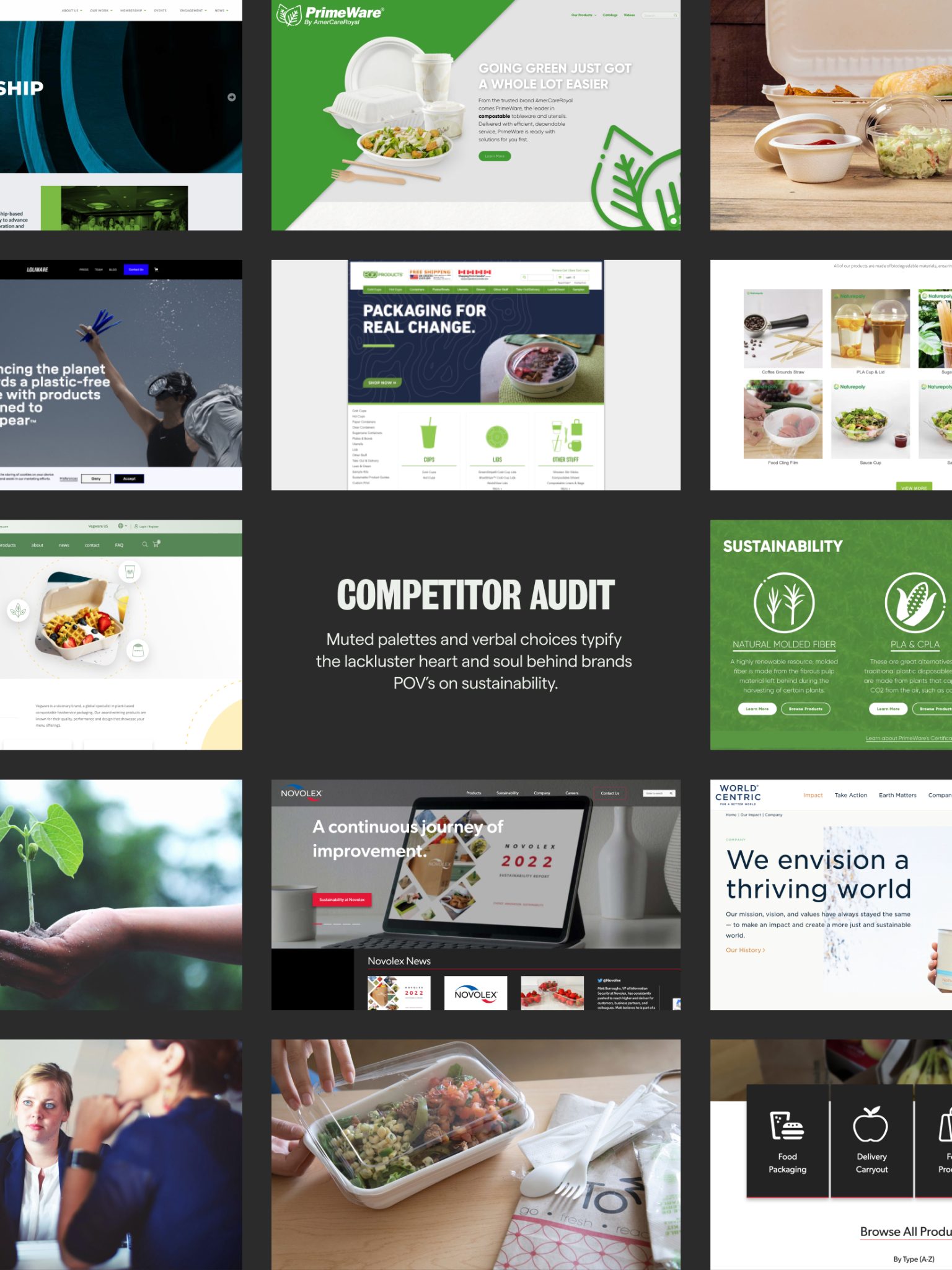
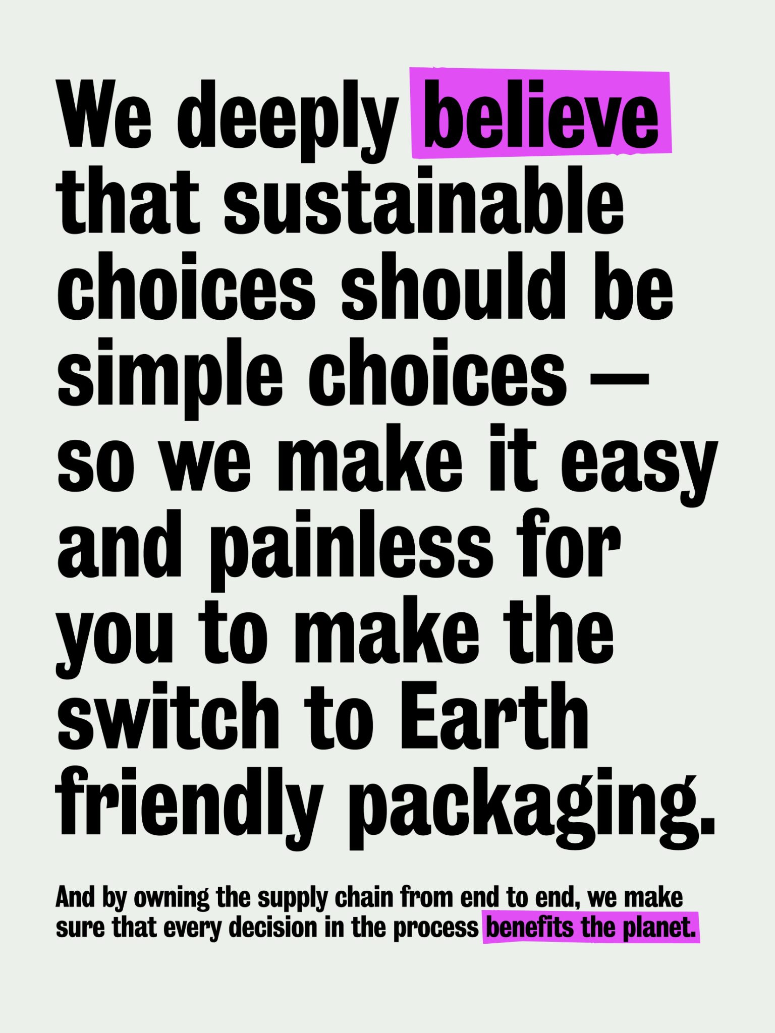
At the heart of De-extinction’s brand identity lies a resolute rebellion against waste. Koto’s early involvement was instrumental in shaping a comprehensive brand vision, from its carefully chosen name to its meticulously crafted visual identity. Rooted in the brand idea of ‘Leave No Trace,’ De-extinction invites stakeholders, including wholesalers, restaurants, and clients, to introspect their impact and actively work towards improvement. The audacious brand challenges industry norms and positions itself as a catalyst for change in the packaging supply chain.
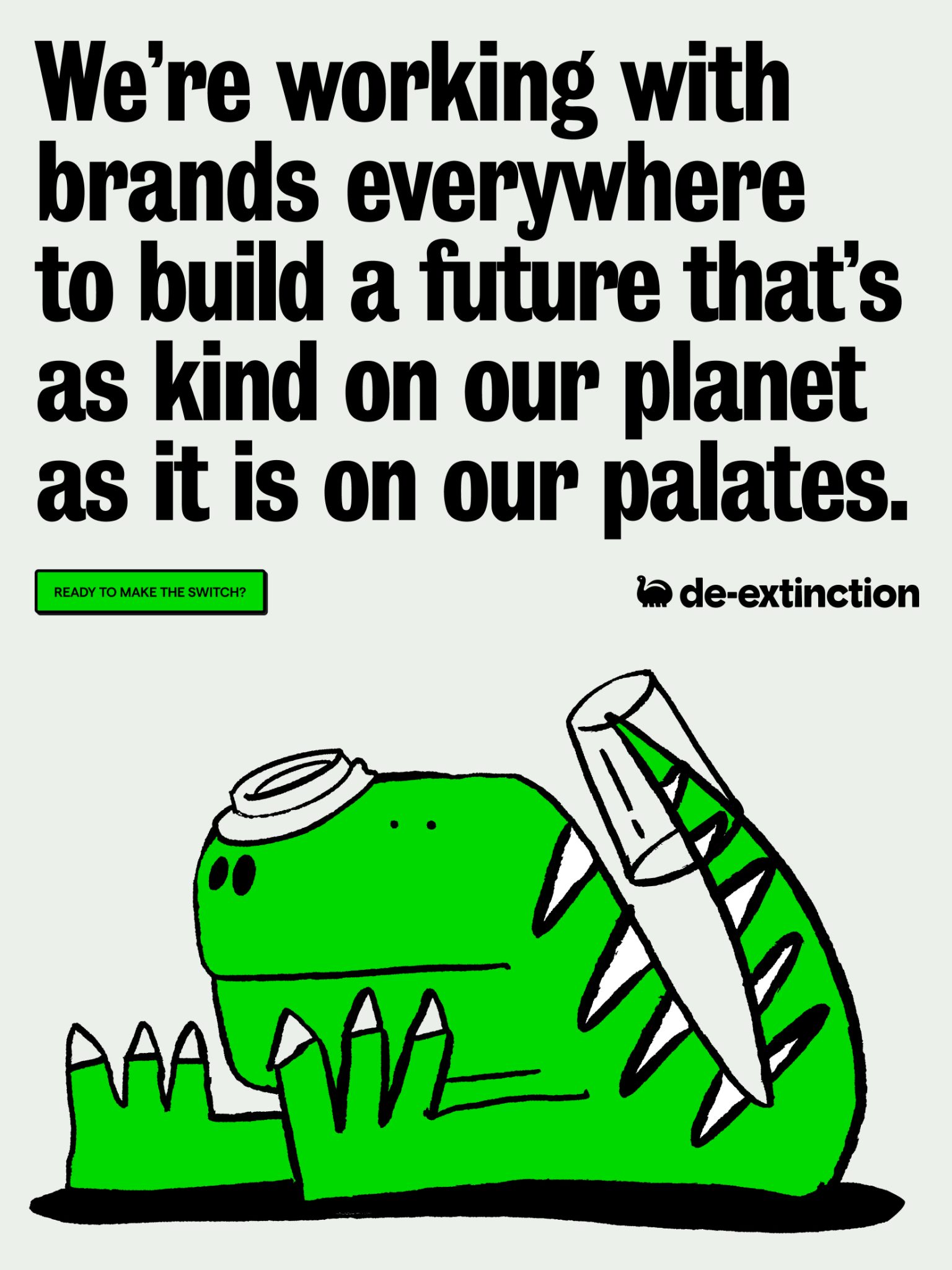
The Voice of Rebellion: ‘The Friendly Instigator’
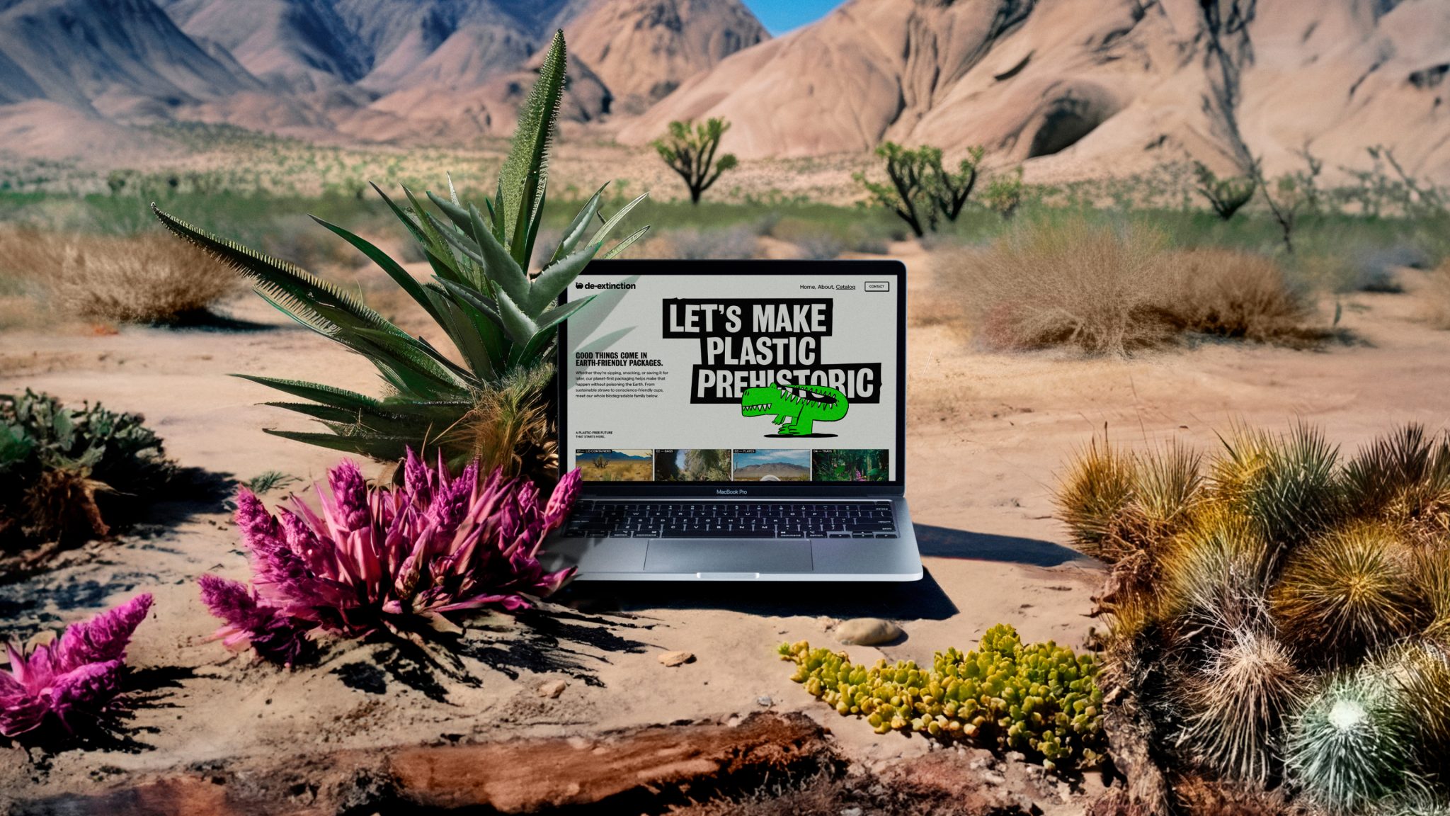
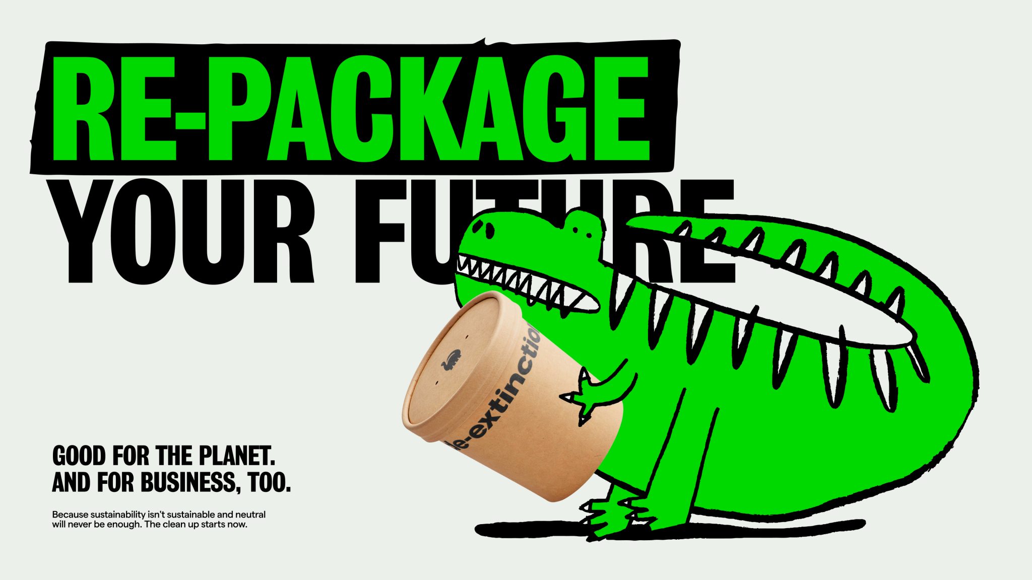
De-extinction’s verbal identity is embodied in ‘The Friendly Instigator.’ This unique persona encourages engagement through thought-provoking inquiries and audacious cues, inspiring action with its charm. The brand’s verbal principles—’ Extending an inviting hand,’ ‘Speaking candidly,’ and ‘Embracing irreverence’—guide its tone across various contexts and platforms. Creative headlines like “Let’s make plastic prehistoric,” “Go lean, go green,” or “Re-package your future” amplify the brand’s compelling message.
Design That Roars
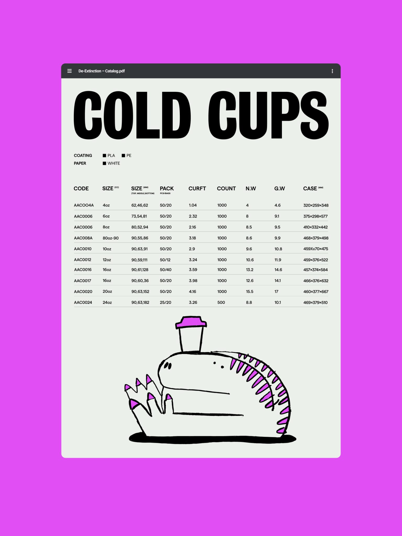
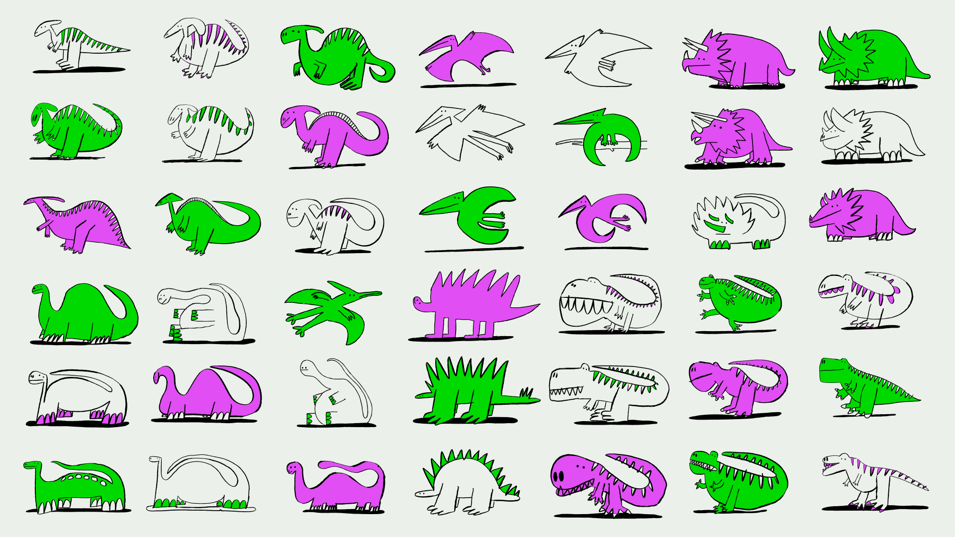
Vibrant colors and bold graphics ensure De-extinction stands out. Custom lettering evokes a primal vibe. And illustrations breathe life into friendly dinosaurs – transforming products into eye-catching stories. De-extinction’s logo—a curvy and friendly dinosaur—captures the brand’s essence. This bold emblem ensures instant recognition across platforms. The customized wordmark, inspired by the dinosaur symbol, masterfully balances simplicity and character, reflecting the brand’s core. The carefully selected Grotesque n9 font harks back to historical roots while symbolizing De-extinction’s mission to breathe new life into the old.
Making Its Mark
De-extinction’s products are distinguished through a dual strategy. First, the bold dino symbol is strategically integrated into product designs, turning everyday items into touchpoints. Secondly, Koto’s creative approach to product catalog imagery transforms it into an immersive experience. By depicting products against Jurassic-style landscapes, especially showcasing products against tropical backdrops reinforces the prehistoric motif. The brand’s vibrancy and thematic essence are vividly communicated by featuring the logo on cups and utensils making an instant visual impact.
The Takeaway
With smart branding choices, De-extinction crafted a distinctive new perspective focused on revitalizing perceptions and speaking to customers in unexpected ways. Their dino-powered rebrand shows that standing out takes rebel thinking. De-extinction leveraged unexpected visuals, witty tones, and immersive art direction to reshape how consumers see sustainability. Their bold new identity proves you can capture attention, spark curiosity and drive action through the power of perception.