Mubi, the popular streaming service known for its curated selection of films, has recently undergone a rebranding of its hybrid membership option, Mubi Go. Let’s delve into the details of the rebranding efforts, highlighting the creative changes made to the Mubi Go logo and its visual identity.
Streamlining the Logo
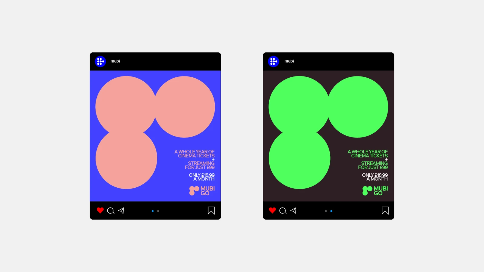
Leading the redesign is design agency Spin, which has been a long-time collaborator with Mubi. Spin, known for its innovative design choices, has taken a fresh approach to Mubi’s iconic logo for the first time. To rebrand Mubi Go, Spin has simplified the recognizable Mubi seven-dot symbol into just three dots, forming the word ‘Go.’ While the transformation may seem abstract at first glance, the three dots also resemble a hole punch, reminiscent of a cinema ticket stub. This clever adaptation alludes to the physical act of going to the movies, capturing the essence of the unique Mubi Go experience.
Tailoring Colors to Film Titles
Alongside the logo transformation, the rebranding of Mubi Go introduces a wider range of colors. Departing from the previous reliance on bright yellow and black, the new palette now embraces flexibility to suit the diverse film titles available on the platform.
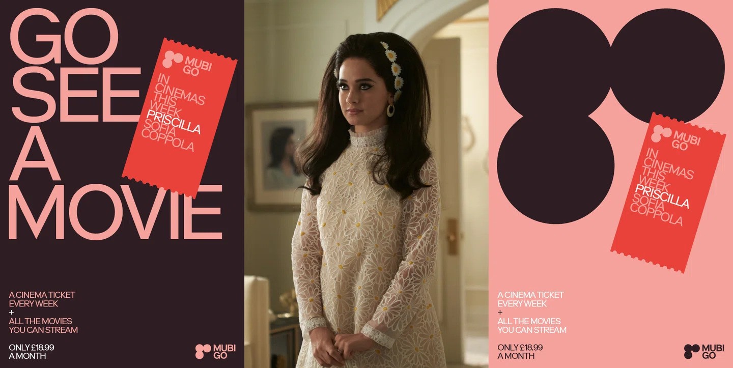
An excellent example is the movie “Priscilla,” Mubi’s largest theatrical release to date. The Priscilla-Go assets feature a vibrant mix of reds and bridal pinks, reflecting the film’s thematic elements. This dynamic approach to color allows Mubi Go to create visually engaging marketing materials that resonate with audiences and enhance their cinema trips.

Simplifying Marketing and Encouraging Cinema Experiences
Mubi Go offers an extended membership that grants users access to Mubi’s streaming titles, along with a complimentary cinema ticket every week. In response to Mubi’s request for a simpler and more evocative graphic solution, Spin incorporated ticket stubs into the rebranding. While the connection between the three circles in the logo spelling ‘Go’ may not be immediately apparent, the dots resemble the corner of a cinema ticket when applied strategically. This clever visual representation symbolizes the unique experience of going to see a movie and encapsulates the essence of Mubi Go.
Key Takeaways
- The rebranding of Mubi Go by design agency Spin breathes new life into Mubi’s hybrid membership option.
- By streamlining the logo and incorporating ticket stub elements, Spin has created a visually captivating identity that represents the physical act of going to the movies.
- The expanded color palette adds vibrancy and flexibility, allowing the brand to adapt to different film titles.
- With its fresh visual identity, Mubi Go aims to drive awareness and encourage cinema enthusiasts to embark on weekly movie adventures.
- As Mubi continues to evolve, its design choices, like this rebranding, exemplify the brand’s commitment to innovation in the streaming and cinema industry.
Read more: Navigating the Change: ESN’s Strong Identity Shifts Gears in Major Rebranding

