Graff, the iconic diamond jewelry brand established in 1960, has undergone a transformative visual evolution, inspired by the brand’s rich history and the intricate craftsmanship emanating from Graff’s London workshop. Let’s explore the backstory behind the creation of Graff’s new identity that sparkles with innovation.
Graff’s Artisanal Legacy
Design agency SomeOne delved into Graff’s archives in a unique collaboration and embarked on a journey to the heart of its century-old London workshop’s rebrand. SomeOne’s founder and executive strategic creative director, Simon Manchipp, shares that Graff’s jewelry is synonymous with “deceptive simplicity, perfect balance, and sensuous, feminine power.”
Crafting a Brand Evolution
Tasked with redefining Graff’s visual identity, SomeOne left no facet untouched. The transformation spanned photographic sets, 3D modeling, typographic systems, color palettes, and animations. While Graff’s previous identity wasn’t broken, every element was reinvented to resonate with the brand’s incredible foundations.
Graff’s London Workshop Odyssey
SomeOne’s designers immersed themselves in Graff’s London workshop, where age-old traditions meet cutting-edge innovations. The unique skills and techniques learned by Graff trainees likened to a “book of secrets,” served as the cornerstone for the brand’s rejuvenation.
Crafting the Brand Pattern
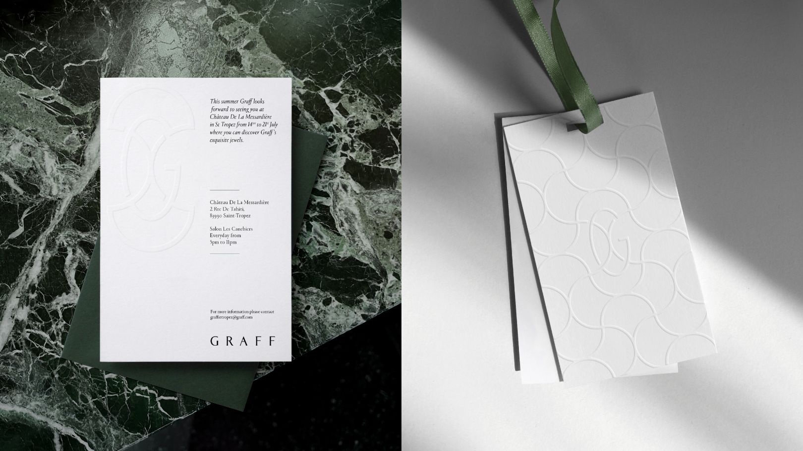
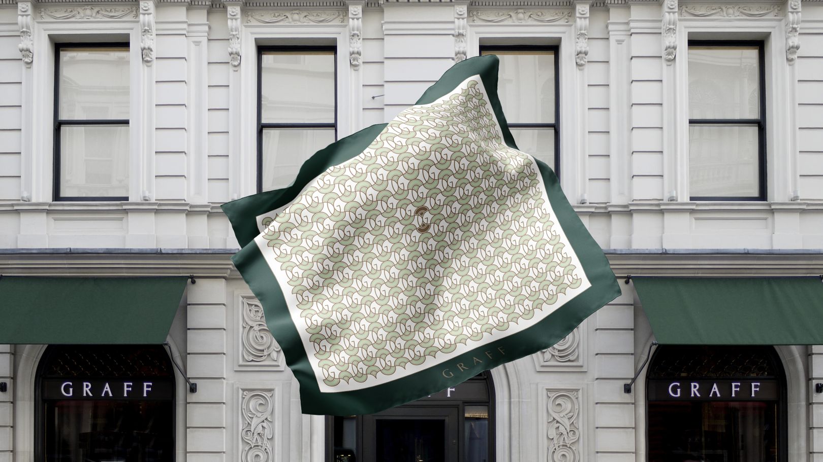
Inspired by the intricate lattice found exclusively on the back of Graff’s signature pieces, SomeOne crafted a brand pattern that seamlessly blends strength, elegance, and the ability to suspend diamonds above the skin. This pattern enhances the allure of the gem, allowing light to dance through with captivating allure.
Graff’s First Monogram
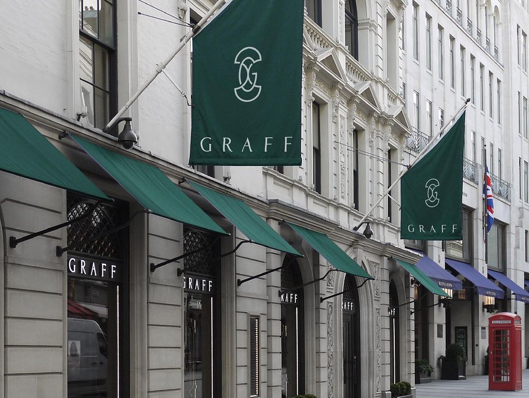
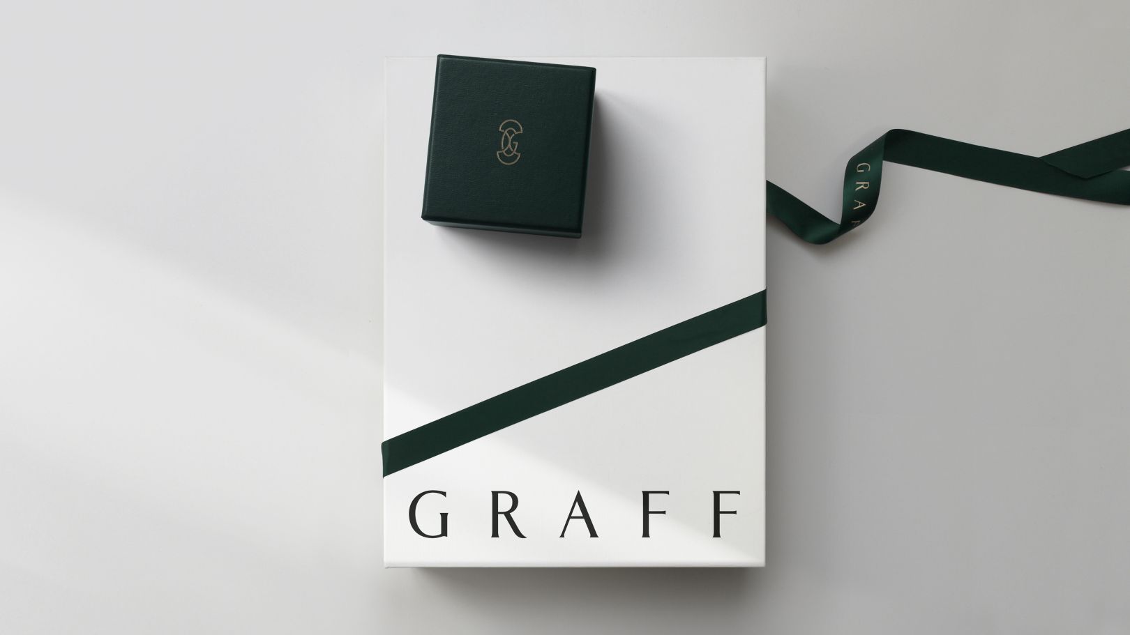
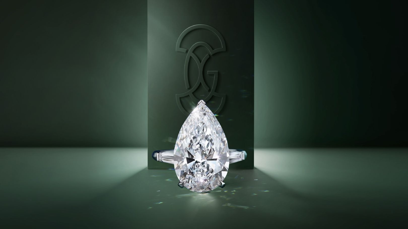
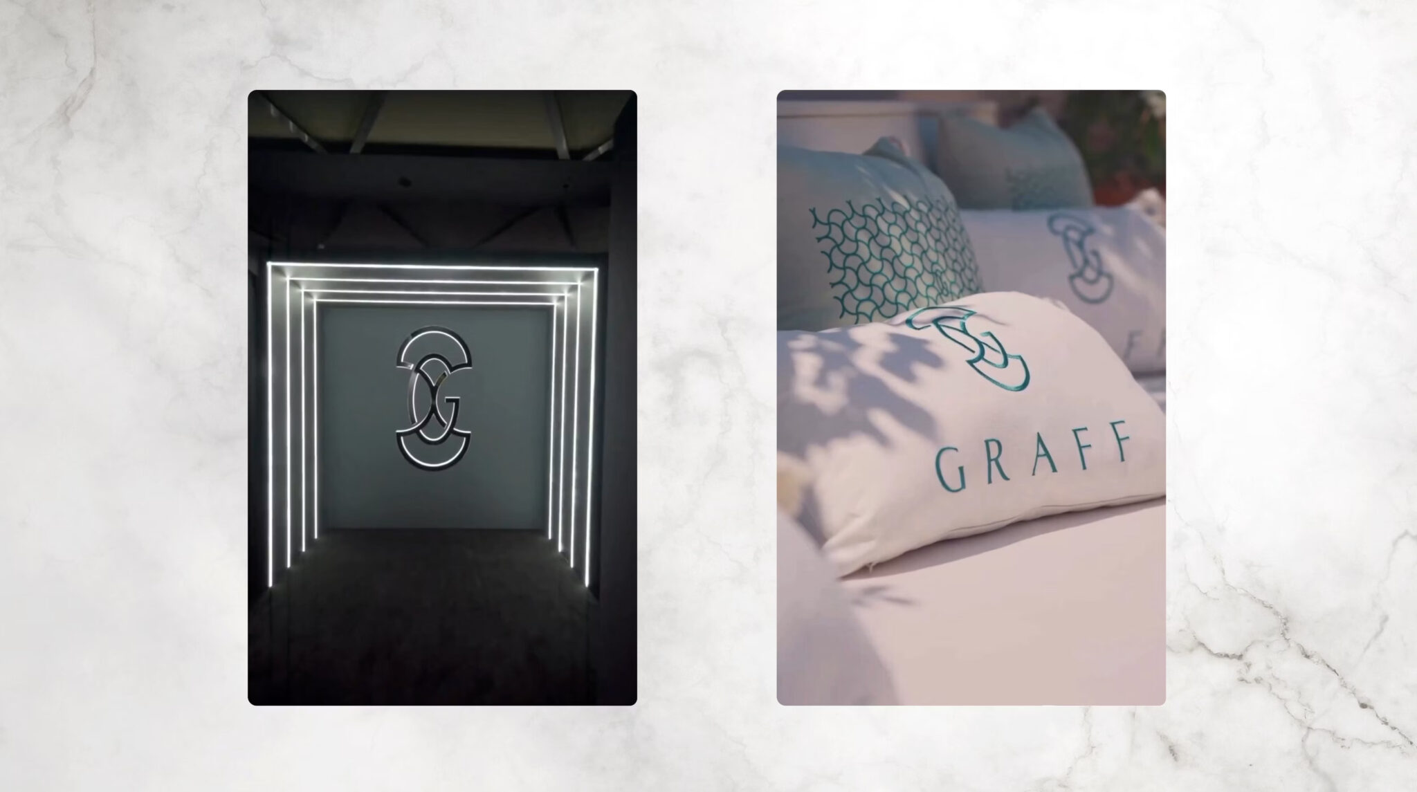
For the first time, Graff introduces a monogram derived from the shapes found in the Graff lattice. Complemented by a bespoke word mark and the Portrait typeface, the new identity marries classical proportions with triangular Latin serifs, adding a touch of timeless sophistication.
Racing Green Color Symphony
To create a more defined system, SomeOne drew inspiration from Graff’s historic use of British racing green. This color defines the new approach, unifying the brand’s visual elements.
Fine Balance Challenge
One of the project’s main challenges was striking a delicate balance to ensure that the new assets and brand touchpoints enhanced Graff’s allure without overshadowing the jewelry itself. Manchipp reflects on the necessity to let the brilliance of the jewelry shine through every aspect of the brand.
Brand Brilliance Unveiled
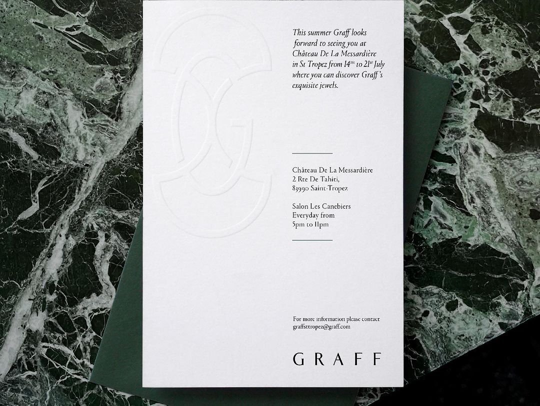
Graff’s new visual identity now graces packaging, stationery, the website, and other collateral, inside and outside the boutique on London’s New Bond Street. SomeOne’s meticulous craftsmanship has seamlessly fused tradition with innovation, breathing new life into Graff’s timeless legacy.
Final Thoughts
As Graff steps into a new era of radiance, the collaboration with SomeOne stands testament to the art of reimagining a brand’s identity while honoring its roots. The journey from London’s workshop to the global stage exemplifies the delicate dance between tradition and transformation, a dance that has illuminated Graff’s path to a dazzling future. This rebrand is thus a significant step forward for Graff.
Also Read: Amazon Ads Gives Advertisers More Control

