Popular Airline brand Air India unveiled a new logo and livery, incorporating shades of red, golden, and violet colors as part of a rebranding exercise after being acquired by Tata Group in January 2022. Since taking over India’s oldest airline, Air India, the Tata Group has actively been working on revamping its image.
Inspired by the Winds and Colours of India
The recently unveiled logo, named ‘The Vista’, features a palette of deep red, aubergine, and gold highlights. The airline stated that the new logo ‘captures the essence of bold new India, marking a milestone in its Vihaan.AI transformation.’
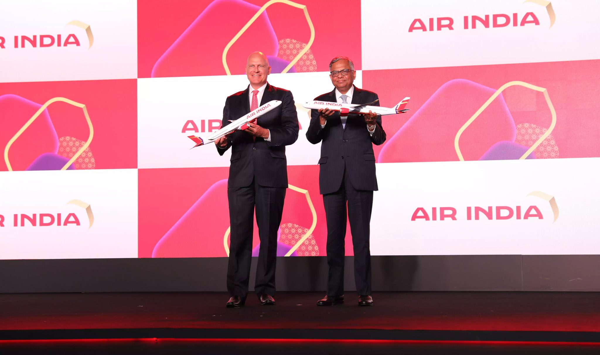
During the rebranding, one of the officials mentioned that the new Air India logo is inspired by the winds aboard all Air India flights that have been a part of the airline’s journey from day one. The new identity has been created by IPG’s Futurebrand, and the films have been conceptualized by McCann Worldgroup.
New Livery and Custom Font for a Bold New Look
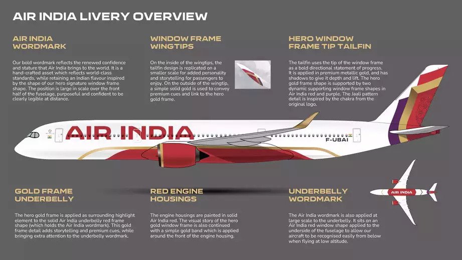
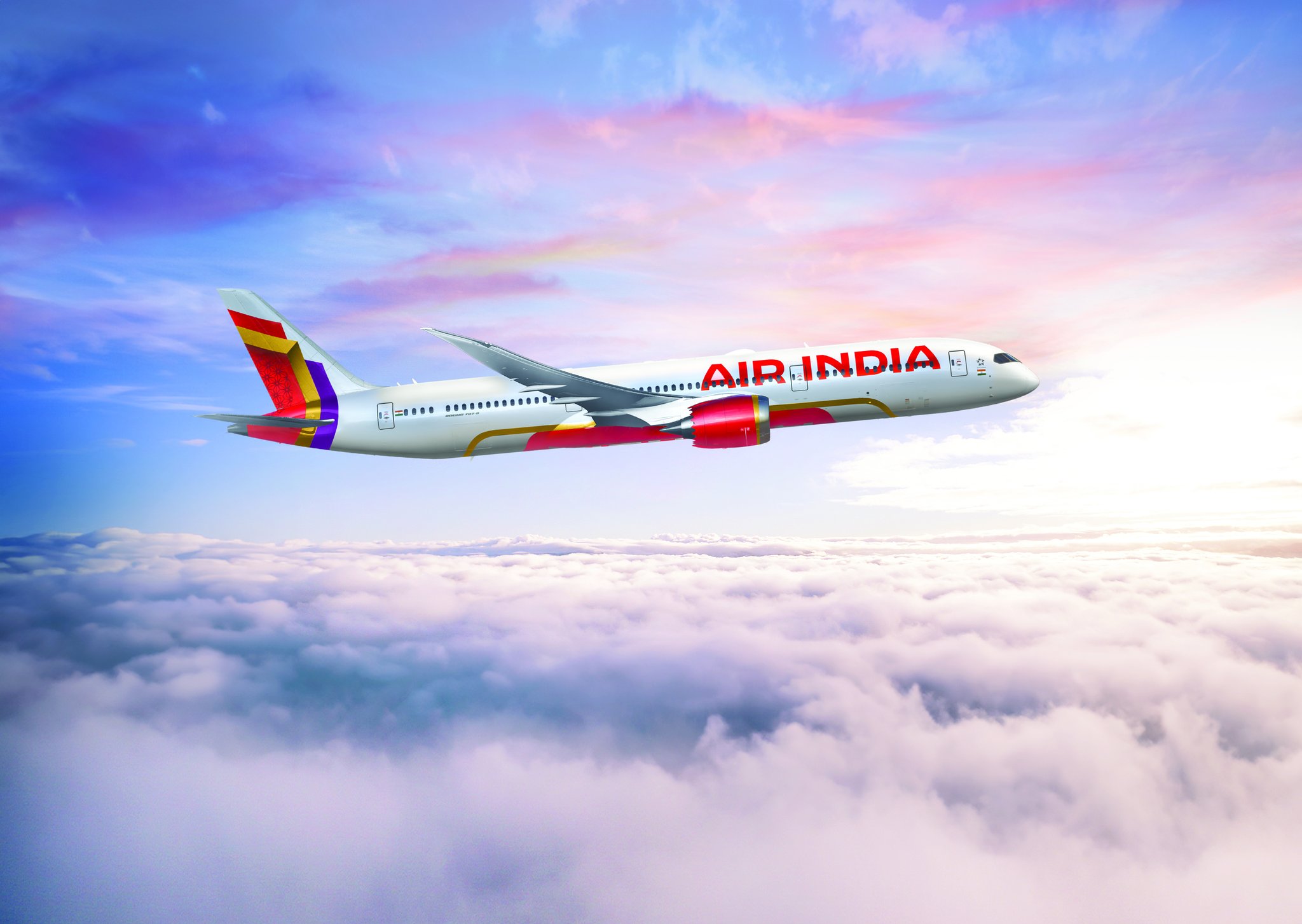
The new airline livery features deep red, aubergine, and gold highlights, as well as a chakra-inspired pattern. The new custom-made ‘Air India Sans’ font is meant to convey confidence and warmth. “The new Air India is bold, confident, and vibrant, but also warm and deeply rooted to its rich history and traditions that make Indian hospitality a global benchmark for standards in service,” says Campbell Wilson, Air India CEO and MD. Moreover, the old logo featured ‘Air India’ text in Hindi, which has been removed from the new logo. This further simplifies the design, aligning with the group’s vision to turn the airline into a ‘world-class airline’.
The Maharaja Stays, But Gets a Makeover
And, to answer the big question, the Maharaja isn’t going anywhere. The iconic Air India mascot will live on and be a part of the airline’s future, as per CEO and MD Campbell Wilson.
Air India CEO Campbell Wilson has called the rebranding a ‘total and complete’ transformation of the airline. He also clarified on the airline’s mascot: “The Maharaja will live on, it will remain beloved. But his look is being changed. The purple and gold colors are being added to his look.”
Flyers will get to see the new logo by December end when Air India’s first Airbus A350 enters its fleet. Tasneem Ali, who designed the new logo for Air India, said they wanted to create something that’s ‘authentically and identifiably Indian’, but presented in a very contemporary world-class manner.
Upgrades to Fleet, Lounges, App, and More
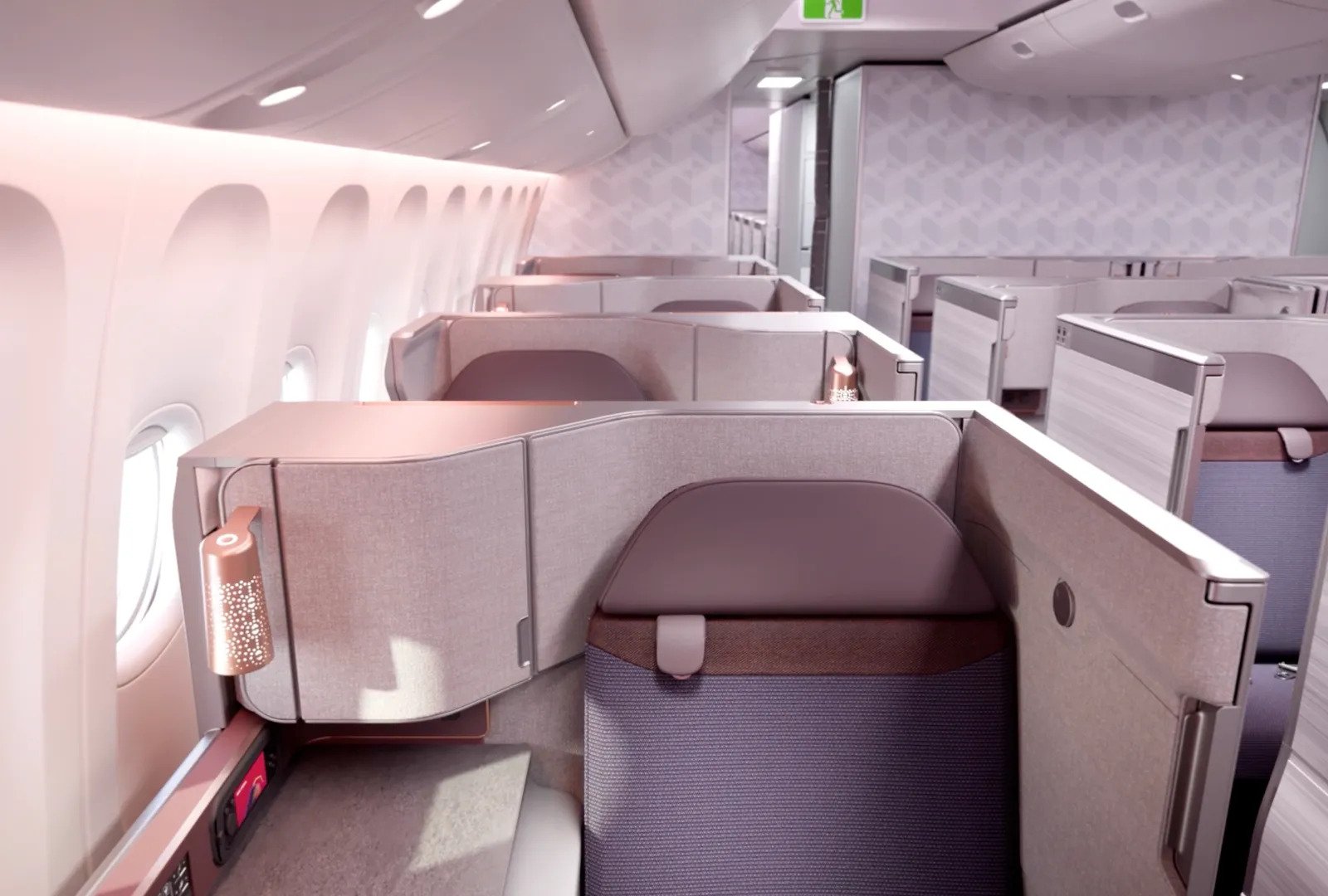
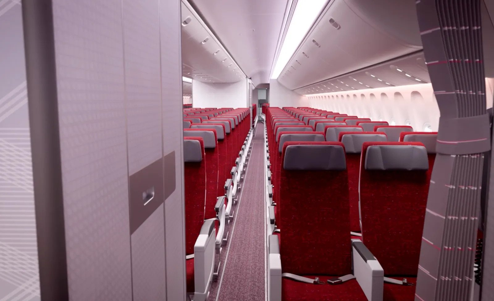
Air India has confirmed purchase agreements to acquire 470 aircraft from Airbus and Boeing at US$70 billion, with deliveries of the new aircraft starting in November this year. The airline has already leased and bought 20 widebody aircraft this year. In mid-2024, Air India will begin a US$400 million program to completely refurbish the interiors of its legacy fleet of 43 widebody aircraft—brand-new seats in every cabin, new inflight entertainment systems, and inflight Wi-Fi internet connectivity.
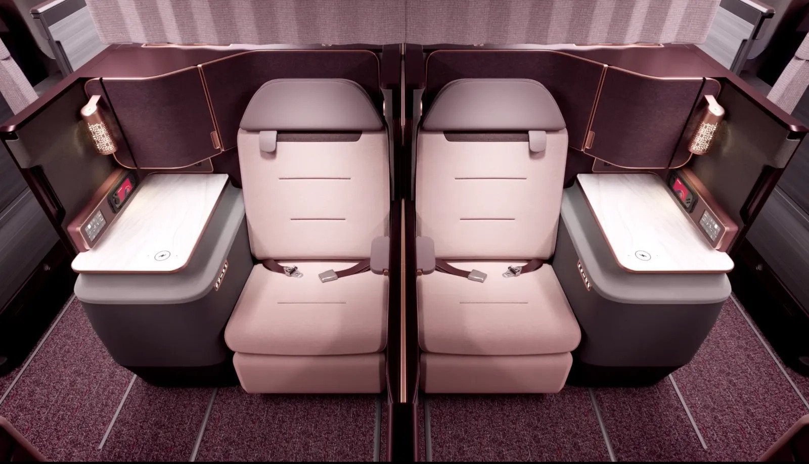
The airline is investing in building completely new lounges at Delhi and New York JFK airports. The goal is to achieve 100% lounge access for all premium passengers at all destinations in its international route network. Air India has launched a new website and mobile app for a better web experience and enhanced digital features.
Simplified, Brand-Neutral Design Similar to Twitter’s Rebrand
Another popular company, Twitter, embarked on a similar journey of changing its logo. The older logo for Air India, featuring a tail fin with the sun inscribed in the middle, had become synonymous with the airline over the years. Similarly, Twitter’s blue bird logo had become synonymous with the platform, but it was replaced with a plain ‘X’.
Kurnal Rawat, Creative Director at Landor & Fitch, shared thoughts on Twitter’s logo change opining that many companies undertaking logo replacement exercises are taking a similar route. This route involves redesigning the logo in a brand-neutral and simplified fashion, eliminating colors and gradient components from the design.
Something similar can be observed in the design of Air India’s new logo. The new logo sees the airline completely removing the tail fin, replacing it with a simple golden arrow. The company stated that ‘Vista’ is inspired by the peak of the gold window frame, and the arrow signifies “limitless possibilities, progressiveness, and the airline’s bold new outlook.”
Final Thoughts
With its refreshed visual identity, Air India aims to project itself as a modern, world-class carrier, while maintaining classic elements such as the Maharaja mascot. A major investment for upgrading the fleet, lounges, digital offerings and more appears to be aimed at growing Air India under Tata management. As time passes, it will be clear if the rebranding effort will transform public perception. The coming months and years will be crucial, as the airline rolls out its ‘total and complete transformation‘. The major test for Air India’s brand makeover will be whether it can consistently deliver an enhanced, premium flying experience to match its bold new look. If Air India manages to walk the talk, its reimagined Maharaja may regain his former glory.

